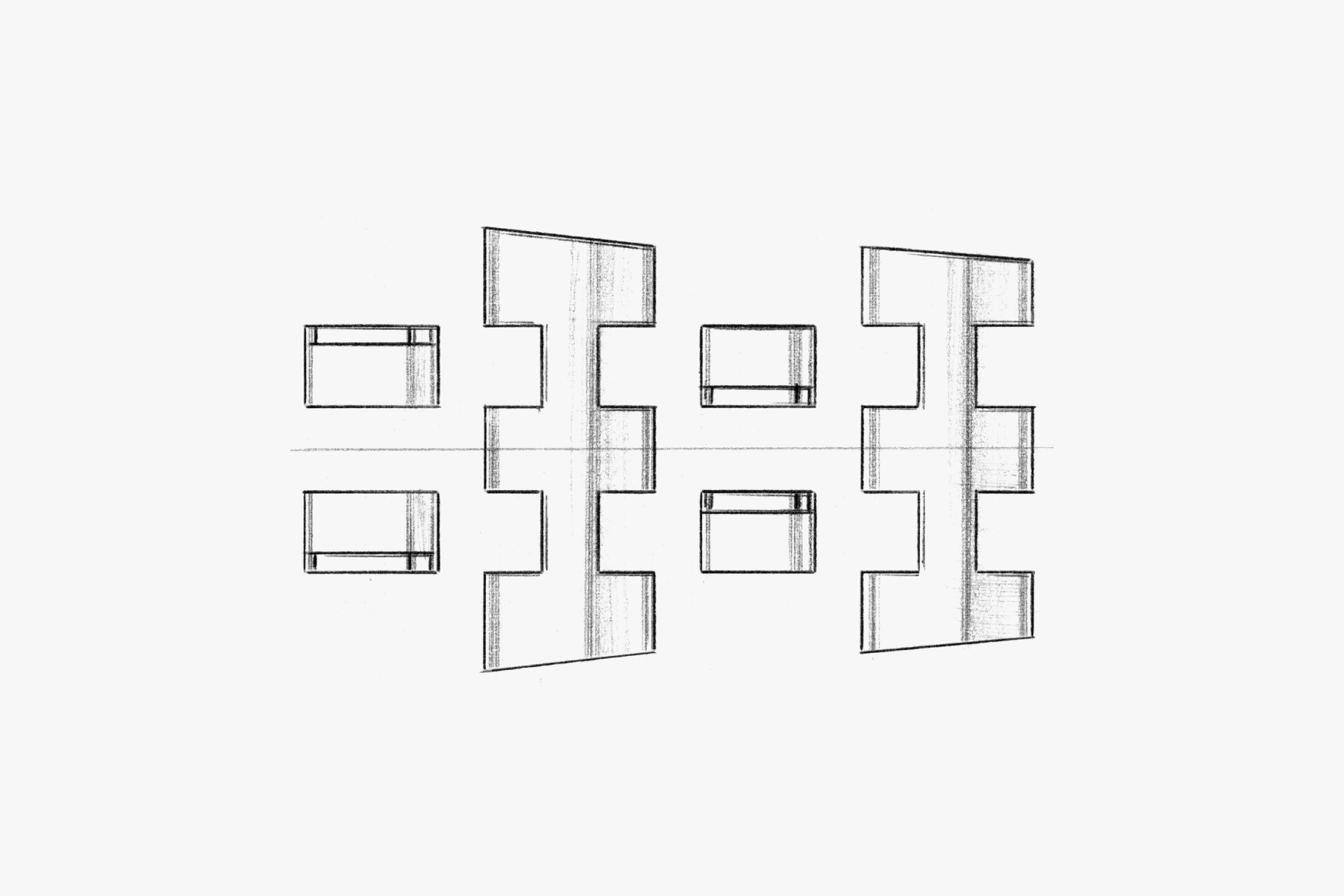
At the heart of this model lies the distinctive 'multi-function' as its core 'element.' How these 'elements' have been expressed from a design perspective is reflected in the high level of completion of this watch. The unique configuration, such as displaying the charge level in a fan shape and using its center as the 12 o'clock index, is one of this model's attractions. At the same time, many elements are arranged on the dial and ring in layers and surfaces so that they do not interfere with each other. Rather than superficially expressing the word 'sports' in form, the design is carefully crafted, such as not adding unnecessary recessed or protruding structures, anticipating actual usage situations. The metal band features alternating polished finishes on the connecting links, creating a dynamic sense of individuality. Additionally, by finishing the crown and push button guards separately, the model is characterized, and together with the shape of the push buttons, it invites the user to utilize the chronograph functions. By structuring and expressing the 'elements' of 'function' and 'sports' with a focus on their essence, this model embodies the true spirit of PROMASTER.
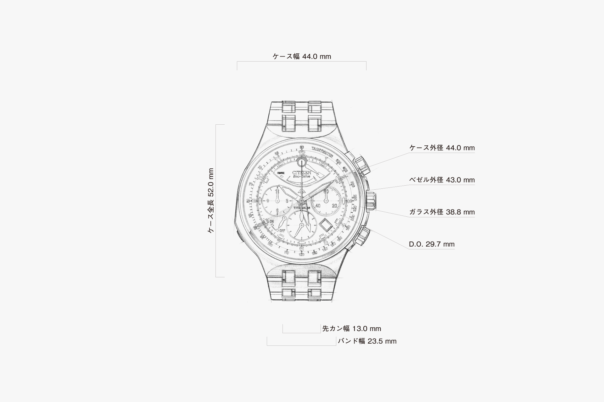
Although the case is large at 44.0 mm, the full-flow integration with the band gives it a clean impression despite the abundance of information.
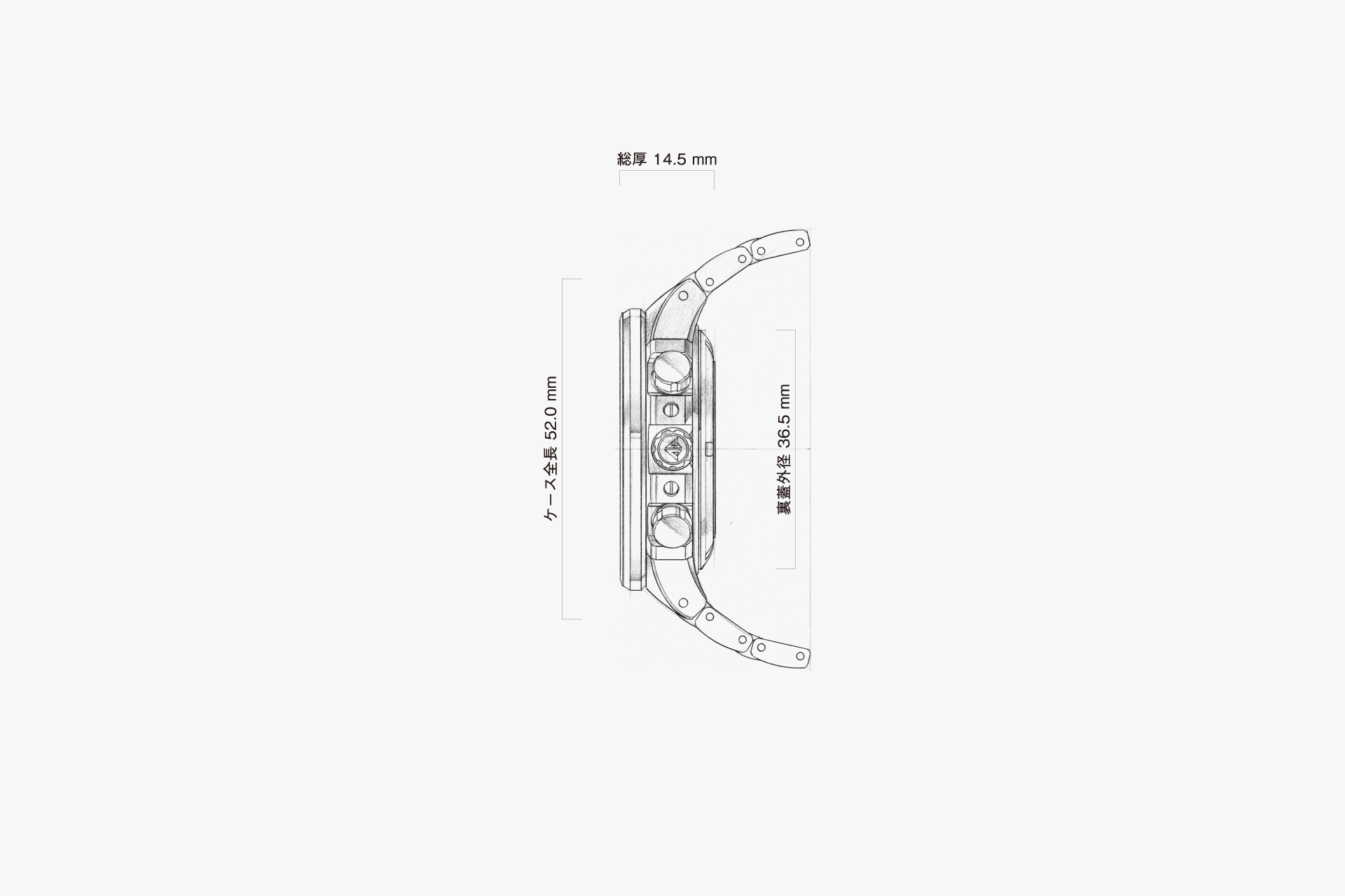
The total case thickness is 14.5 mm, but with the bezel, case body, and case back in a 3:5:2 ratio, it avoids feeling unnecessarily bulky.

The upper part of the case lugs is aligned with the upper surface of the band, further emphasizing the sense of unity between the case and the band.
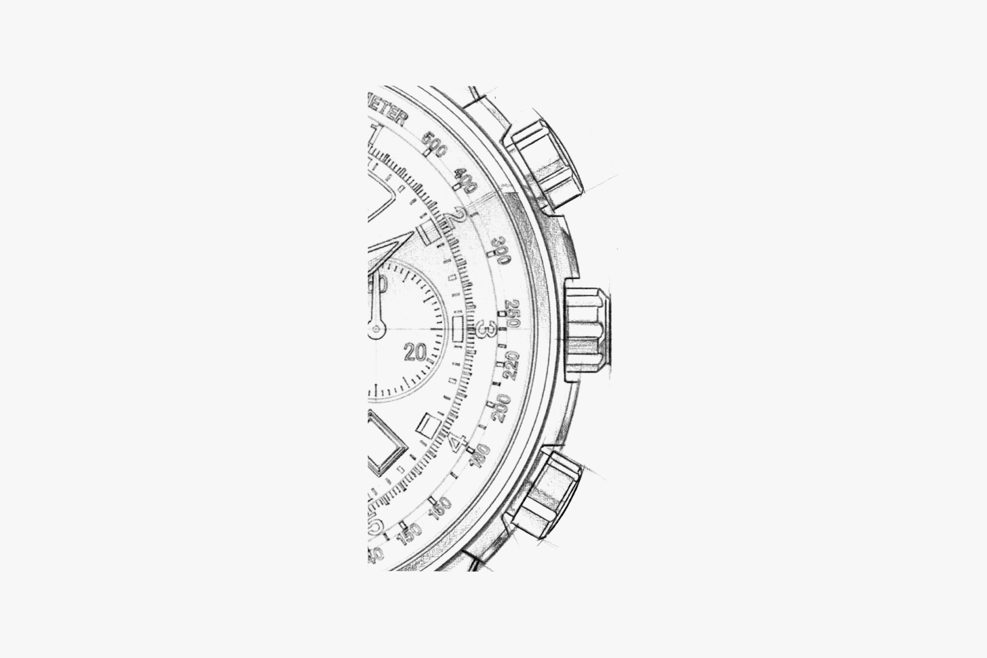
By giving the 3 o'clock separate guard a different finish from the main body, the watch's functionality is expressed. The guards are designed to adjust the protrusion of the crown and push buttons so they do not cause stress on the wrist.
The 8 o'clock alarm crown, which is not used regularly, is covered by an integrated guard with a flowing line, reducing stress on the wrist.
The mirror-finished parts of the connecting links are arranged alternately inside and outside, providing an accent within the otherwise monotonous structure. The adoption of the H-link structure improves the fit on the wrist.
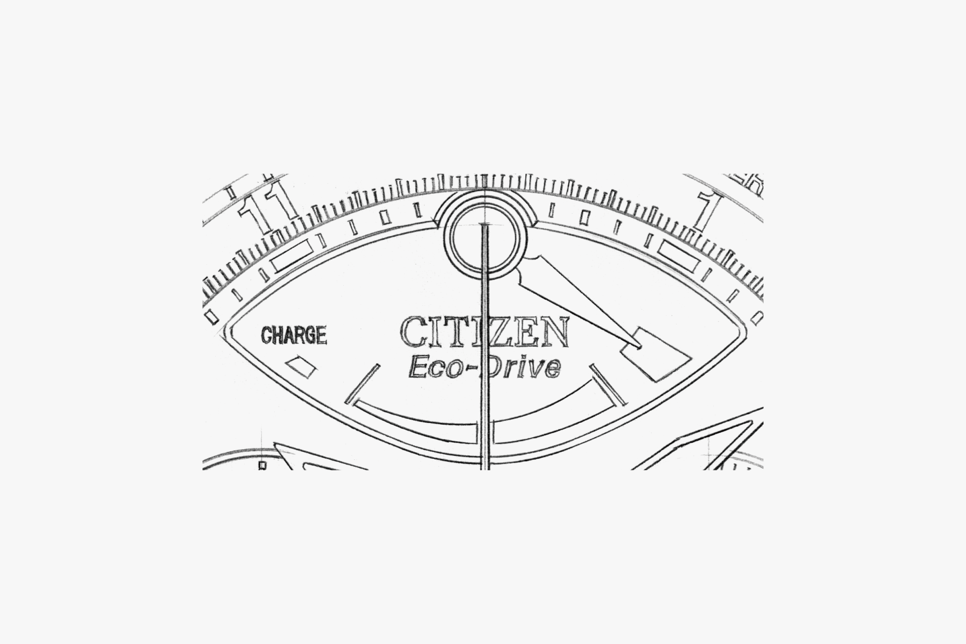
The center of the 12 o'clock charge level indicator hand also serves as a round luminescent index, making the charge display and the unique window shape the model's most distinctive features.
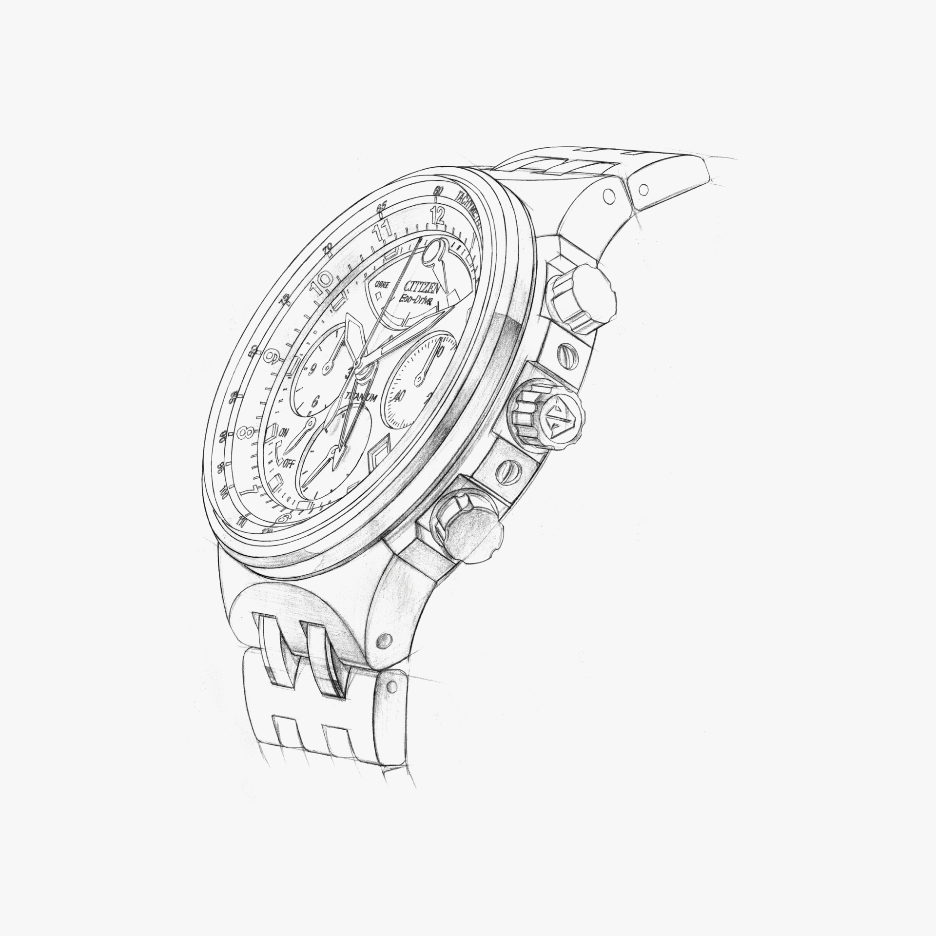
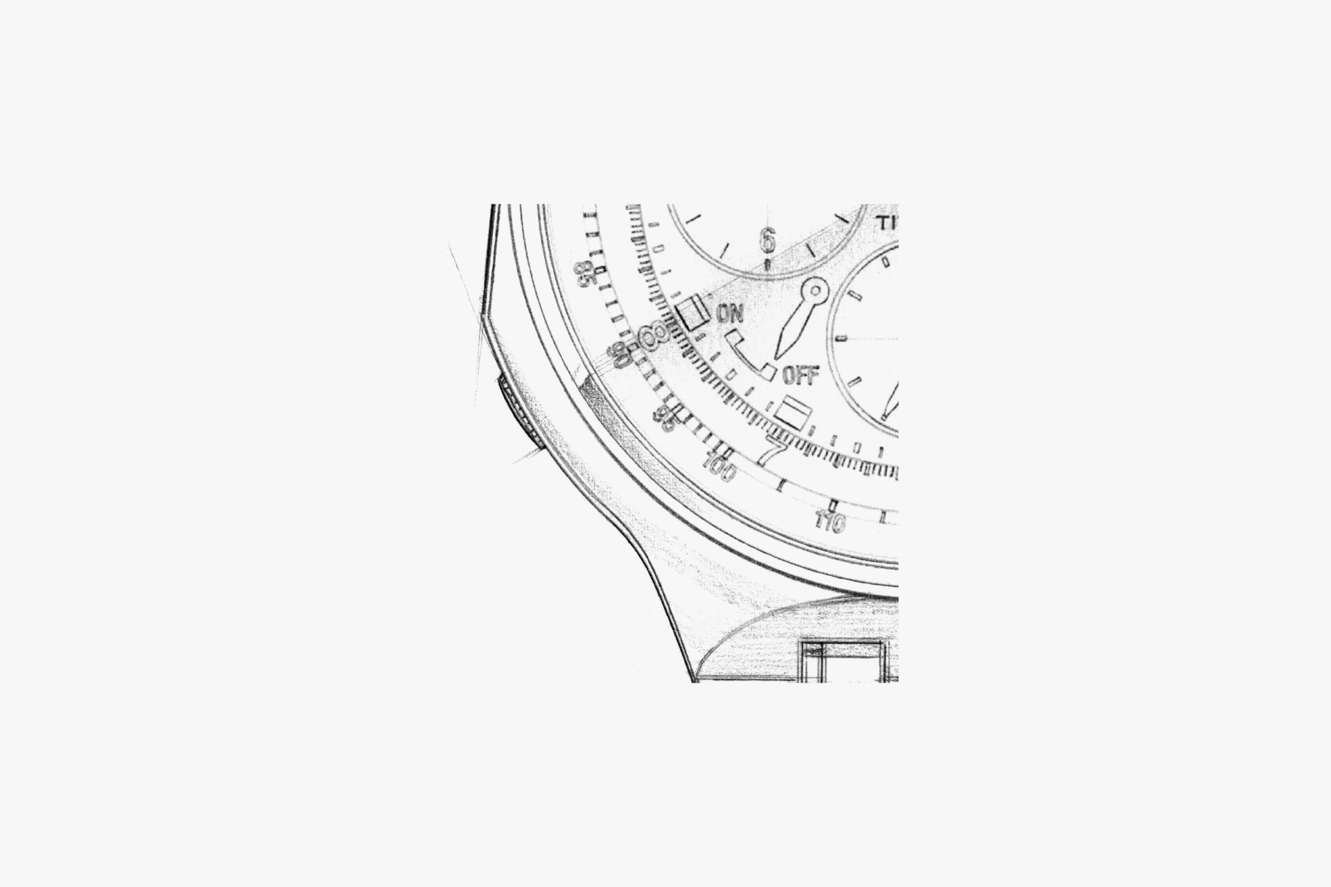
By making the bezel thin and less assertive, the functional information of the dial and ring is conveyed to the fullest extent.
ENGINEER'S EYE
Mobilizing the Full
A light-powered chronograph movement that, for the first time in a quartz watch, adopts an instantaneous return-to-zero mechanism.
We obsessed over the tactile feel of the push buttons to deliver a precise sensation at your fingertips, and as a result, all chronograph hands snap back to zero instantly—befitting the name of a true chronograph.
By boldly placing, at the 12 o’clock position, the charge-level indicator hand—which constantly displays the remaining charge and was adopted for the first time in an Eco-Drive—we achieved a distinctive design unlike any other.
Although instantaneous return-to-zero is the hallmark of this product, during the prototyping stage there was an issue where the second hand would shift off position each time it returned to zero. To solve this, we sourced beryllium copper material for the hands, among other measures, making this a model that faced a difficult development process.
As an aside, because the test equipment of the time could not perform durability testing of this movement’s push buttons, the evaluation team had to conduct several thousand manual durability cycles. Unable to endure the finger pain, we urgently had to select easy-to-use thimbles.
Despite being a quartz movement, this movement comprises well over 200 parts. To develop it, nearly all members of the movement design department at the time became involved in its design.