In the 1970s, a new method of time display—digital display—was developed. At the time, this display function evoked expectations for watches of the near future.
This watch was designed based on the idea of utilizing the effectiveness of digital display and, for the first time, adding a calculator function to a wristwatch.
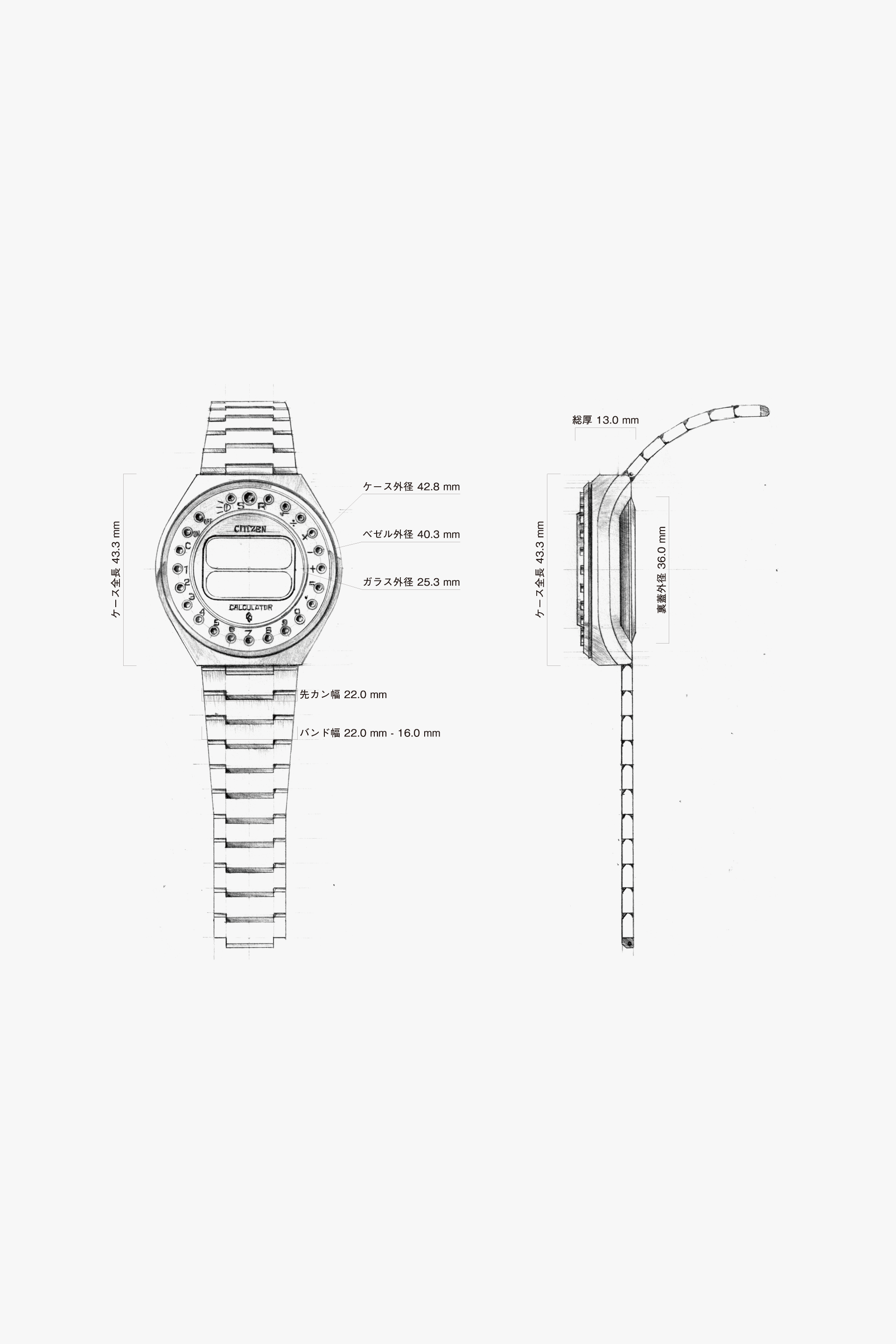
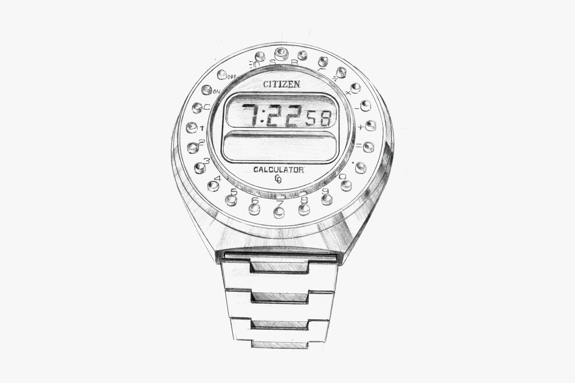
The first domestically produced wristwatch to combine watch and calculator functions is expressed with a unique design style: a central display monitor and 23 push buttons arranged radially around the perimeter. Achieving this in the classic round shape of a wristwatch is a testament to the creativity of watch designers.
The artificial brilliance of the push buttons, arranged every 15 degrees. The simple lines of the case and band, free from any recesses or protrusions. These are the result of traditional machining, and the combination of a thick case and cool digital display creates a retro-futuristic feel through the imbalance of old and new technologies.
Additionally, this early model is unified in gold, skillfully using gold with different textures for each exterior part, creating an elegant atmosphere despite the flashy color scheme.
Although the distinctive button layout did not become standard, it exudes the coolness and pride of being a pioneer.
The unfamiliar button arrangement and the seamless flow from the case to the band without a protruding crown give it a unique and timeless brilliance. The contrast between the volume of the case and the thickness of the band evokes the '70s style and a sense of openness.
The sense of unity between the case and band. The color scheme unified in gold. The bold arrangement of push buttons evokes expectations for watches of the near future and exudes a retro-futuristic feel. It conveys both beauty and a sense of retro-futurism.
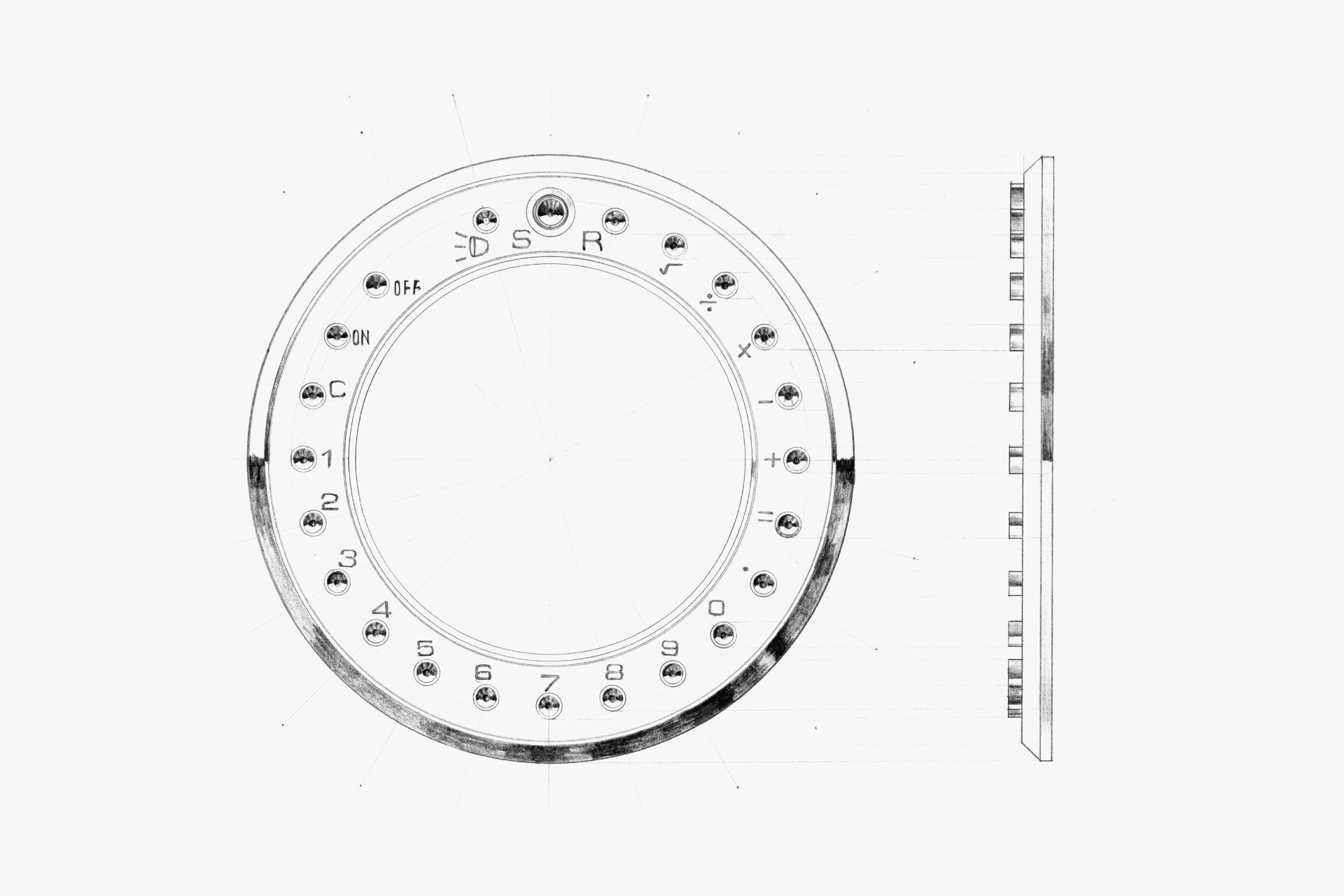
The novelty of arranging push buttons in a circular pattern. The brilliance of the push buttons, processed in a concave shape, achieves both "function" and "decoration."
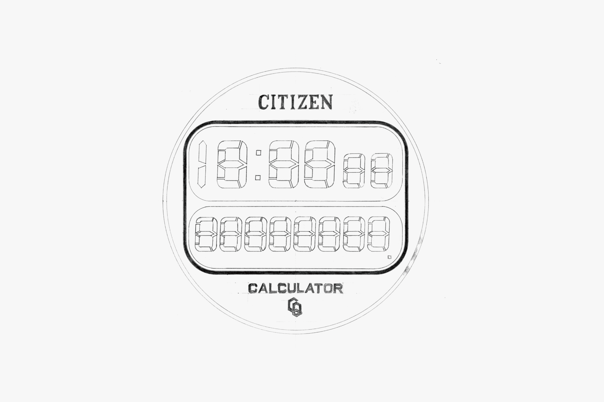
Top: Time & calendar display. Bottom: Calculator display. The characters printed on the back of the glass (the black areas) are processed in a slightly brownish tone rather than pure black, beautifully harmonizing with the gold-based design.
The 23 push buttons, arranged in a concave shape, guide the tip of a pointed object to the center, ensuring accurate pressing and preventing misoperation.
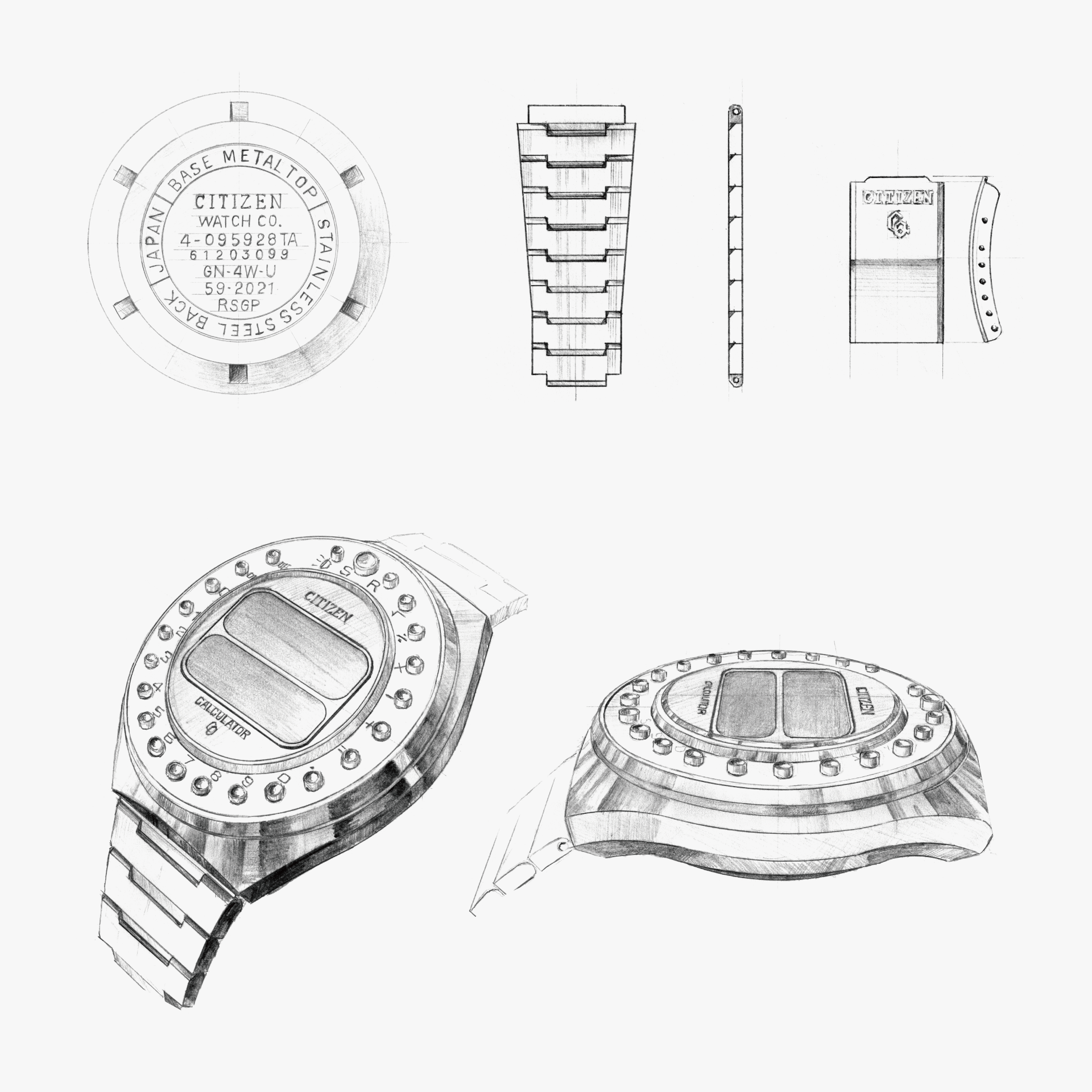
The case back itself is a screw back, just like quartz watches of the time. "RSGP = Rose Gold" was rare among watches back then. The idea of arranging push buttons in a circular pattern is unique to wristwatch designers. While the entire watch is clad in gold, the use of different shades and tones is superb. It conveys a sense of pride in being the first domestic watch with these functions.
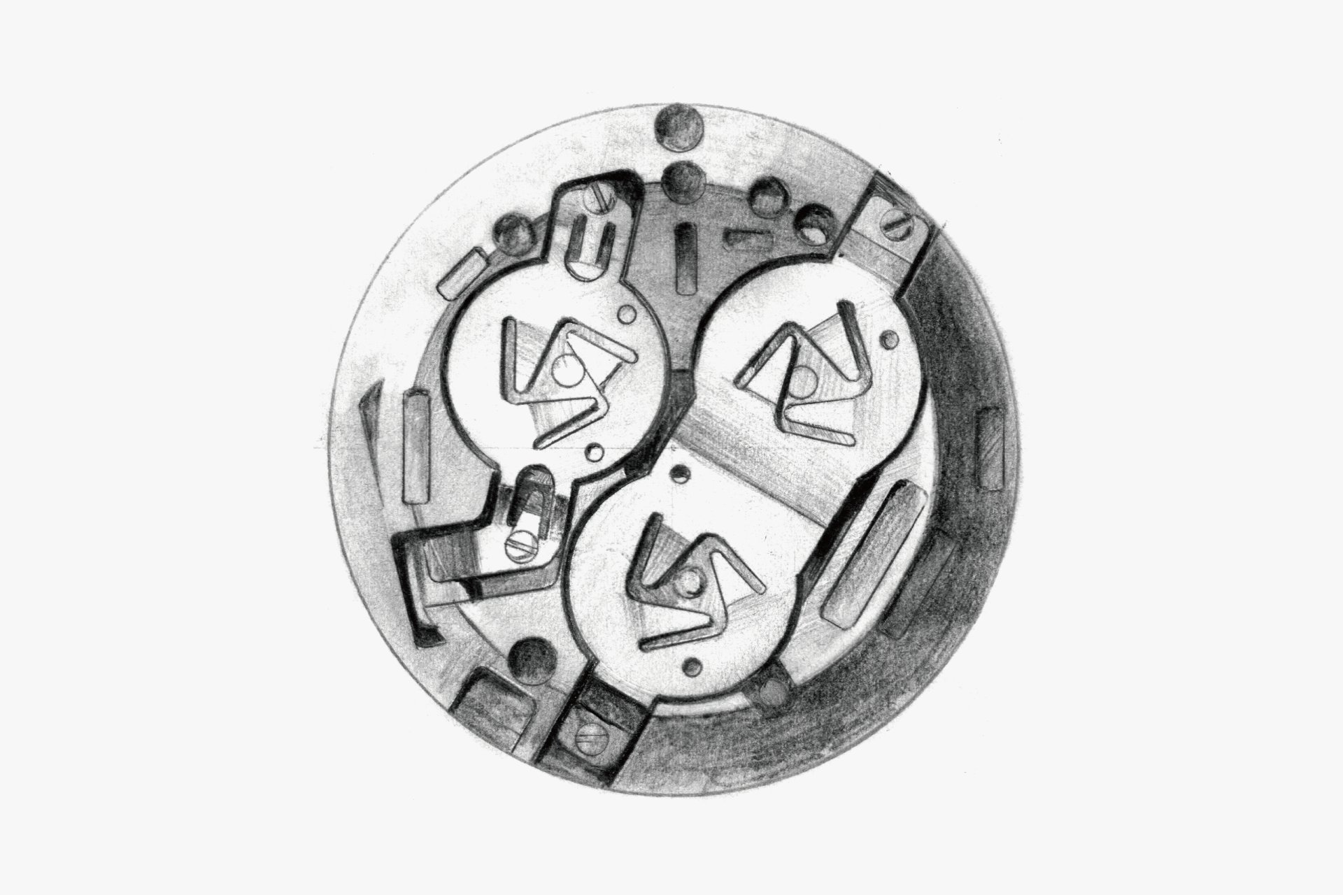
The contrast between the green resin of the device cover and the gold of the case is beautiful. Three batteries are required for operation.
ENGINEER'S EYE
Multi-Functionality
This was the first domestically produced digital watch with a built-in calculator. It also became the world’s first to display both the time and calculator functions simultaneously on a single LCD cell.
Equipping a calculator—an application unrelated to timekeeping—was a new experiment for wristwatches, and it paved the way for the subsequent trend toward multi-function watches. Moreover, the fact that this calculator-equipped wristwatch was released a year before the debut of business-card-sized electronic calculators suggests that watchmaking technology was at the forefront of miniaturization and precision engineering.
To fit everything into a wristwatch-sized form, the operation buttons were arranged around the perimeter of the display. This not only produced a cohesive wristwatch design, but by spacing the buttons evenly near the display, the layout allowed operation with fingertips—without using, for example, the tip of a ballpoint pen—making it possible to operate the watch while viewing the display.
In the calculator display on the lower part of the digital screen, calculations up to eight digits were possible for the four basic operations (+, −, ×, ÷), decimal points, and square roots.