By prioritizing 'consideration for people,' which means ease of use for everyone, this watch is filled with 'gentleness' in both its functionality and design. It is suitable for anyone, regardless of age or gender, and is easy to accept for all. As it is based on the concept of universal design, it thoroughly emphasizes two points: 'legibility' and 'comfort.' The rounded case without any edges and the universal font with plump, rounded tips are prime examples, and as a result of focusing on kindness to people, the watch also gives a gentle impression in its appearance, which is quite interesting. Because the concept is clear, the forms derived from it are also straightforward. This philosophy is reflected everywhere, from the easy-to-pull crown at the 4 o'clock position to the rubber clasp cover that protects your nails. The texture when touched is also considered: the smooth feel of the sand-blasted titanium and the soft touch of the clasp cover. As a product worn and operated on the wrist, the 'gentleness' that appeals to the senses is pleasantly felt.
A watch that emphasizes universal design and is equipped with details that make it easy for anyone to use. It thoroughly focuses on the two elements of 'legibility' and 'comfort,' and as a result, its appearance gives a gentle impression.
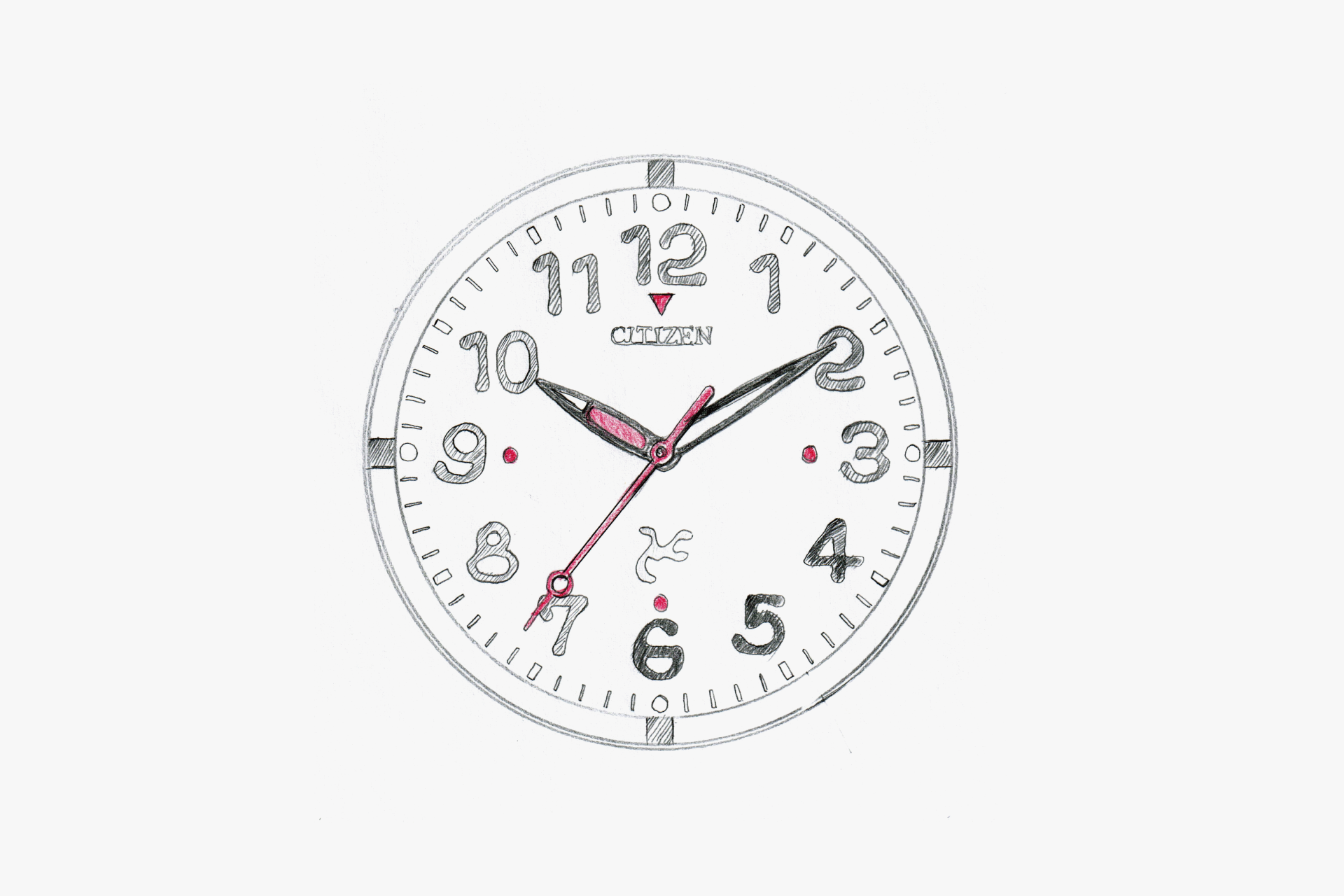
By using three colors—white, black, and red—for high contrast, and placing a red dot at the 4 o'clock position, the design thoroughly pursues improved legibility.
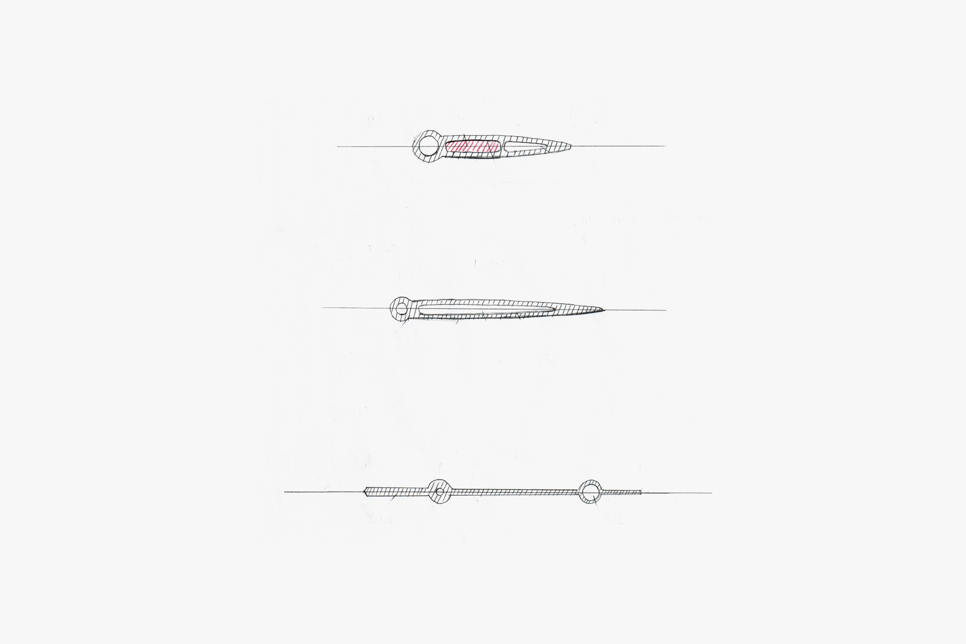
A very gentle and friendly impression is created by the gentle curve that runs all around. To make it easier to distinguish from the minute hand, the base of the hour hand is printed in red.
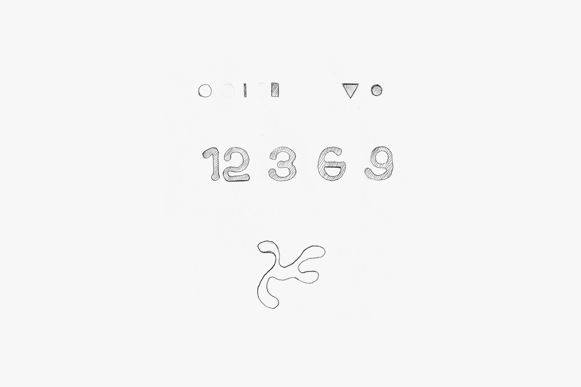
The Arabic numerals are original to this model, and the combination of geometric elements of straight lines and perfect circles with organic free curves results in a highly legible font.
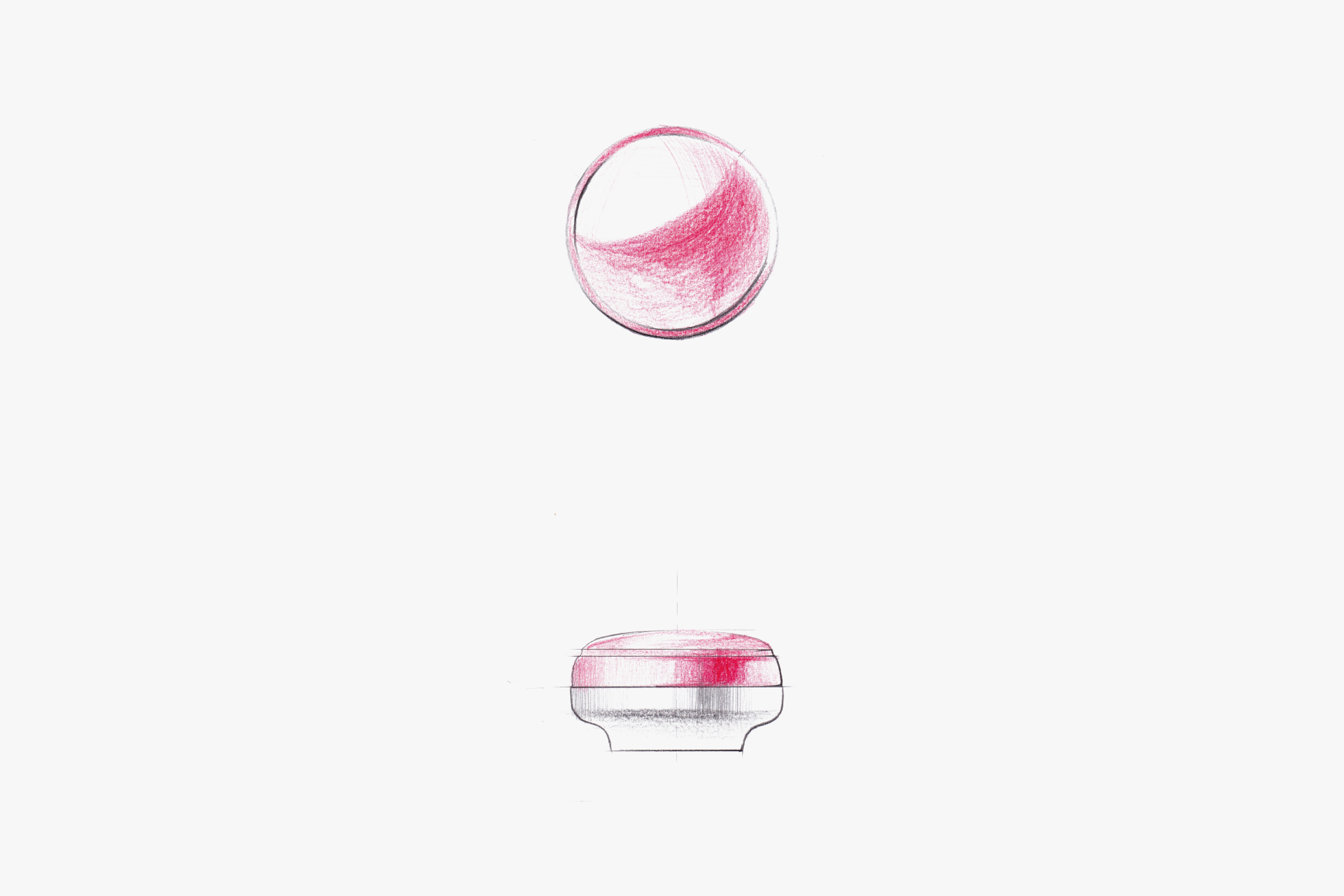
It features a gentle curve, giving a sensation that seems to cling to the pad of your finger when pressed. The red accent color can be considered a charming point of this model.
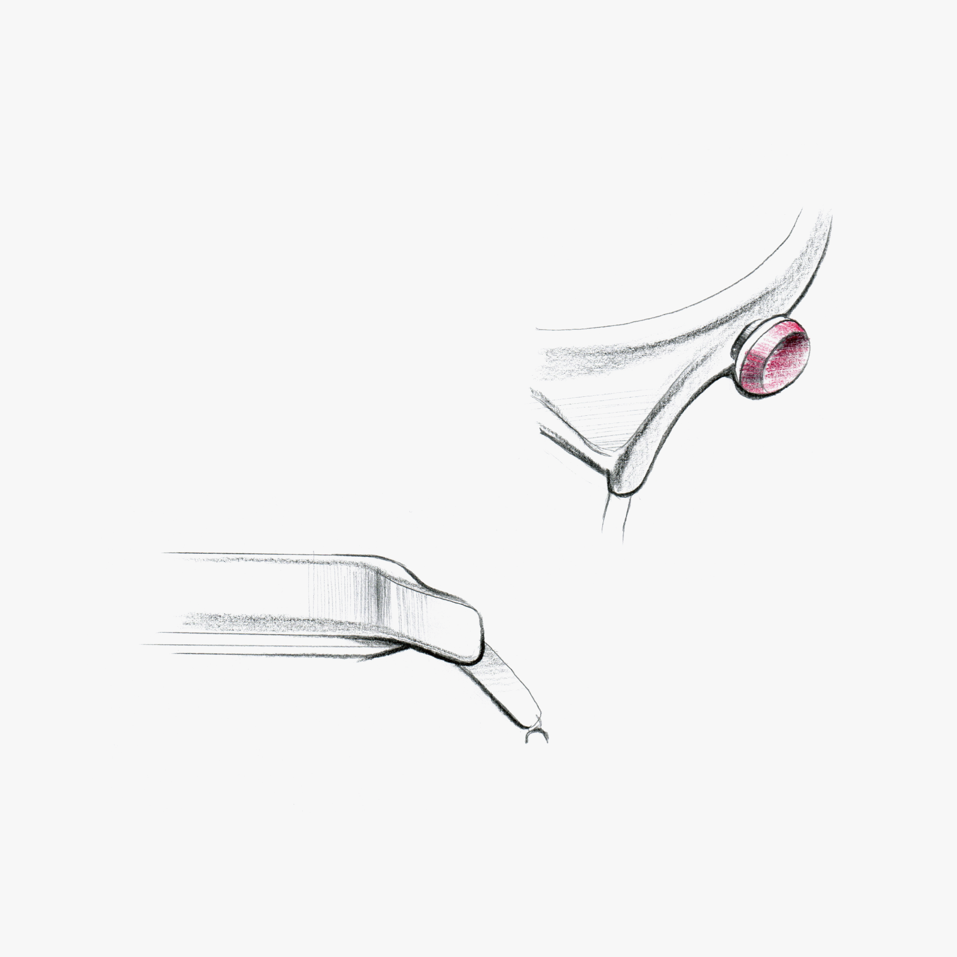
The surfaces connect smoothly from the lug to the side surface of the case. All surfaces are gently connected, with no sharp ridges to be found. Around the crown, a gap is provided between the case side surface to make it easier for nails to fit in.
The clasp cover is made of firm rubber material. While it has softness, it does not have the sticky feel typical of rubber, offering a soft texture. It also serves to protect your nails.
ENGINEER'S EYE
Clarity First
Developed under the core concept of “HUMANWEAR,” incorporating the principles of universal design and collaborating with an external design firm. The dial features a unique typeface with high legibility from any viewing angle. To ensure visibility, the glass is treated with an Anti-reflective coating.
In pursuit of being “kind to everyone,” we adopted a crown sized for excellent operability, and the material is titanium with a nickel-allergy-resistant specification that is lightweight and gentle on the skin. The clasp uses a rubber-coated push button mechanism that opens easily without damaging nails—every design and specification choice was made with user-friendliness in mind.
The instruction manual is also made slightly larger for better readability. This model also received the GOOD DESIGN AWARD that year.