This watch was manufactured for use by railway workers, making it something of an unsung hero supporting social infrastructure. To support such public transportation infrastructure, practicality has been given full consideration. For example, it has a function that stops the second hand at the 12 o'clock position to make it easy to set the time, and particular attention has been paid to legibility (ease of reading the time).
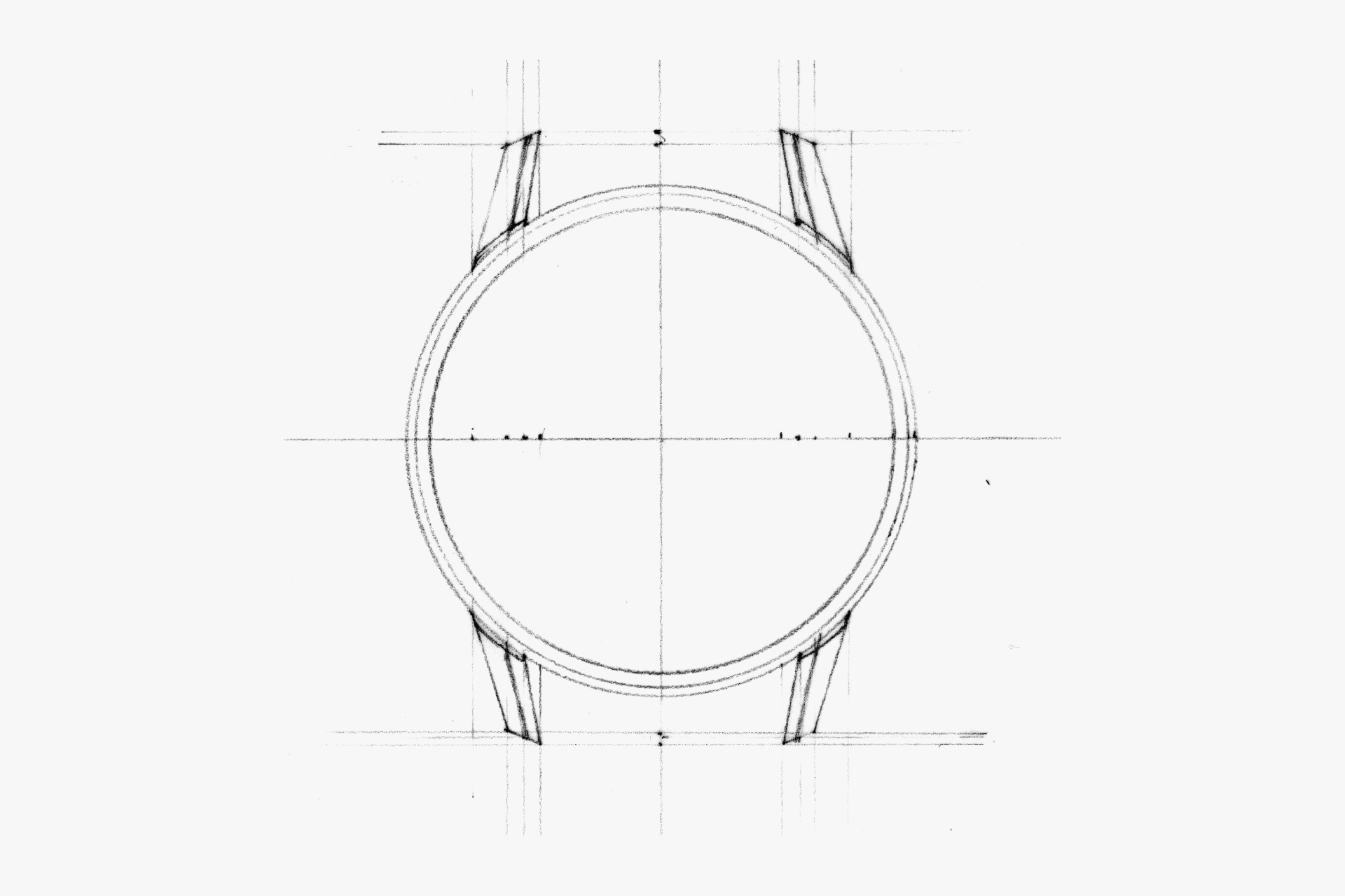
Therefore, elements other than the dial, which are deeply related to legibility, are kept understated. For example, the thin and narrow bezel and its surface composition, the surface composition of the lugs, and the undercutting of the lower part of the case.
However, rather than simply erasing their presence, overall harmony—beauty—is firmly maintained. Only the parts that truly should be shown are highlighted, while the rest are beautifully made to disappear. This intention seems to be embodied in this watch.
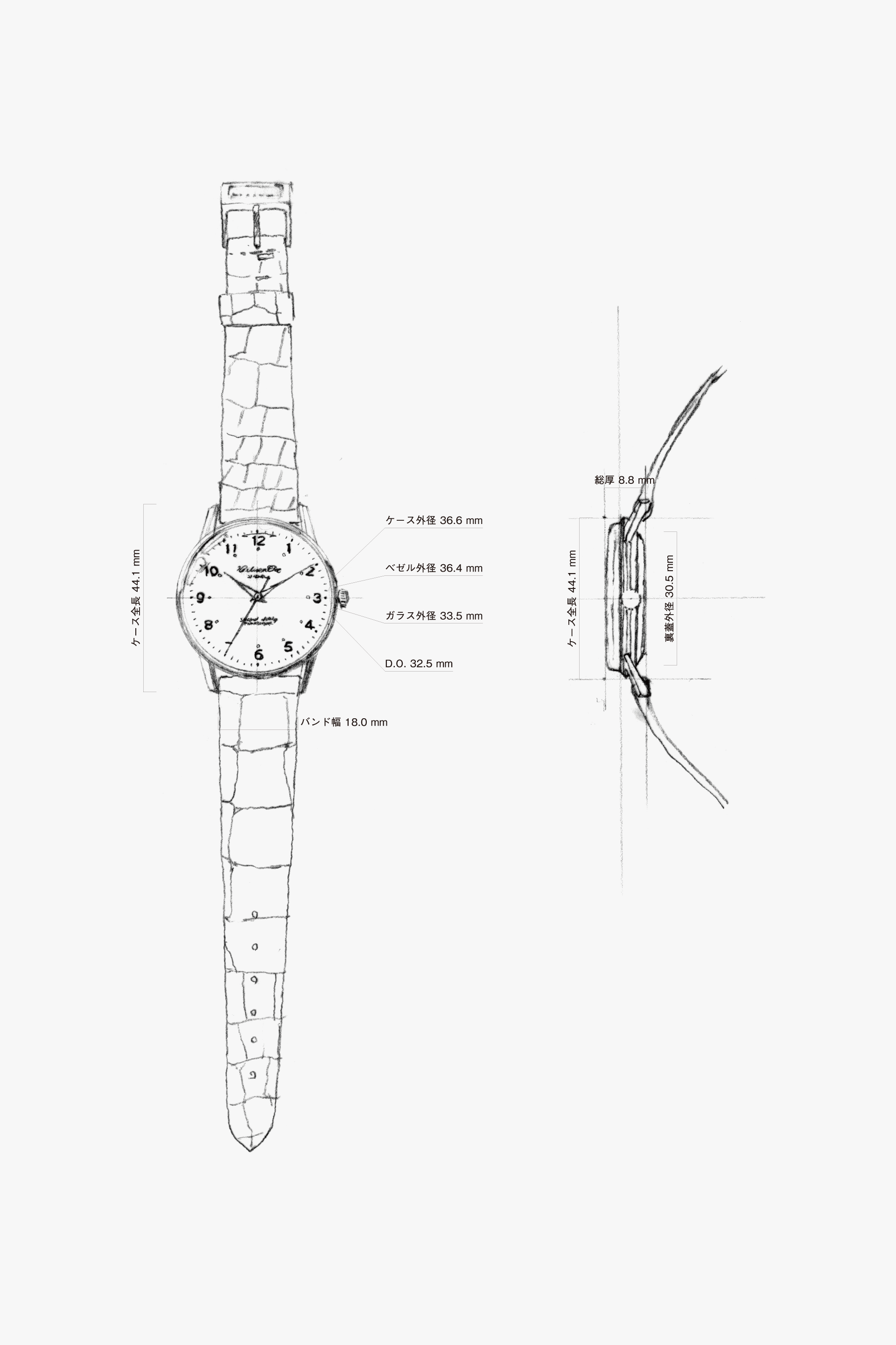
Although it is surprisingly small at 36.6 mm, the thin bezel and wide dial opening make it appear larger. It maintains high legibility with a well-balanced size and a spacious dial.
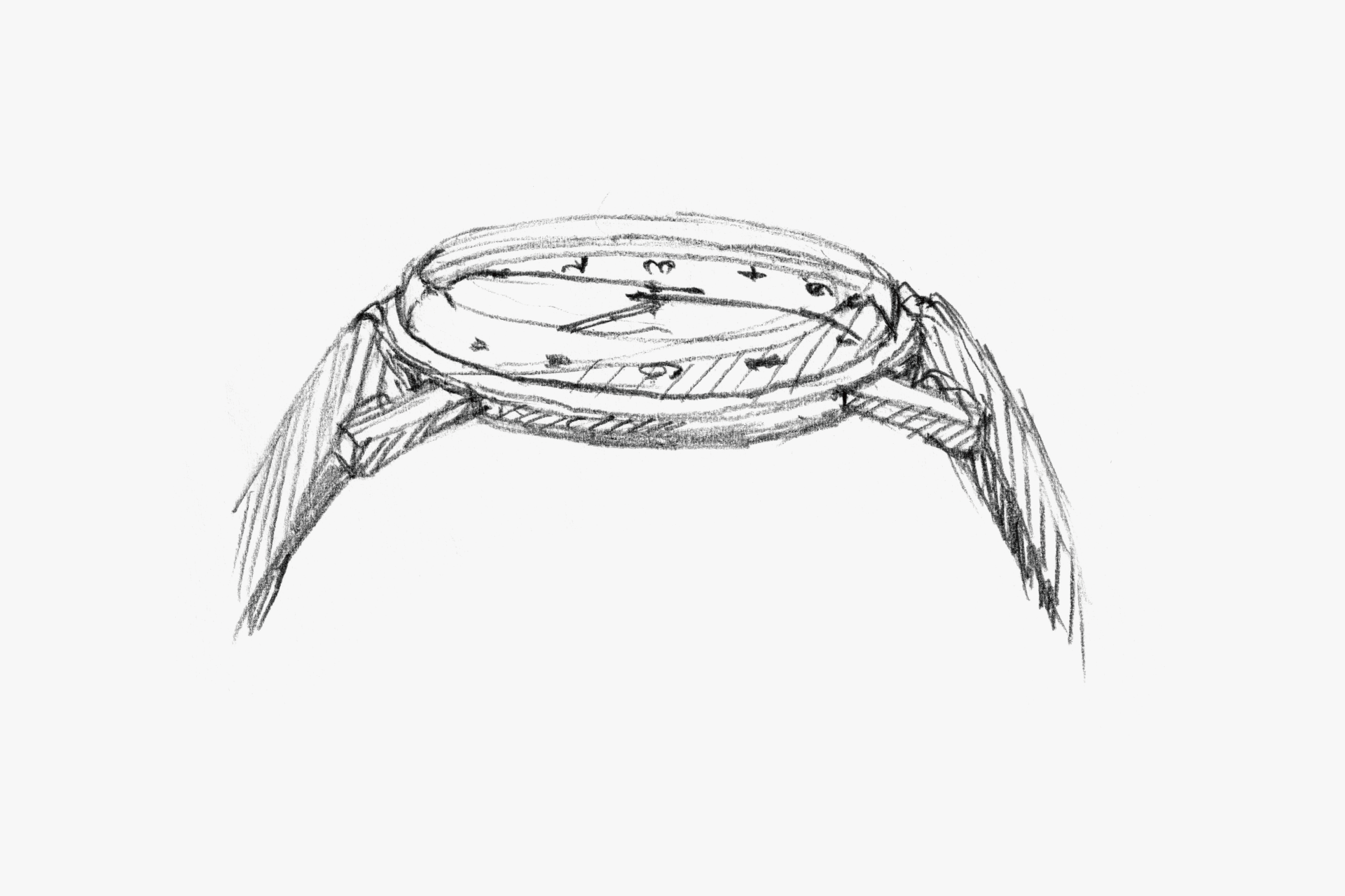
The box glass, domed dial, and curved hands help keep the bezel height low. Combined with the thin bezel from the front, this further reduces its presence and enhances the legibility of the dial.
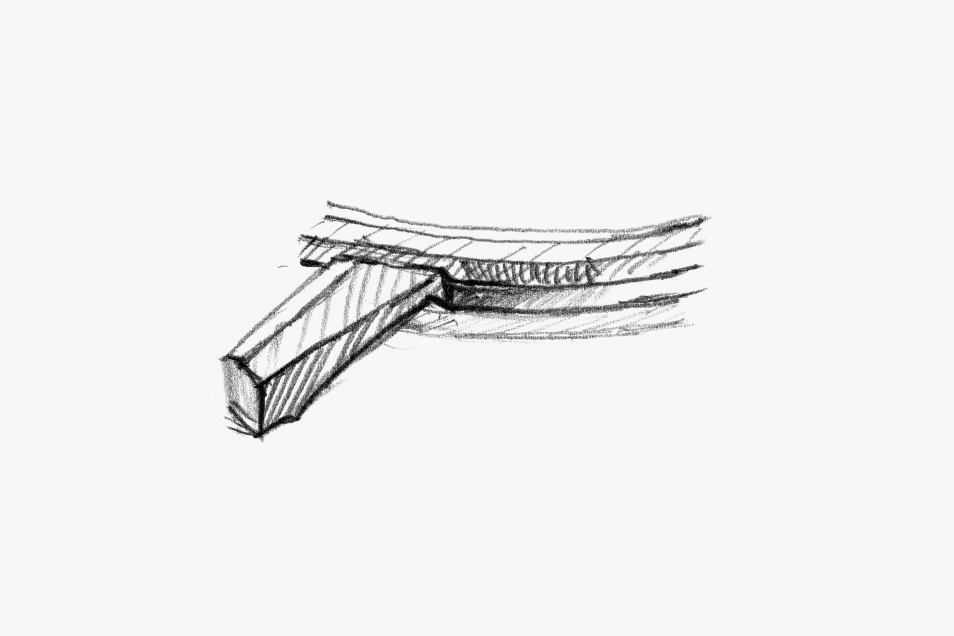
The top surface of the lug slightly overlaps the bezel. This allows the polished finish on the top surface of the bezel to be beautifully polished.
The bezel has a three-surface structure, with a slight incline on the top surface. The polished surface emphasizes the thin and narrow bezel both from above and from the side (creating an effect where the middle slope seems to disappear).
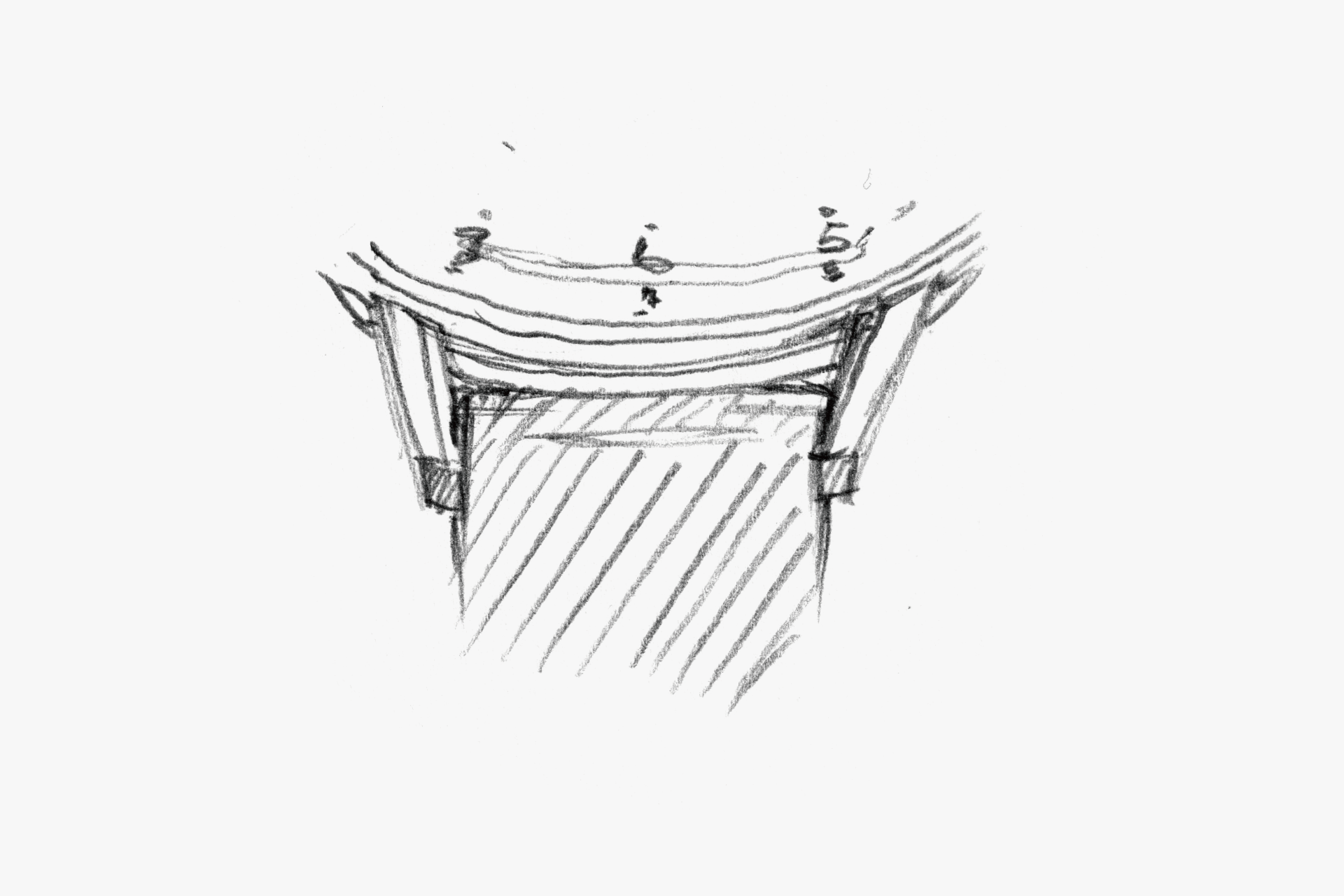
The end piece tapers from the base of the lug toward the tip. This seems to balance delicacy with stability.
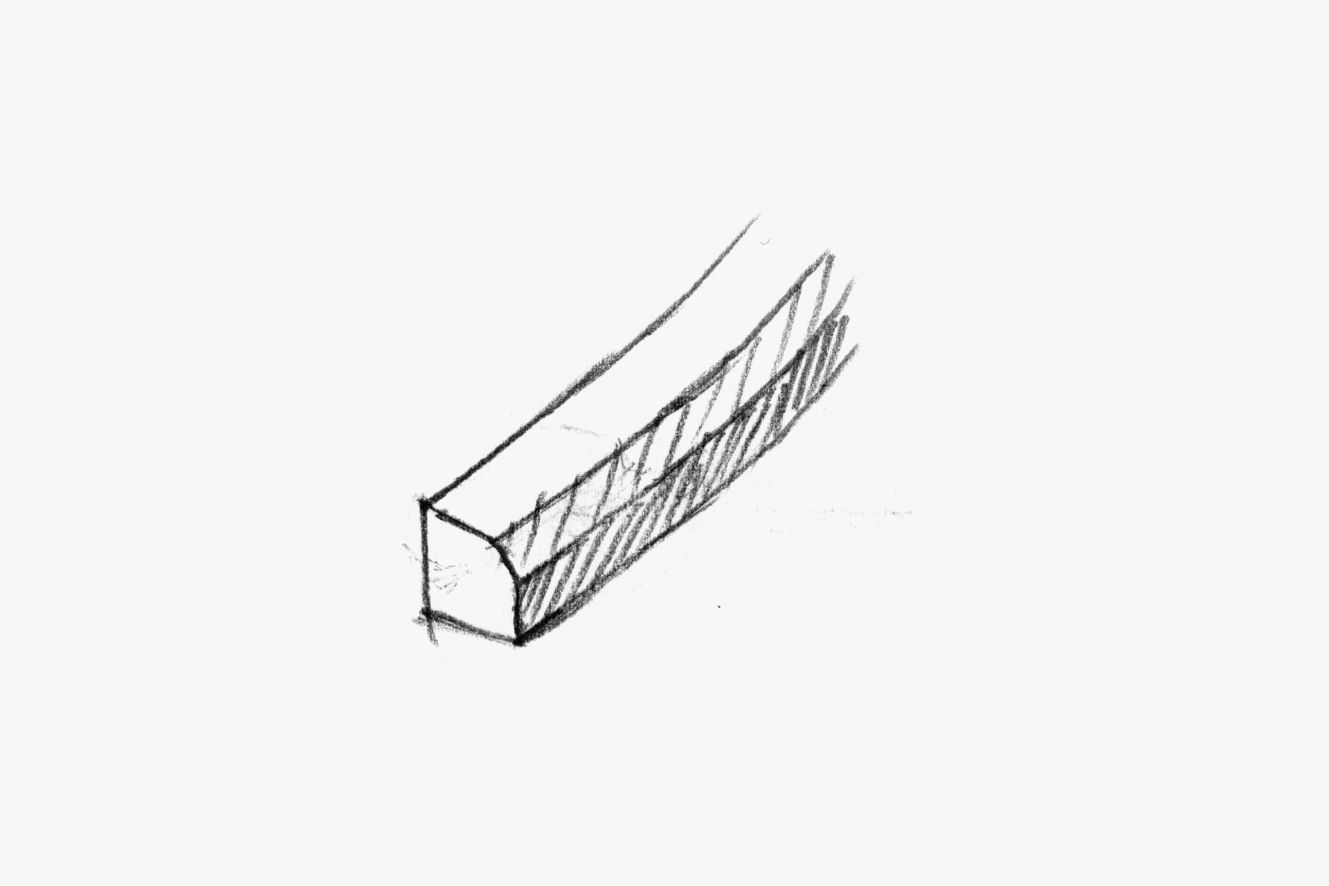
The lug has a two-flat-surface structure. While the chamfer makes it look slender, it also provides a solid sense of stability, achieving a clean impression.
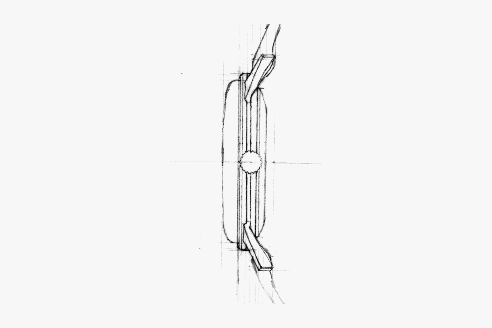
By using box glass, the bezel is made thinner and the dial is raised, improving legibility. The plump side profile also gives it a sense of charm.
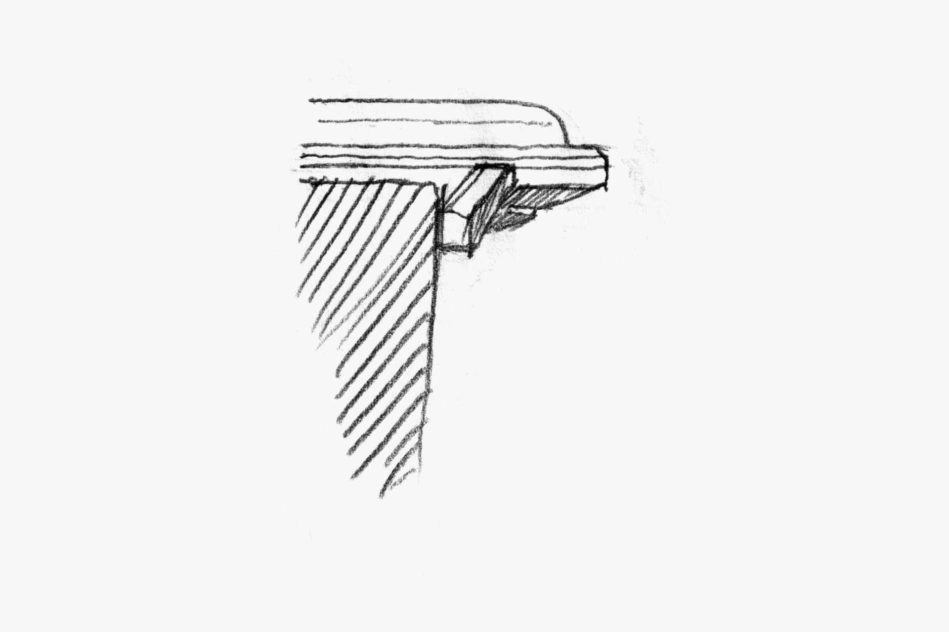
The lower slope of the case is deeply undercut. This makes the case appear thinner and less visible.
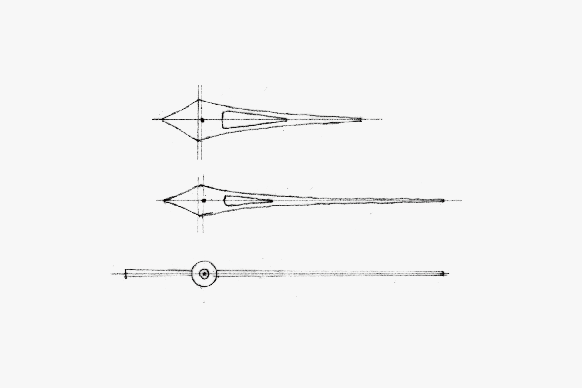
The hour and minute hands taper with a reverse arc toward the tip, giving a sense of precision that is almost on the verge of disappearing. The minute and second hands are bent at the tip to match the curve of the dial, following the indexes and minute markers. This also serves a structural role in keeping the rehaut low, overall enhancing legibility.
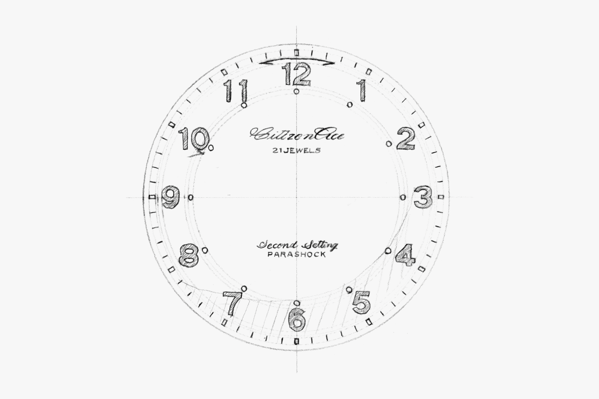
A well-balanced layout. The pleasing black-and-white contrast provides a highly legible dial. The domed shape, which brings the dial closer to the glass, highlights the dial as the key functional element in a watch where precision is essential.
ENGINEER'S EYE
Proof of Excellence
Railway watches are a special field. Since the establishment of standards for railroad pocket watches in the United States at the end of the 19th century, supplying genuine railway watches has been regarded by watch manufacturers as proof that their products can deliver accurate timekeeping and reliability.
In Japan, railway watches began with imported pocket watches, but for CITIZEN, the first railway watch was the “Ace.” The Ace was a minor update of the hugely successful Deluxe; its bridge design shifted dramatically from straight-lined to curvilinear, completely refreshing the look of the movement.
The difference between a regular Ace and the railroad-use Ace lies in the presence or absence of a stop-seconds mechanism. On the railroad-use model, even if you pull the crown, the second hand continues to move but stops when it reaches the 60-second position. Because operating it near 60 seconds may sometimes cause it not to function correctly, red arrow printing was applied to the ±3-second area around 60 on the dial to alert railway staff.
It is a fine product that softens the stiffness required for professional use with a slim design, achieving a well-balanced result.