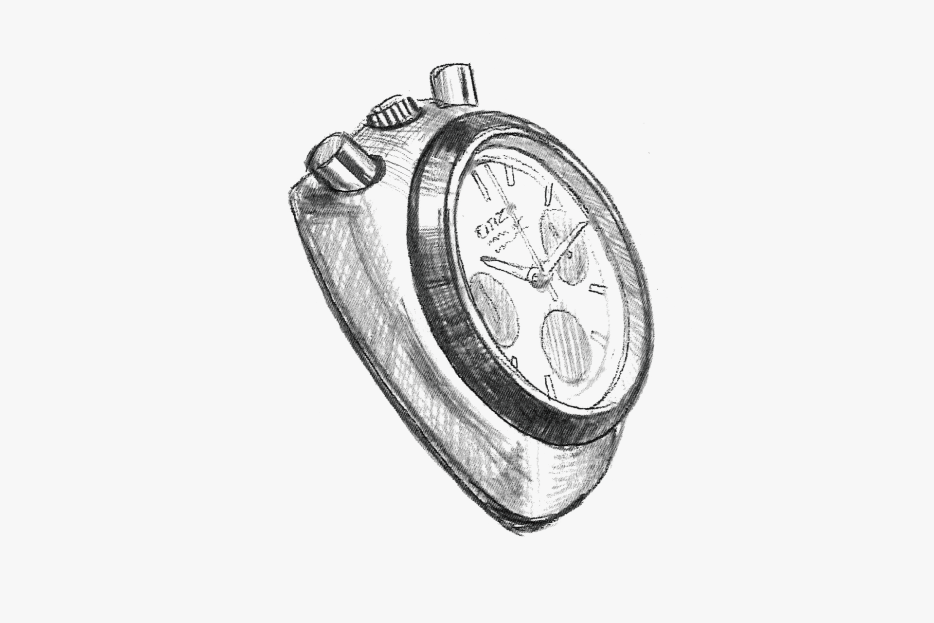
A model that makes you reconsider the possibilities of design through creative ideas. Originally, the movement had sub-dials at 12 and 6 o'clock. By rotating it 90 degrees and placing the push button at the 12 o'clock position, the sub-dials are now at 3 and 9 o'clock, and the calendar, now at 6 o'clock, is incorporated as one of the sub-dials. This design results in a 'three-eyed' chronograph face at the bottom. Placing the push button at 12 o'clock does not interfere with functionality at all.
The case shape is also generously rounded, making it very comfortable to wear. This overall roundness is a major feature of the model, giving users a pleasant impression when held in the hand. The black and white contrast of the dial, which leads to the nickname 'Panda,' is also likely due to this rounded case shape.
In this way, the shift in perspective of 'rotating the movement' brings a change to the design without compromising the original function of the watch, serving as a good example of maximizing its features. By changing the original concept, it is reborn in a completely different form. This flexible thinking broadens the scope of design and contributes to creating a special character. The nickname 'Tsuno Chrono' is proof of this.
Such methods are effective design strategies for expanding the range of universal watch styling.
A chronograph with a push button at the 12 o'clock position. It was later named 'Tsuno Chrono.' The black bezel gives the overall impression a sharp look.
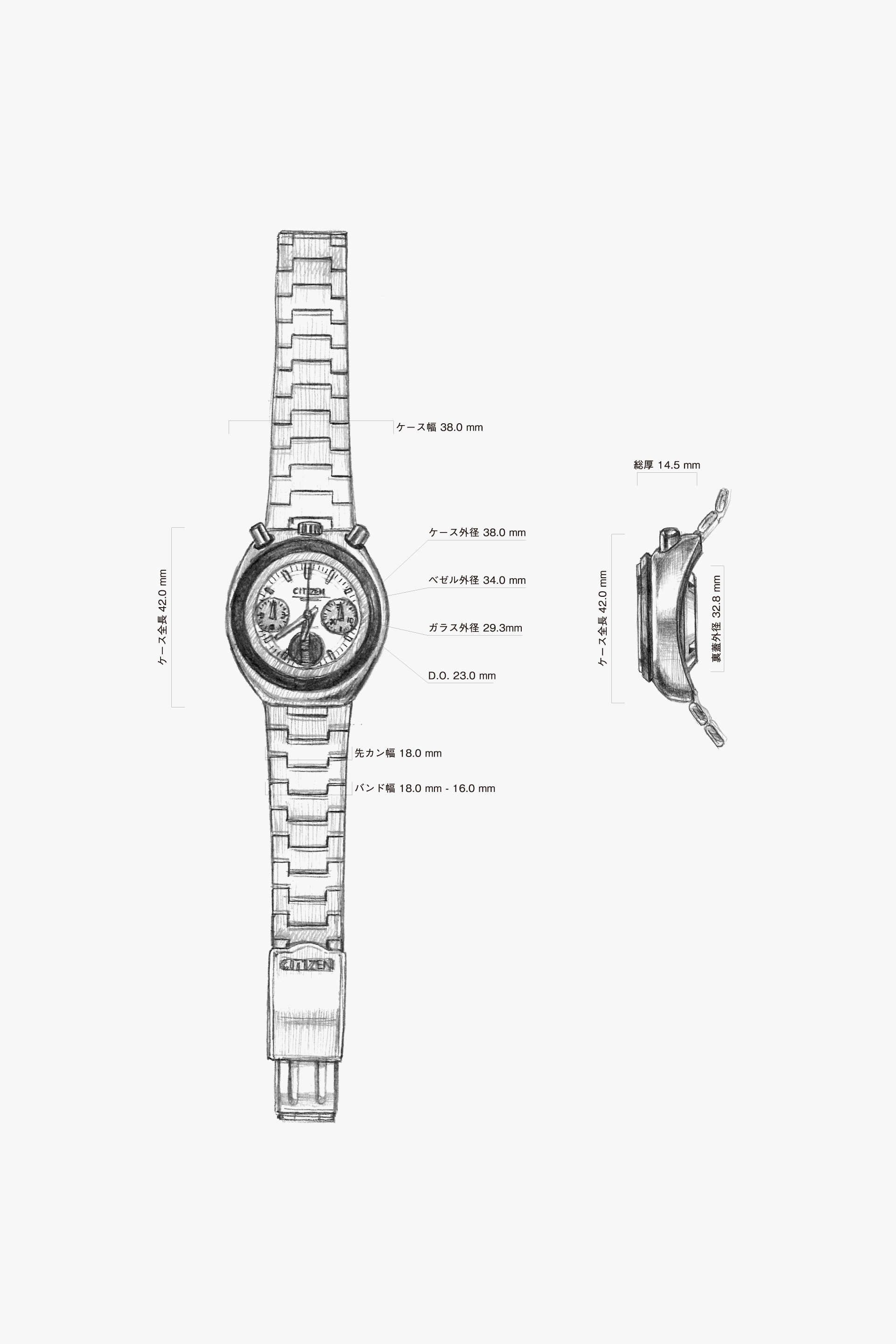
The case is generously rounded, giving a comfortable bulge when held in the hand. You can see that the lug at the 12 o'clock side is significantly lowered for a better fit on the wrist.
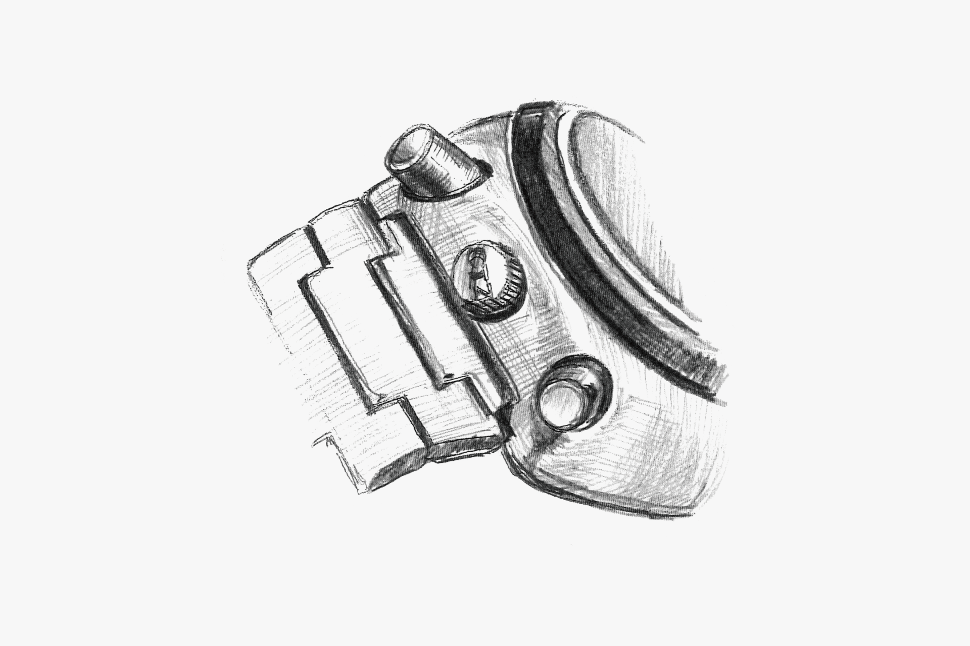
The 12 o'clock side is rounded with a large arc, making it easier to press the push button. The push button is also easy to press and sized so that it doesn't hurt your finger.
The overall roundness of the case contrasts with the flatness of the top of the glass, emphasizing a sense of solidity.
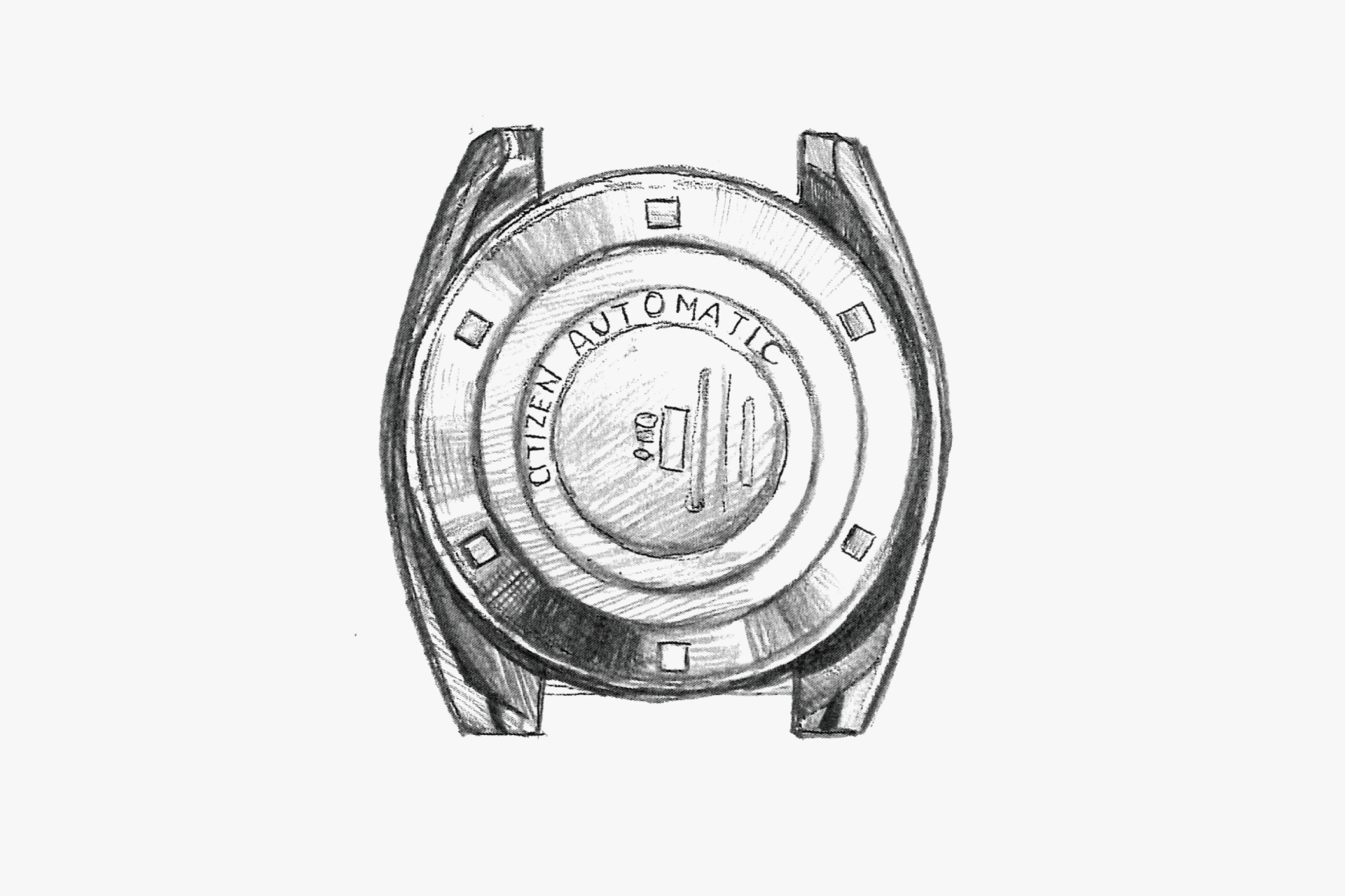
The back of the lugs is deeply conically cut, with a slope extending to the tip of the lugs. The case back is a screw-back, firmly secured.
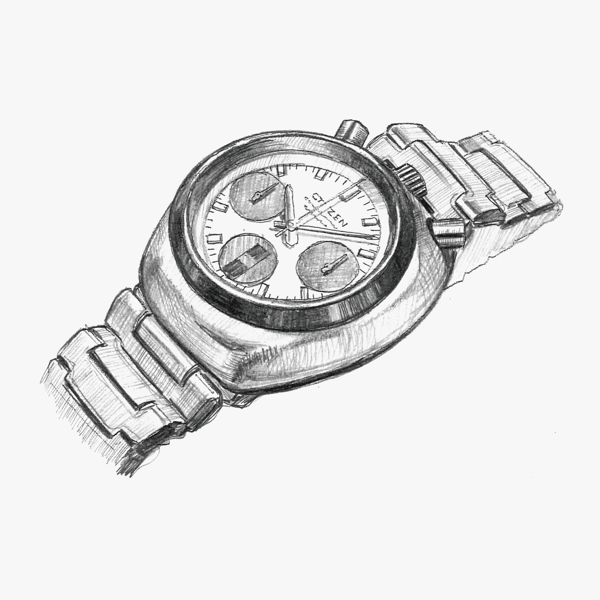
An asymmetrical case design from top to bottom. The effect of the black sloped bezel gives it a sharp look. The metal band design adds a slightly modern touch to the otherwise classical case.
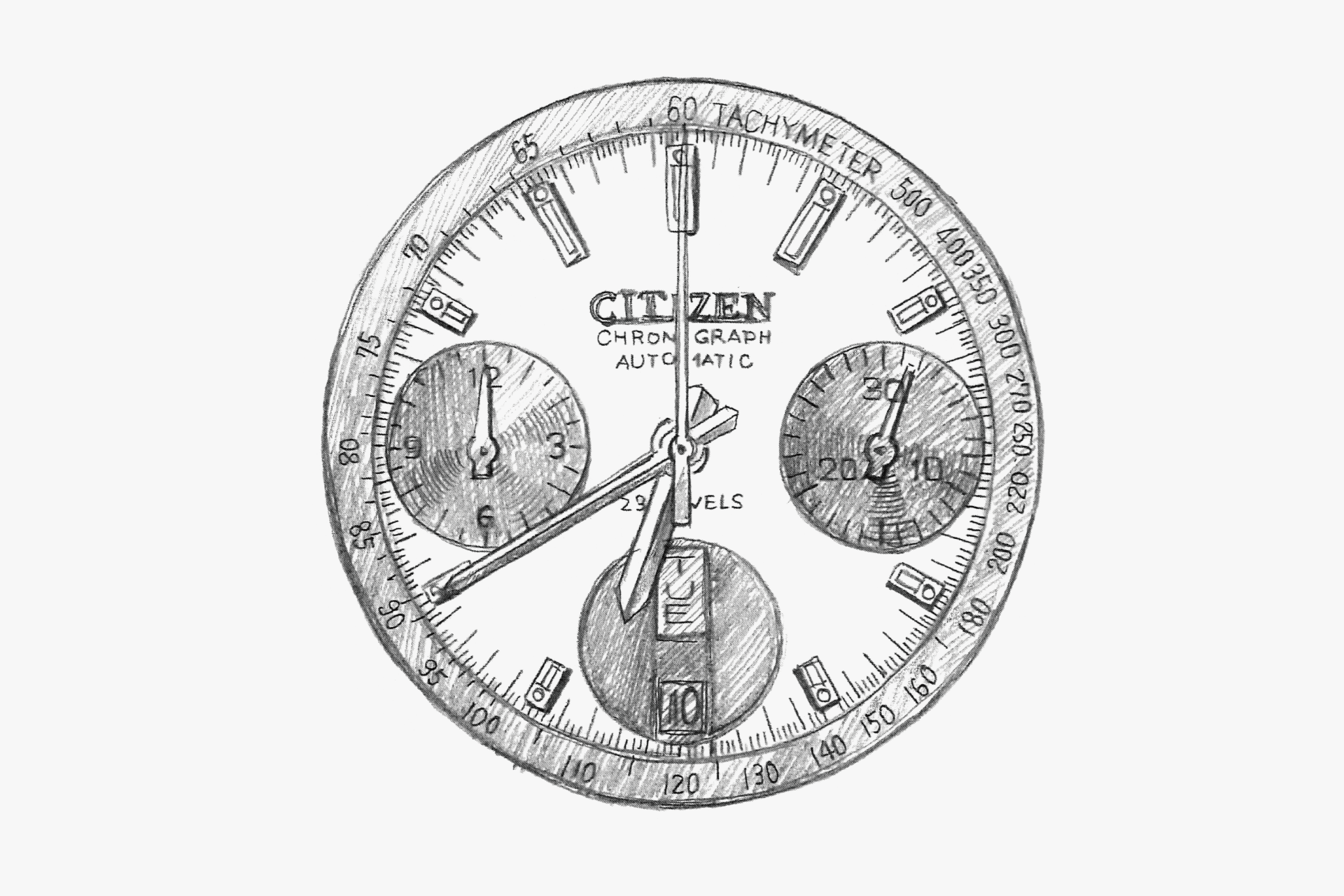
The contrast of the three sub-dials in silver and black gives a sporty feel. The orange central chronograph second hand further enhances this impression. The sub-dial at 6 o'clock cleverly incorporates the calendar to complete the three-eye look.
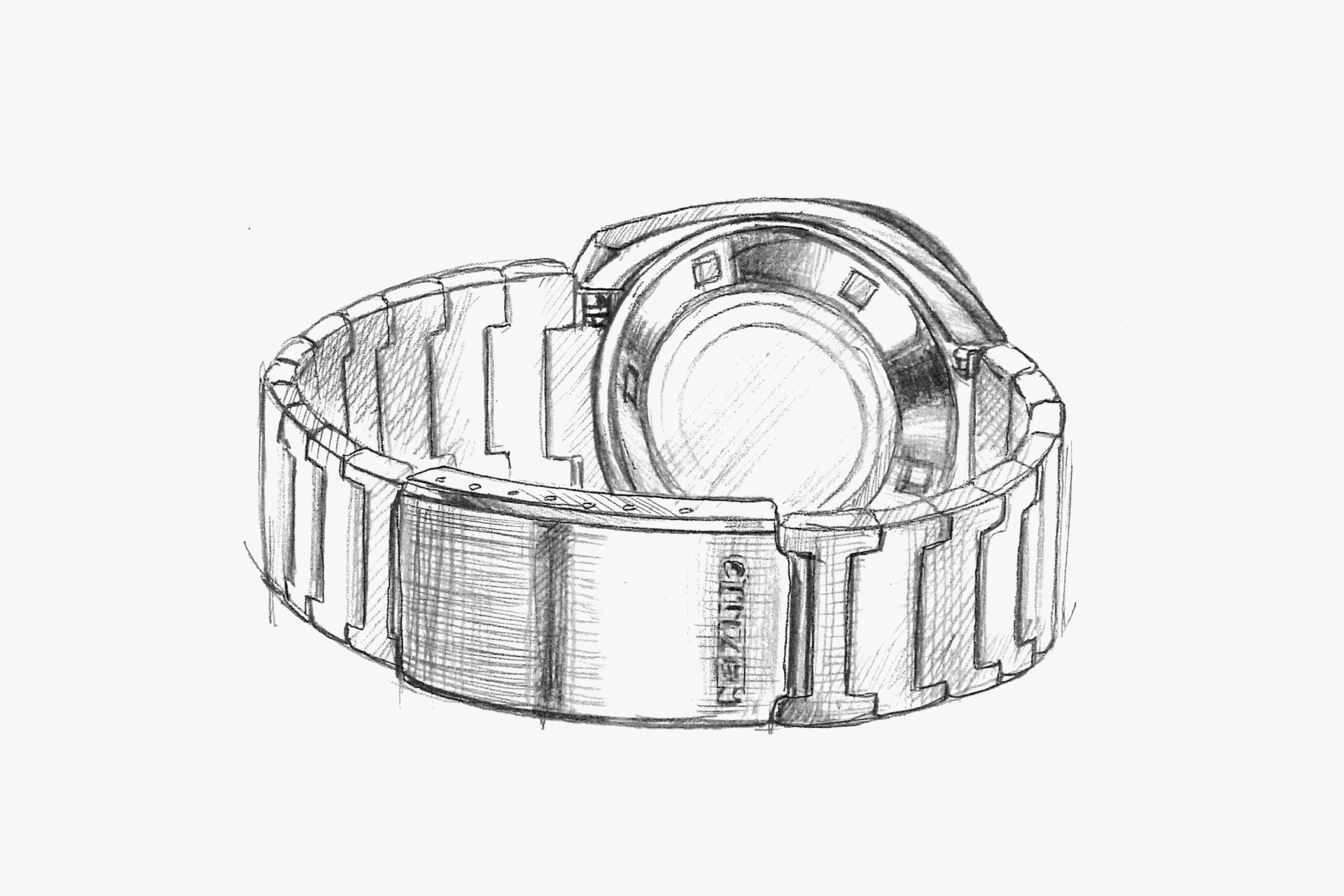
The metal band is relatively thin compared to the volume of the case. The fine pitch of the links ensures a good fit on the wrist. The clasp features a raised CITIZEN logo.
ENGINEER'S EYE
Tsuno Chrono
The 1970s was a time when the diversification of watch design accelerated. It was also around this time that chronographs began to adopt automatic winding, and manufacturers were exploring models that combined avant-garde design with this technology.
In this context, the automatic chronograph that CITIZEN launched, right on cue, was the Challenge Timer. Despite its comprehensive specification—including an 8-beat balance wheel with a regulator for fine adjustment, hour-and-minute totalizers, day-and-date display, and hand-winding capability—the movement size was contained to φ27.0 mm × t6.72 mm (hour-and-minute totalizer type), enabling a wide lineup of models with designs suited to the era.
Among them was this watch commonly nicknamed the "Tsuno (Bull-head)," which is one of the most famous models among the many from CITIZEN, and the aura emanating from its design has not faded even 50 years later.