This model is the first in Japan to use Duratect Sakura Pink, aiming to express the mature and elegant atmosphere of this color. With a new design approach centered on Sakura Pink—a color that suits Japanese skin tones and exudes a subtle yet dignified expression—this model offers a fresh appeal distinct from previous best-sellers in the domestic market.
Overall, the design is calm and understated, but the new, never-before-seen color and its elegance invite you to pick it up. The dial is easy to read, with black Roman numerals and hands. By limiting the visible colors, Sakura Pink stands out, giving the watch a simple impression and a dignified individuality.
At first glance, the Roman numeral font appears linear, but subtle curves in the details create contrast and express a feminine strength. Additionally, the milgrain detail on the indicator ring softly connects the Sakura Pink case and the dial, creating an elegant sense of unity.
The design gently asserts itself without being overbearing, and its careful attention to detail makes it a piece you will grow to love over time.
A watch form that gives a sense of comfort and tranquility. The color combination of the Sakura Pink case and the pink beige dial creates a sense of unity. The black Roman numeral indexes and hands on the dial tighten the overall look, giving it a mature and distinctive character.
A natural, unpretentious case line.
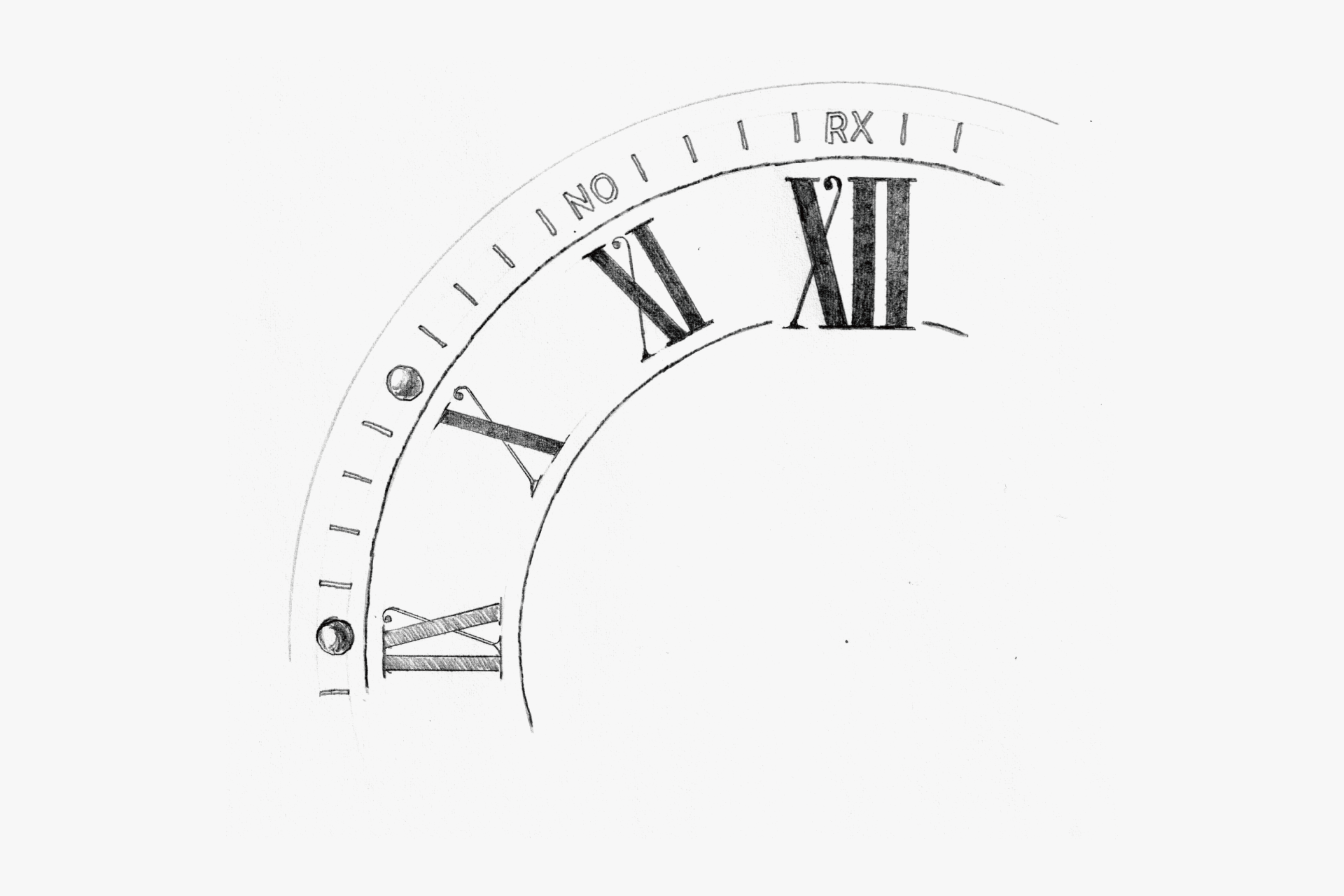
A Roman numeral font with dynamic line thickness and contrast. The subtle vine-like decorations combine gentleness and strength.
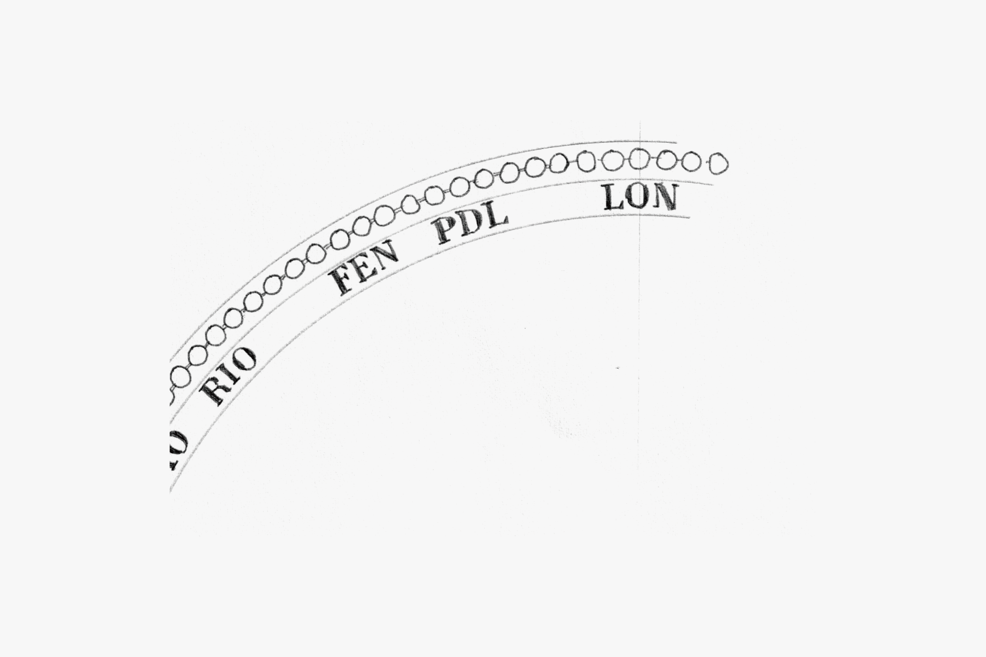
The sparkling milgrain on the edge of the glass gives it a glamorous look. The font used for the country indication on the indicator ring is also elegant.
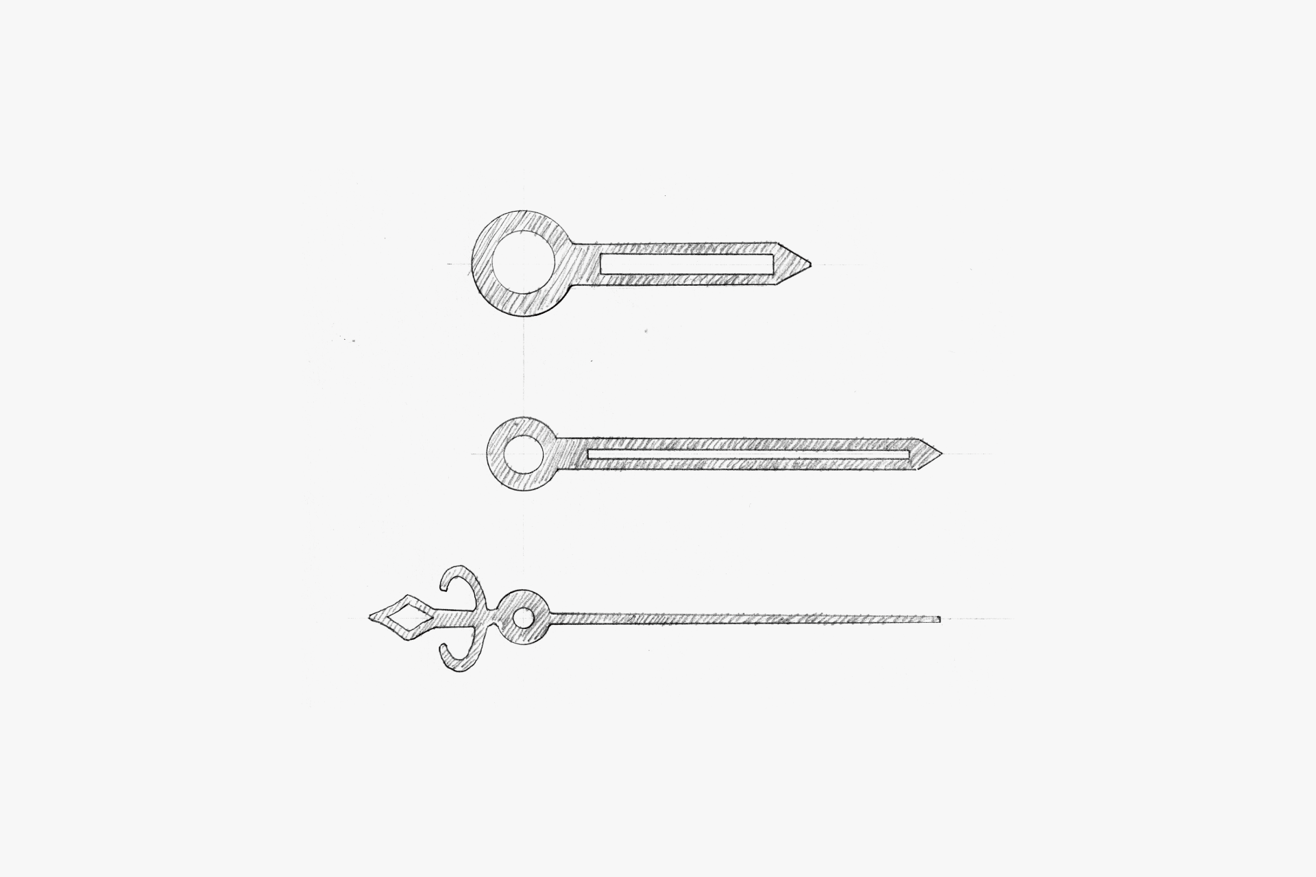
The straight silhouette of the black hands ensures excellent legibility and harmonizes with the Roman numeral font.
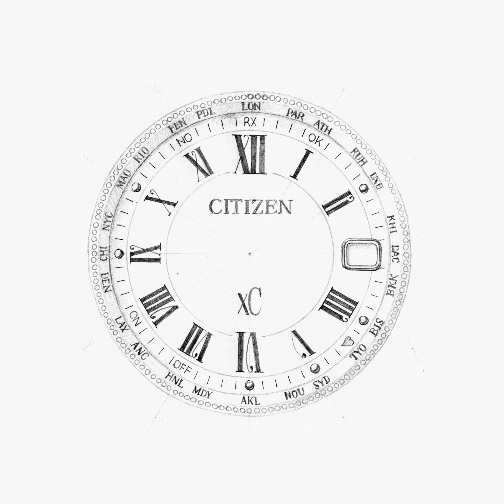
Multiple elements such as fonts, circle lines, and milgrain harmonize with the open space, creating an elegant composition. The matte beige of the dial softens the intensity of the black printing, resulting in a gentle impression.
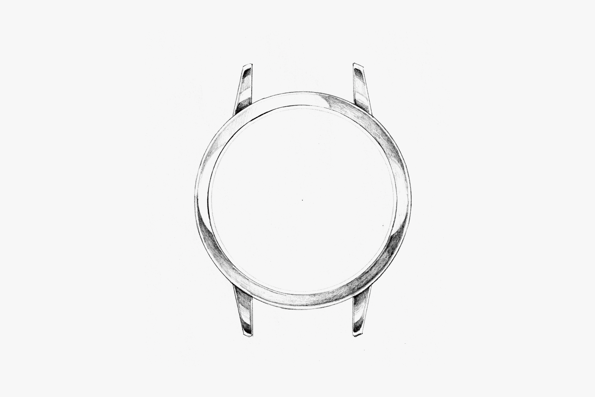
The firm, curved surface gives a gentle luster. The end piece width is relatively narrow compared to the case, creating a feminine silhouette.
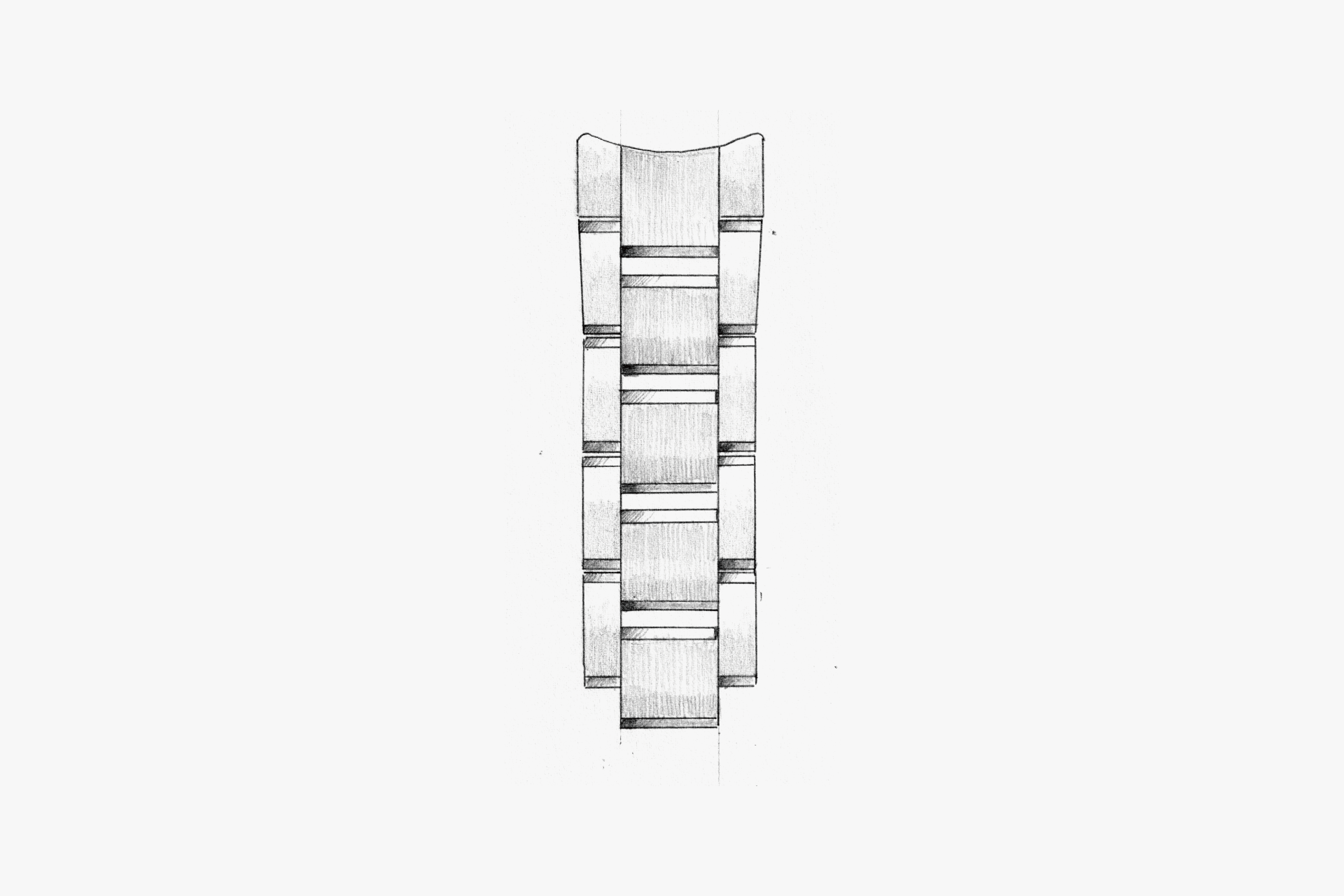
A combination of hairline and polished finishes, with polished small chamfers that sparkle. This finishing makes the movement of the wrist look more glamorous.
ENGINEER'S EYE
The Elegance and Strength of Sakura Pink
DURATECT Sakura Pink is a sakura-colored DURATECT developed to resonate with Japanese aesthetics, with a tone and luster designed to continue blending naturally with Japanese women’s skin.
The conventional DURATECT Pink used a metal carbonitride film as the base layer and a combination of precious metals as the topcoat. To improve brightness and corrosion resistance, we adopted an alloy metal carbonitride film for the base layer and further added materials with high colorfastness to the topcoat, achieving a stable, pale tone and enhanced corrosion resistance. In this way, a sakura color embodying both the supple elegance and strength characteristic of Japan was born.
The sakura-inspired name, familiar to people in Japan, has gained traction among users and has been adopted for major models such as xC, EXCEED, and ATTESA. It has become established as a new standard color for CITIZEN.