If you take a careful look at the parts that make up the entire watch, you'll find a variety of hidden touches throughout.
[Dial - Index] Surprisingly, the index color is black. Since the base is also a black dial, the outline blends in. However, when you move the watch, the indexes sparkle, clearly conveying their texture. The contrast with the white luminescence applied to the top surface is striking, contributing to a sharp, linear look.
[Dial - Printing] White and silver printing are used selectively. Information that needs to be instantly recognized is emphasized in white, while supplementary details are shown in silver.
[Dial - Grid Pattern] You can't see it unless you look closely, but once you notice it, you realize it adds richness to the watch face. Its delicacy gives the impression of a high-tech, reliable watch.
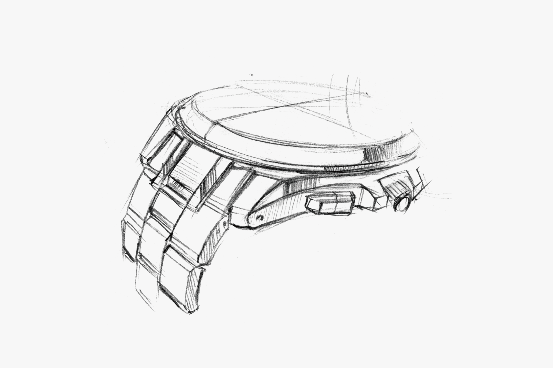
[Band] The center and outer links are finished with vertical and horizontal hairlines, respectively. Even though they share the same curved shape, the different finishes create a distinct appearance. The polished end piece further enhances the sense of originality.
While the watch incorporates various hidden flavors and elements, they are skillfully blended and harmonized through expert techniques. Each element does not overpower the others, but instead, they complement each other’s strengths. The meticulous attention to detail mutually enhances the overall beauty.
Smart and stylish. It gives an impression of discipline. The dial has a calm, spacious margin.
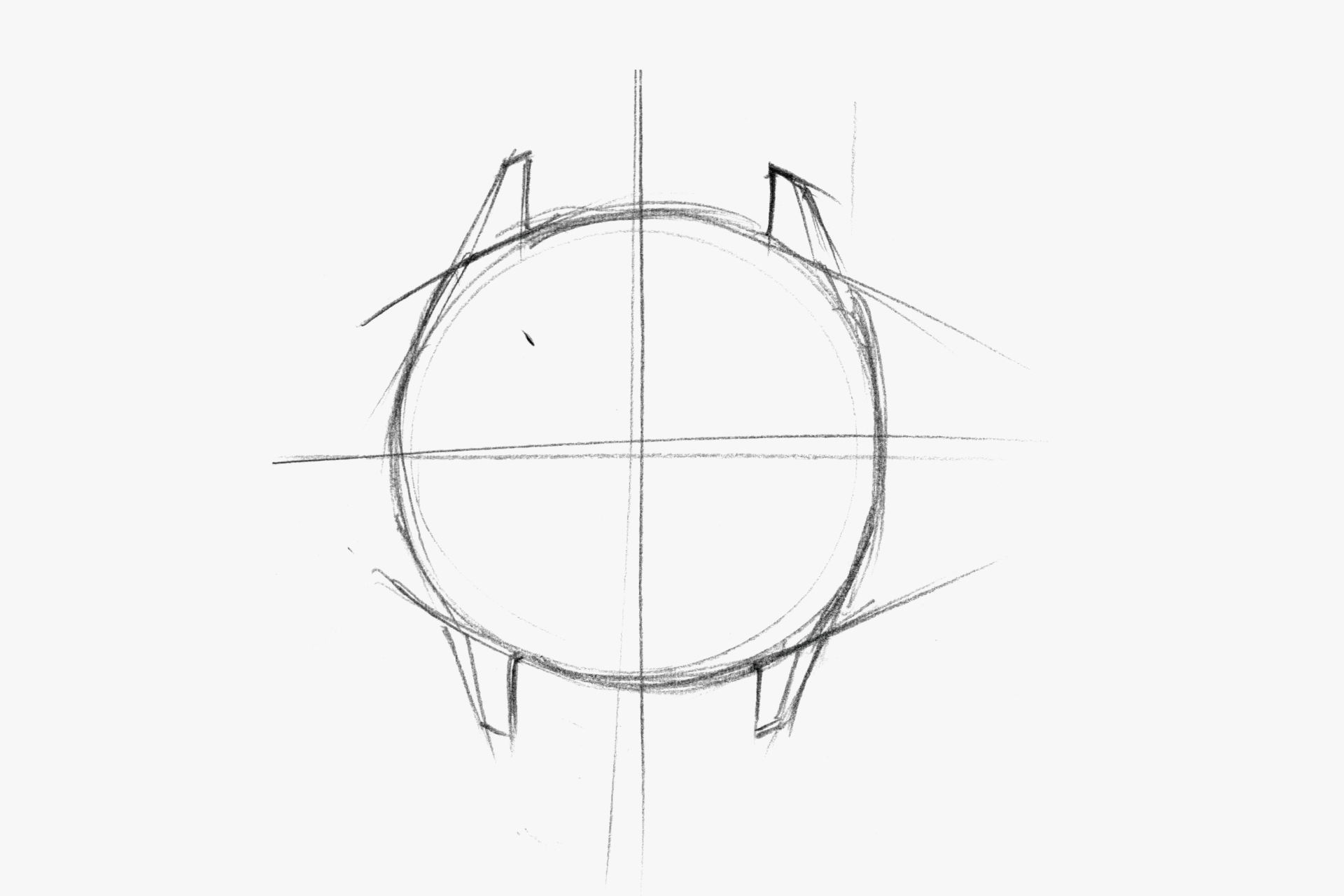
The case back has no protrusion, giving a refreshing feel. It looks as if it would fit snugly on your wrist.
The fine patterns create a sense of precision. While not overly assertive, they help build the image of a highly functional and reliable watch overall.
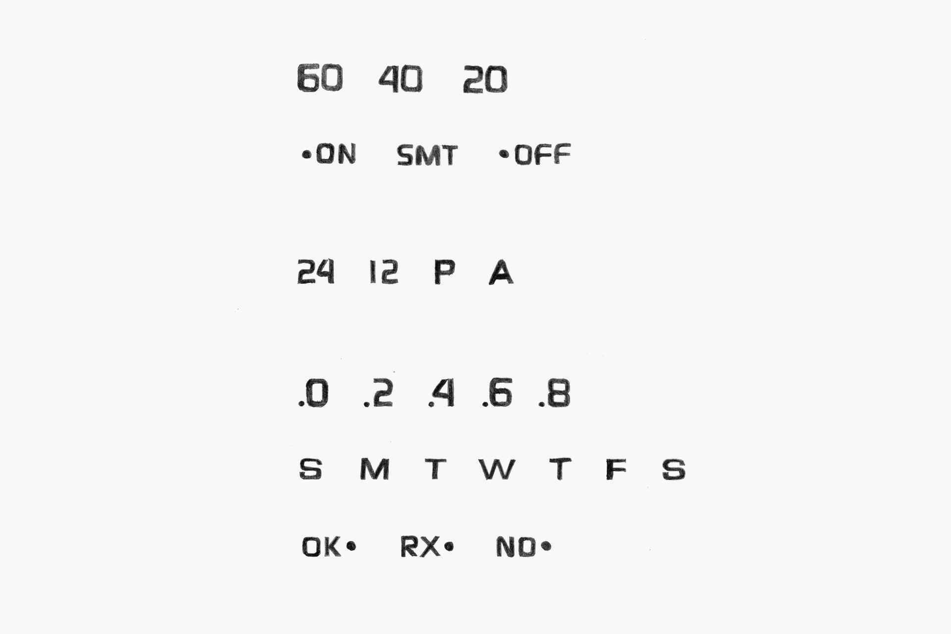
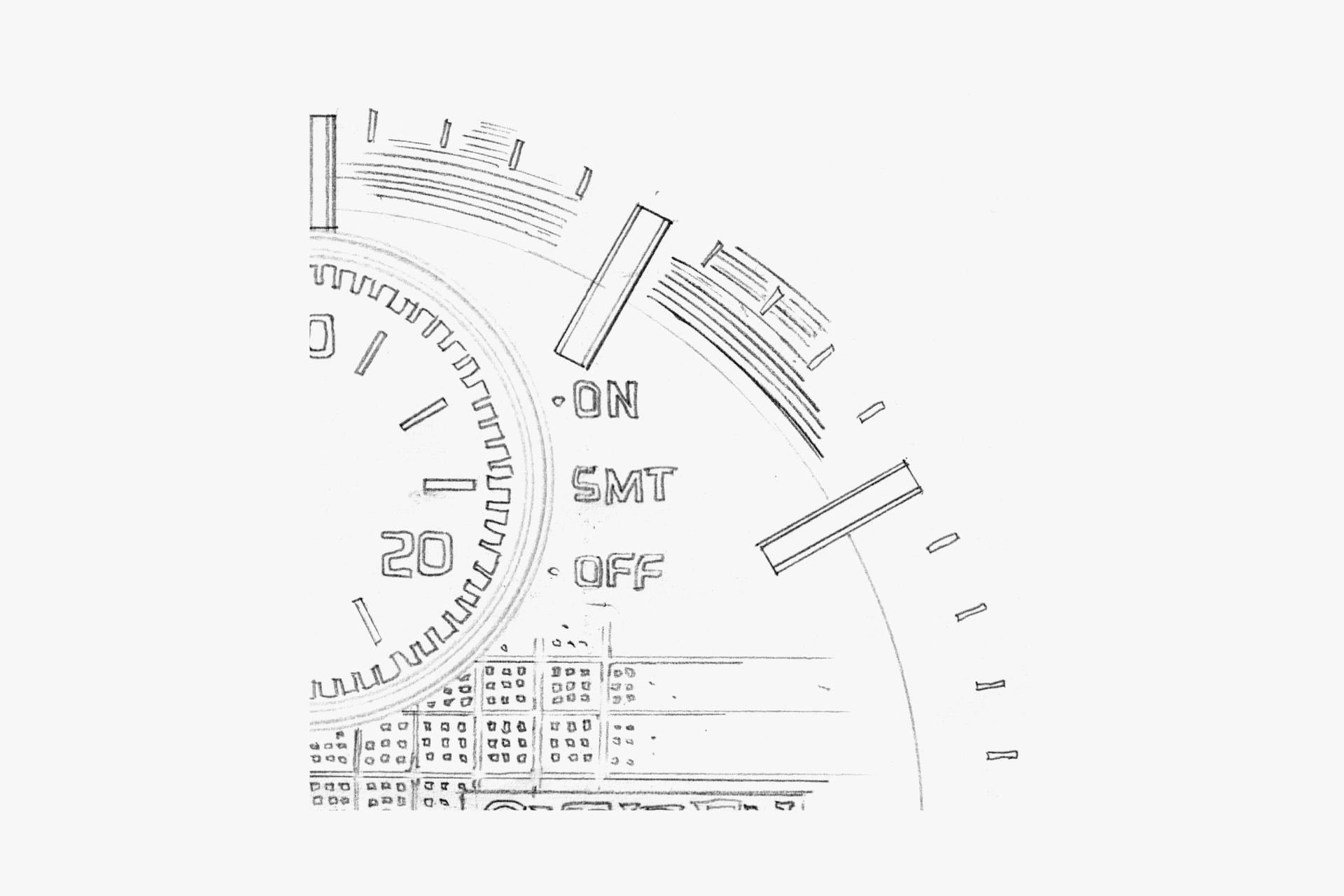
The function display font. By using both white and silver printing, the display is given a clear hierarchy of importance.
Lines as sharp as a Japanese sword.
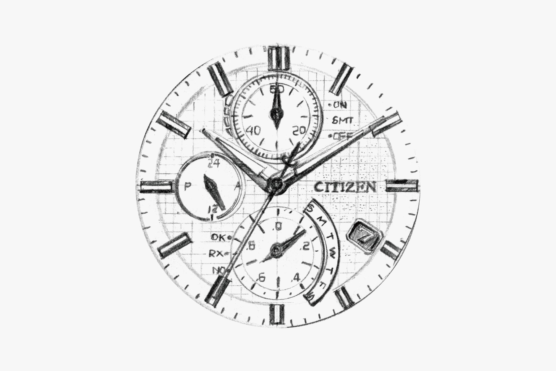
Appropriate spacing. It avoids the cluttered impression often found in multifunctional watches. The indexes are black, which further enhances the contrast with the luminescence applied on top.
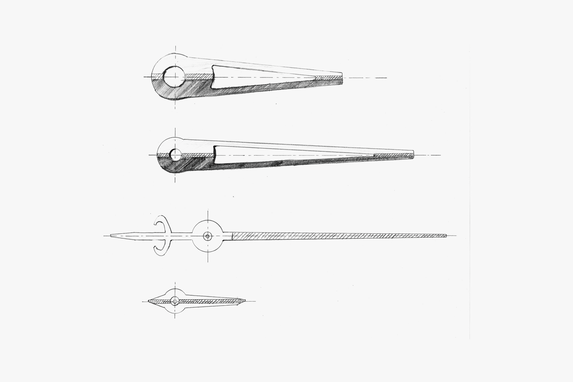
A white line printed at the center of the hour and minute hands. The linear expressions seen in many places come together to form the overall design.
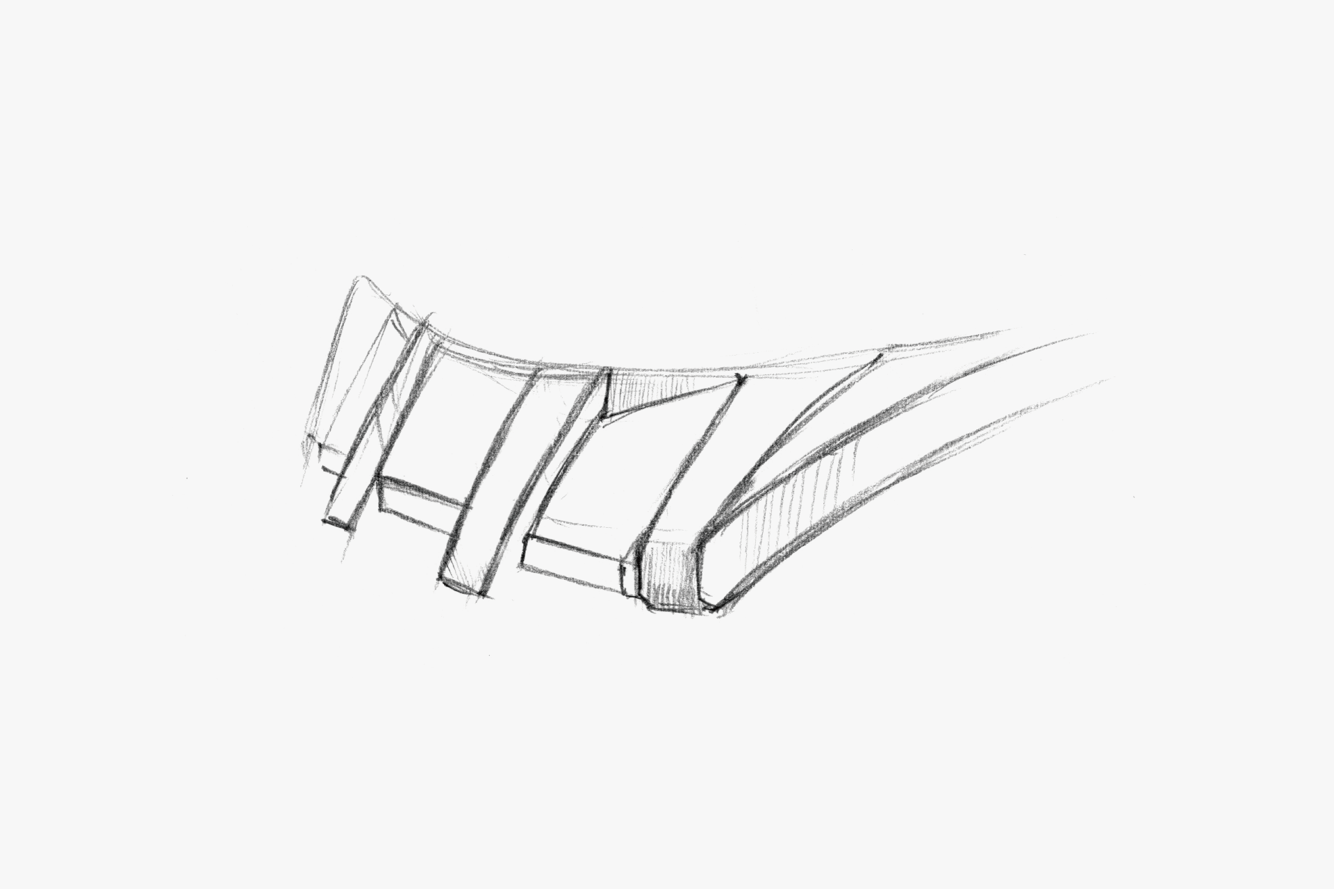
The center link of the end piece is raised to avoid emphasizing the vertical surface of the case.
A surface composition that established one of ATTESA’s standards. The use of different finishes is skillful, and the ridges are clearly defined. The dial has a calm, spacious margin. It avoids the cluttered impression often found in multifunctional watches. The indexes are black, which further enhances the contrast with the luminescence applied on top.
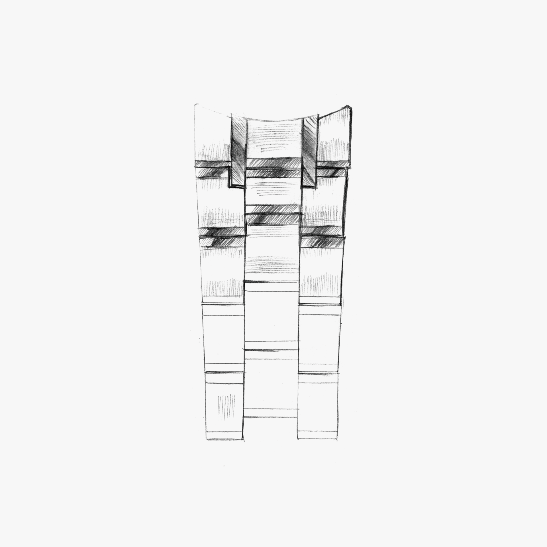
Two distinctive polished lines create a vertical flow. Although the bracelet has a simple three-row structure, the direction of the hairlines is varied to prevent monotony.
ENGINEER'S EYE
Meticulously Refined
This model adopts a newly developed movement for a multi-station radio-controlled watch, and the design brief was to make it look as thin as possible. Within a clean case design, we needed to sharpen the edges, and we struggled to achieve a design that beautifully expresses the contrast between polished and matte finishes.
For the band as well, the outer links required a vertical hairline finish and the center links a horizontal hairline finish, with each part finished before assembly. This introduced many challenging elements in realizing production, such as optimizing the machining processes.
The dial also reflects the designer’s commitment: a fan-shaped metal component is placed in the sub-dial at 6 o’clock. As a result, it serves as a fine accent to the dial and, I believe, enhances the appeal of the model. The dial surface also features fine geometric patterns, revealing further meticulous attention to detail.
Combining both sportiness and elegance, and coupled with its high functionality, this model remains one of ATTESA’s signature pieces even now, more than ten years after its release.