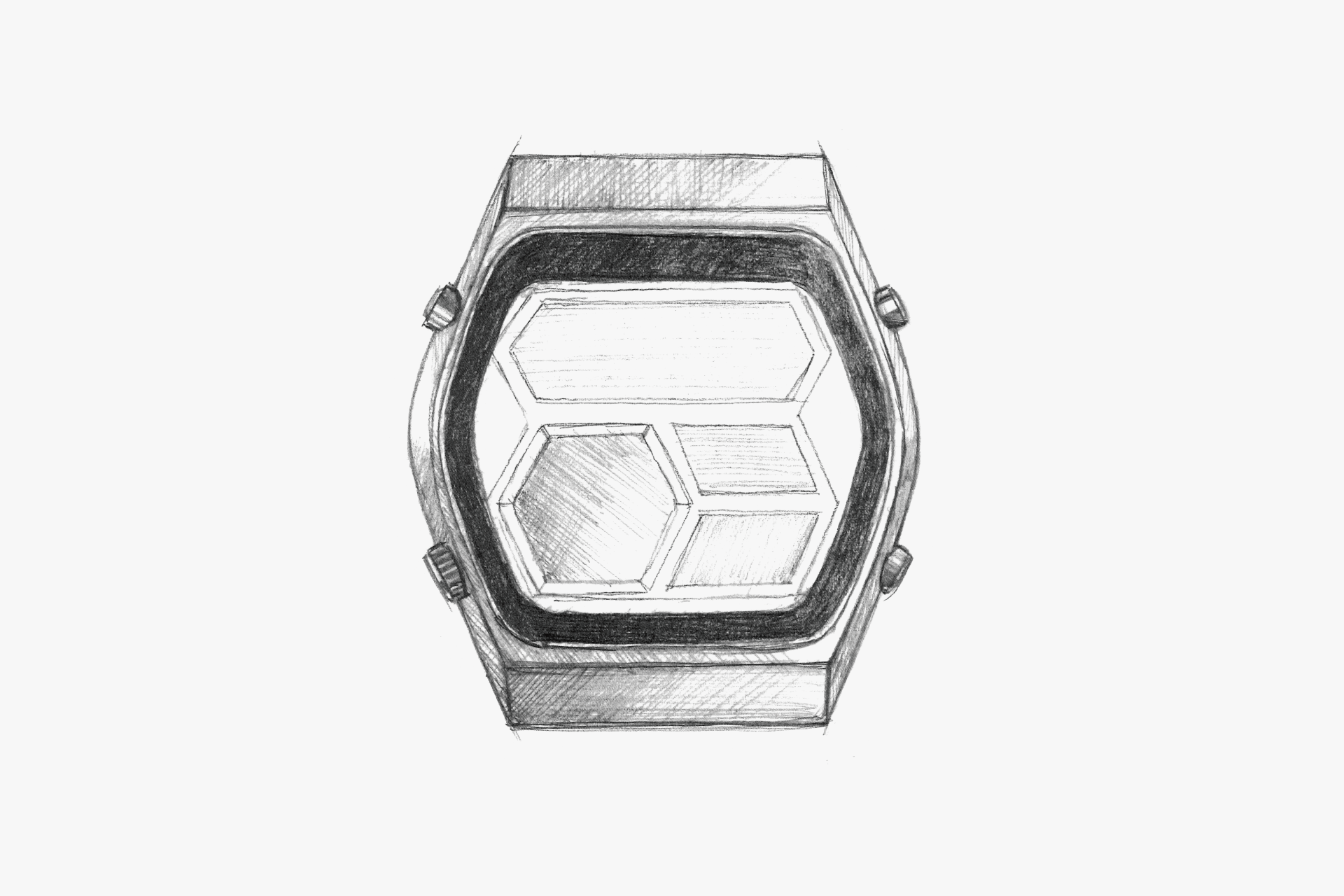
The design theme of this model is, simply put, the hexagon. The hexagon is a shape reminiscent of the quartz crystal in quartz watches, making it a perfect design motif for cutting-edge quartz watches of the time. The dial is composed of a large digital section and a modest analog section, resulting in an extremely simple expression. Even the LCD segments of the digital display use numerals made up of hexagons, and the shapes of the windows for both the digital and analog sections follow this motif. Even the small dot shapes used for function indicators are hexagonal... This thoroughly applied motif not only gives users a sense of familiarity but also clearly defines the character of this watch. As a result, it serves as a good example of how such a motif can also improve functional visibility. When a design motif is present, delicacy is required in the design process. If it is too literal, it can feel cheap; if too weak, the design concept becomes unclear. In this respect, this watch maintains consistent details based on a single motif, from the overall form down to the smallest parts, achieving a sense of unity without sacrificing functionality or legibility. Skillfully unifying the entire design around a single motif in this way is an important element of the design process.
The sharp surface composition is beautiful. The hexagonal motif is incorporated into the design, giving a sense of unity to the case, dial, and band. By today’s standards, it appears somewhat compact.
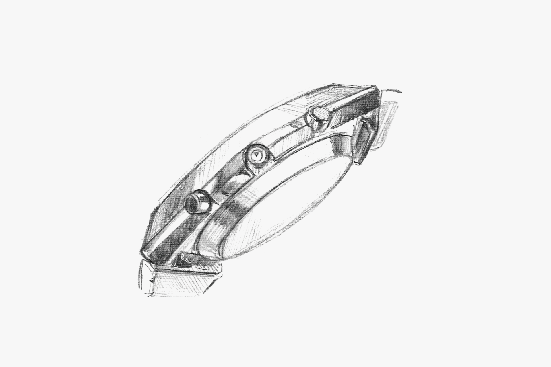
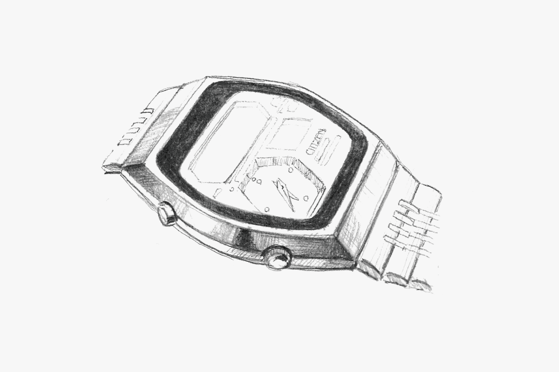
The dynamic sloped surfaces on the side of the case are a distinctive feature. This helps to soften the sense of volume of the case. The push buttons are small and do not disrupt the case profile.
The sharp case lines are pleasant, and the case sides have a rounded shape. The contrast between the stainless steel color of the case and the black printing on the glass gives a bold impression.
The case back is small relative to the case, and the sharp edge contributes to a thinner appearance. The push buttons are also modestly sized and unobtrusive.
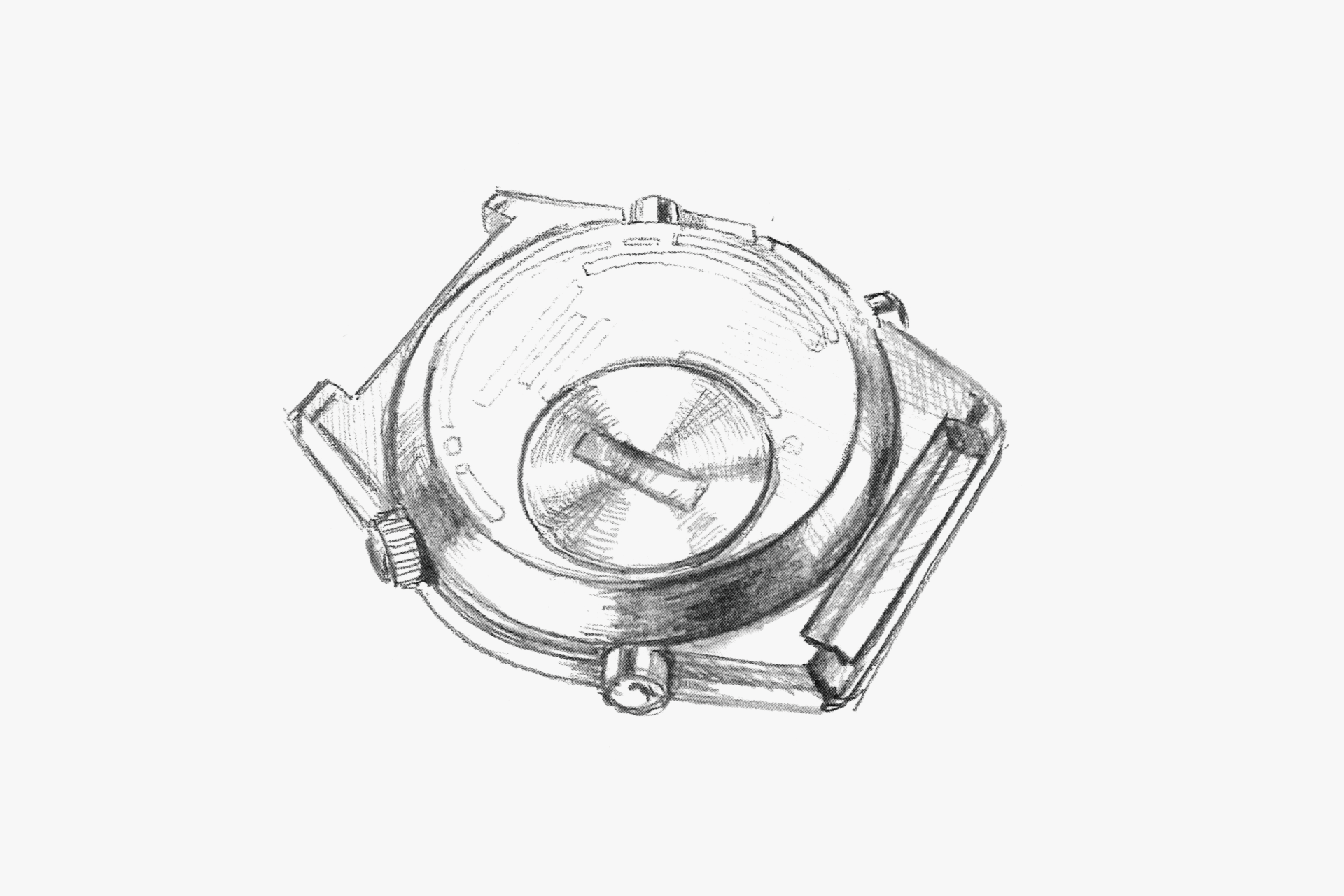
The battery case back is a bold accent on the back. By making the case back thicker, the case itself is made to appear thinner.
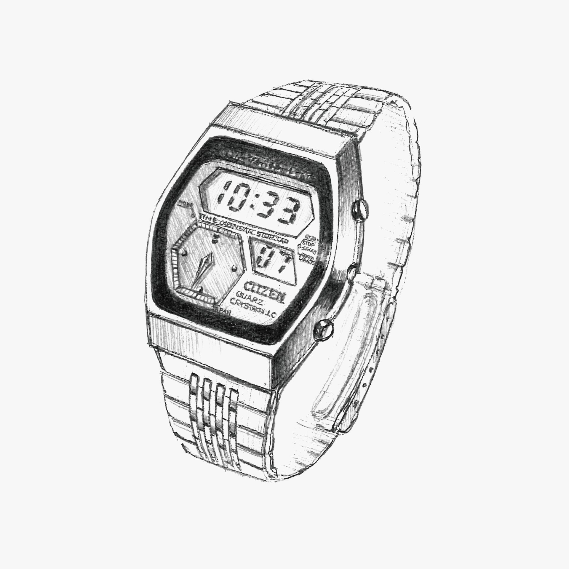
The coexistence of analog and digital displays is the watch’s greatest feature. The integrated end piece structure with bold slopes enhances the fit on the wrist. The consistently expressed hexagonal motif on the case and dial is an icon of this watch.
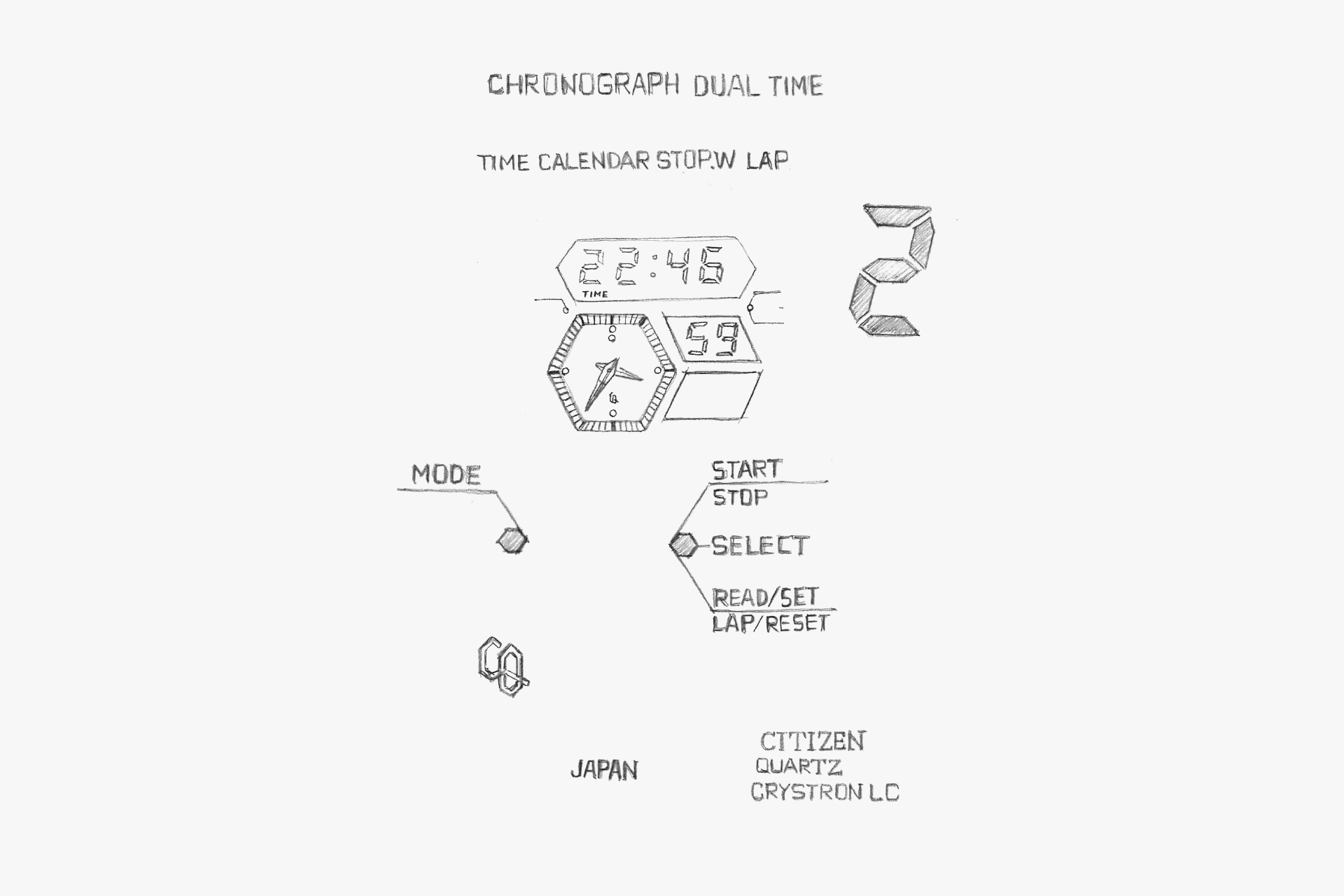
The hexagonal motif is repeated on the dial. Even the small dots are hexagonal. There is a sense of unity even in the digital segments and the CQ marking.
A meticulously crafted 9-row band. The slightly thinner rolled band contributes to a light feel.
ENGINEER'S EYE
Japanese First Combination Watch
Japan’s first combination watch that fused analog and digital. At the time, as a second wave of quartz watches, “digital watches” using LCDs were becoming widespread. Because digital watches, composed solely of electronic components, did not require precision mechanical machining such as gears, electrical manufacturers entered the market and fierce competition was anticipated.
From the standpoint of differentiation from new entrants, CITIZEN focused on a hybrid product with analog watches that could leverage its cultivated technologies, and development began based on a designer’s boldly innovative concept that became the prototype of this model.
The lower-left portion of the square LCD panel made of glass was cut out in the shape of the “Gulf of Mexico,” and the mechanism of a small analog movement was housed there. However, manufacturing this irregularly shaped LCD panel involved one difficulty after another. In prototypes, fewer than one in ten units was acceptable, and even after painstakingly producing them, most were destroyed in drop tests, which vexed the engineers.
After trial and error, by refining the LCD panel’s shape and its processing method, the team succeeded in creating an impact-resistant LCD panel suitable for mass production.
The watch became a smash hit immediately upon release, and it’s said that, at the time, sales staff were pressed daily by watch retailers to deliver “digi-ana” models.