Kinder Time is a watch designed to support children by solving the problem that "children struggle to read the time" through a clearer way of displaying time. The two main features that make it "easy to tell the time" are showing the time in time zones and using matching colors for the hour and minute hands and their corresponding markers. Additionally, the second hand reaching all the way to the minute track is another thoughtful detail that makes reading the time easier. The vivid and energetic red and yellow colors, the CITIZEN logo on the dial that resembles an emblem, and the bright red leather strap reminiscent of a shiny new school bag all contribute to an exciting design. While this watch is sure to delight children, it also has aspects that are unusual for a children's watch. To make it easier to read the time, the case is slightly larger than typical children's watches. The sharp, well-defined surfaces give a somewhat edgy impression for a children's watch, but the clean, uncluttered design nicely balances the cuteness of the dial. The simple yet charming and easy-to-read Arabic numerals are also appealing to adults. The design shows a commitment to quality, never compromising just because it's for children, while always staying close to their needs.
Although it's a children's watch, the larger size makes it suitable even for adults. The solid lugs give it a reassuring shape.
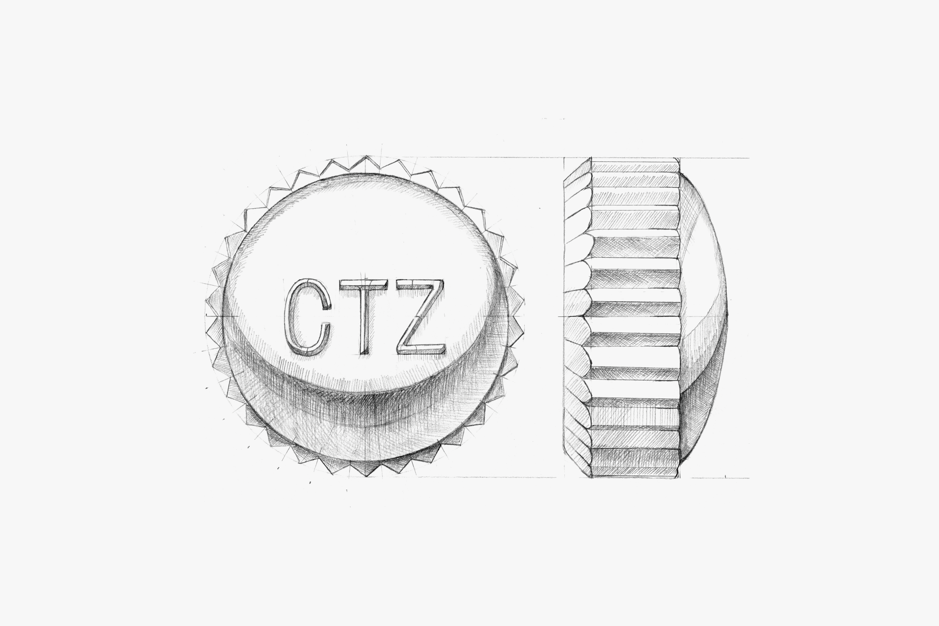
The watch has a thick, forward-projecting glass that stands out. Its sharp edges give it an unexpectedly sophisticated look for a children's watch.
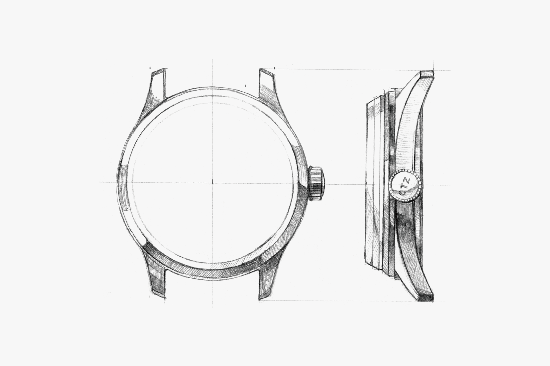
The case is slightly larger than usual for a children's watch. The sturdy lugs provide a sense of security.
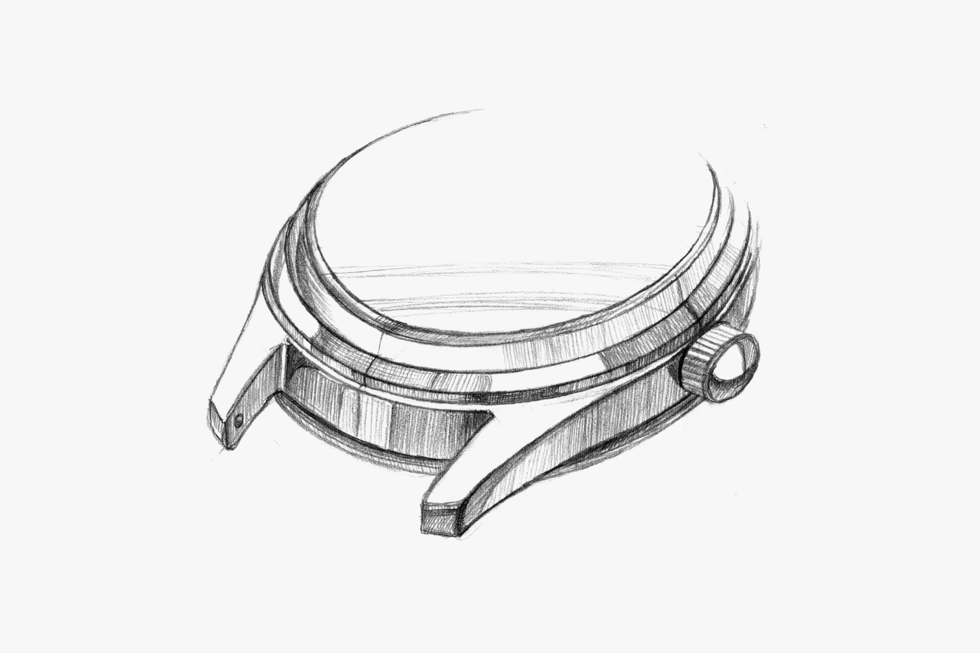
With a slim bezel and a prominent, forward-projecting glass, the case has a sharp, edgy, and clean shape that doesn't look like a typical children's watch.
The large crown is easy for children's fingers to turn, and its rounded shape with the CITIZEN mark gives a sense of pride.
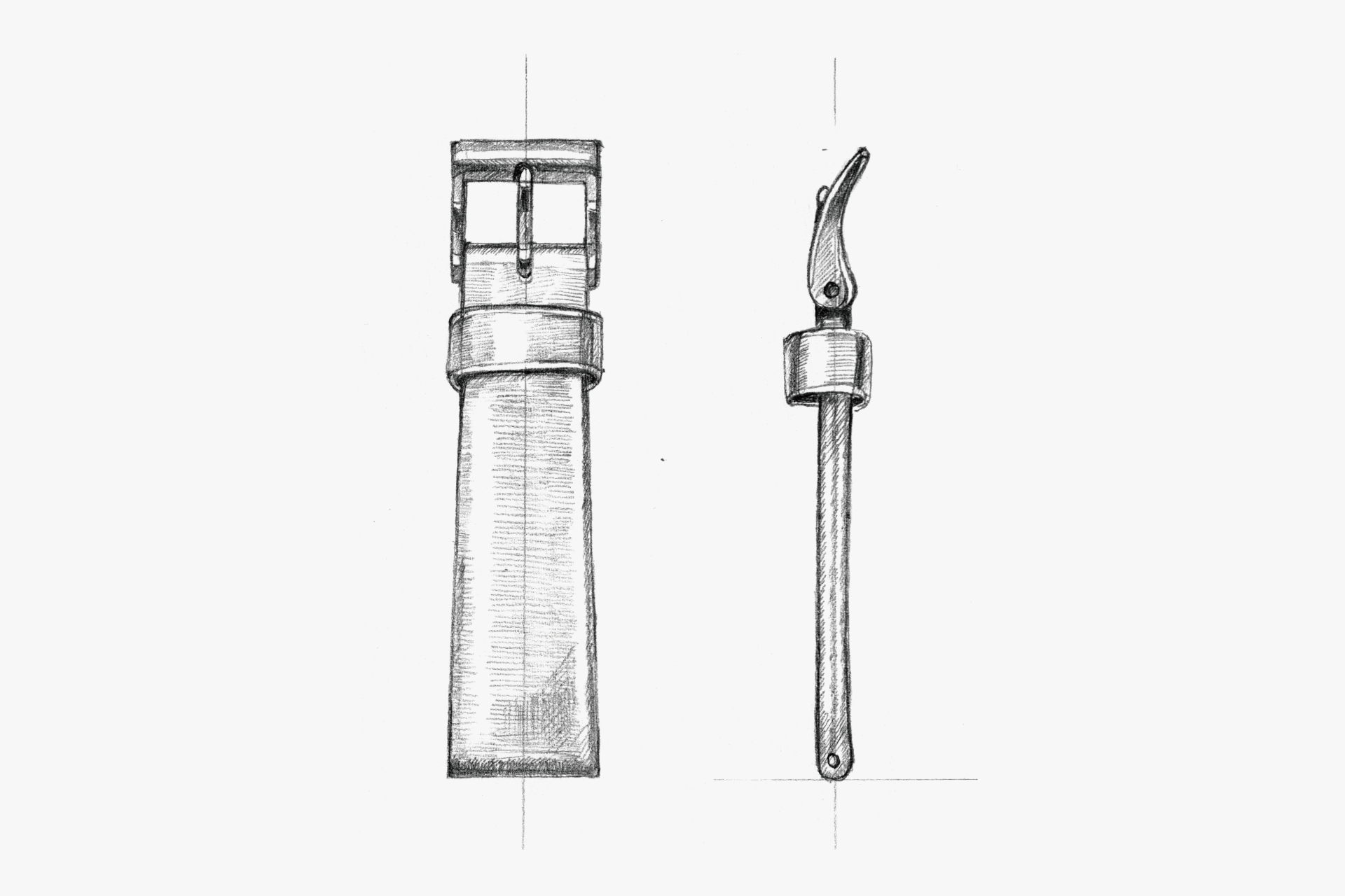
The bright red leather strap, reminiscent of a school bag, has a glossy finish just like a brand-new backpack, sure to delight children.
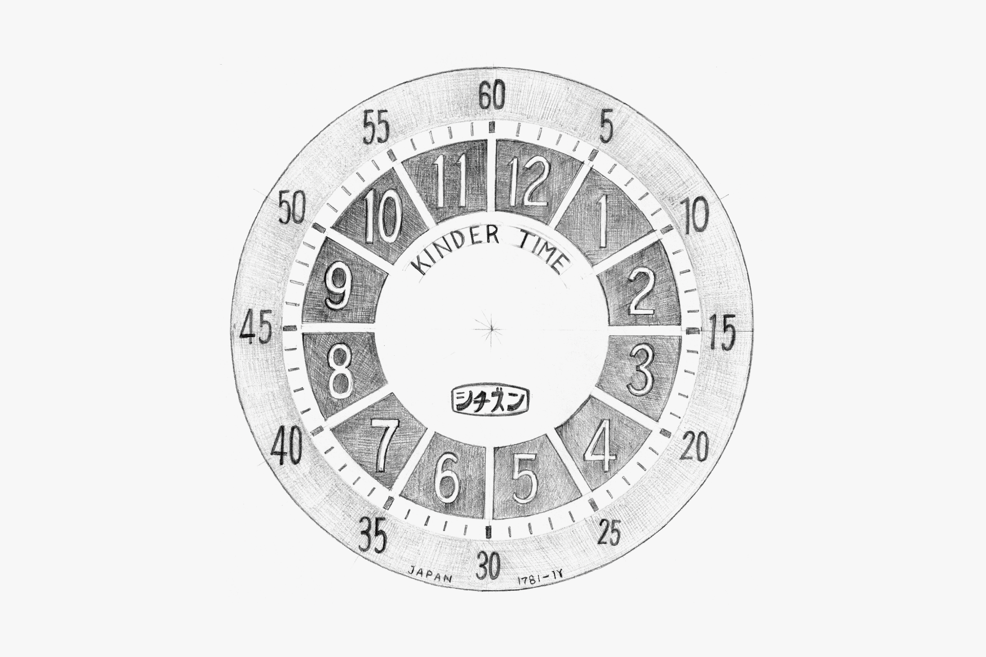
A new way of displaying time by showing it in time zones.
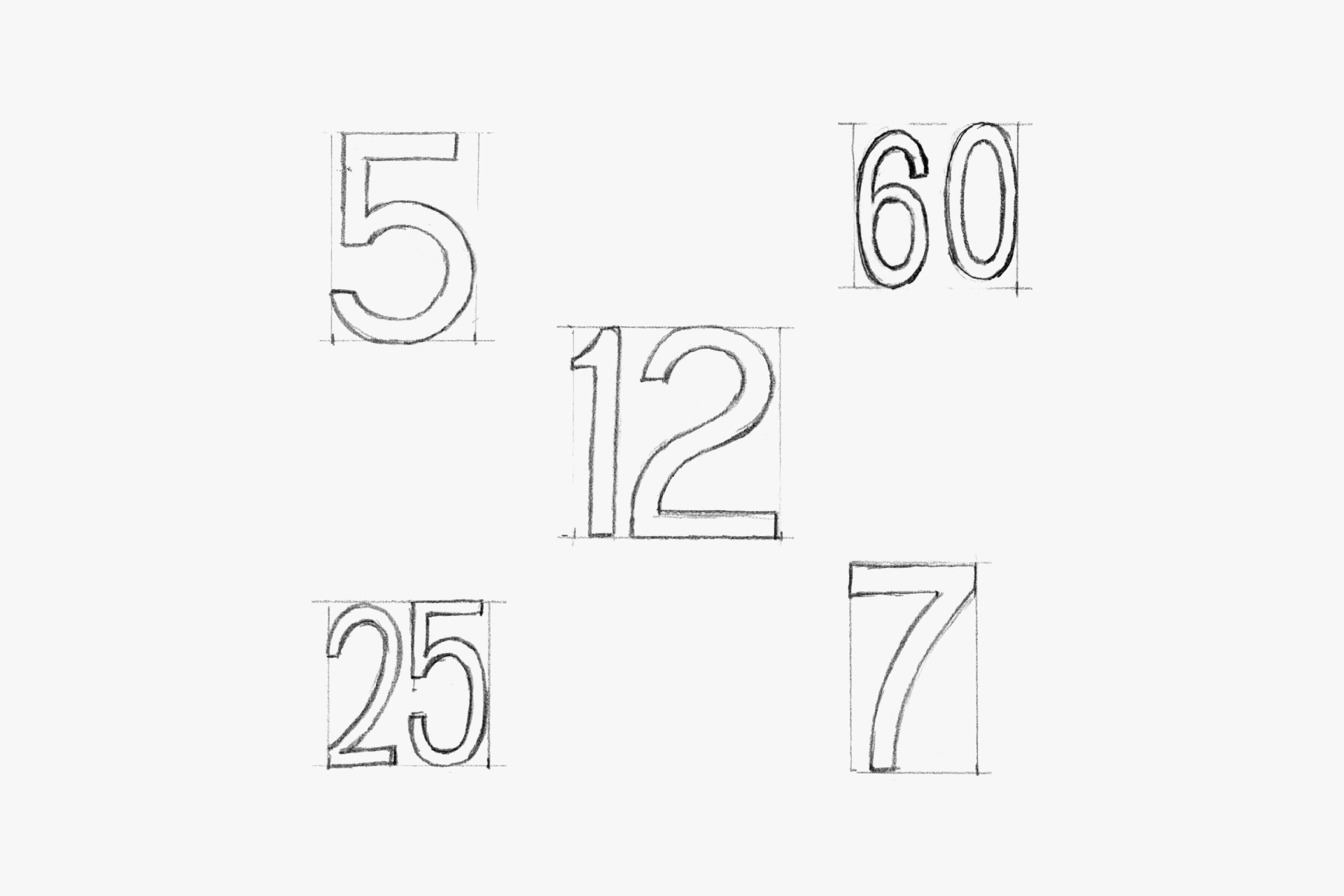
The Arabic numerals are easy to read and adorable, with a simple yet charming quirk.
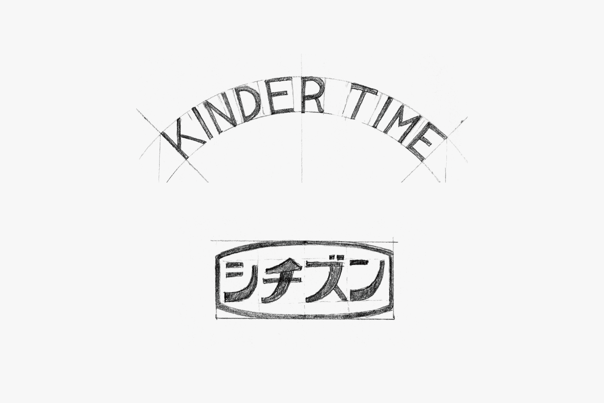
The circularly arranged Kinder Time logo and the emblem-like CITIZEN mark in katakana give a friendly and lovable impression.
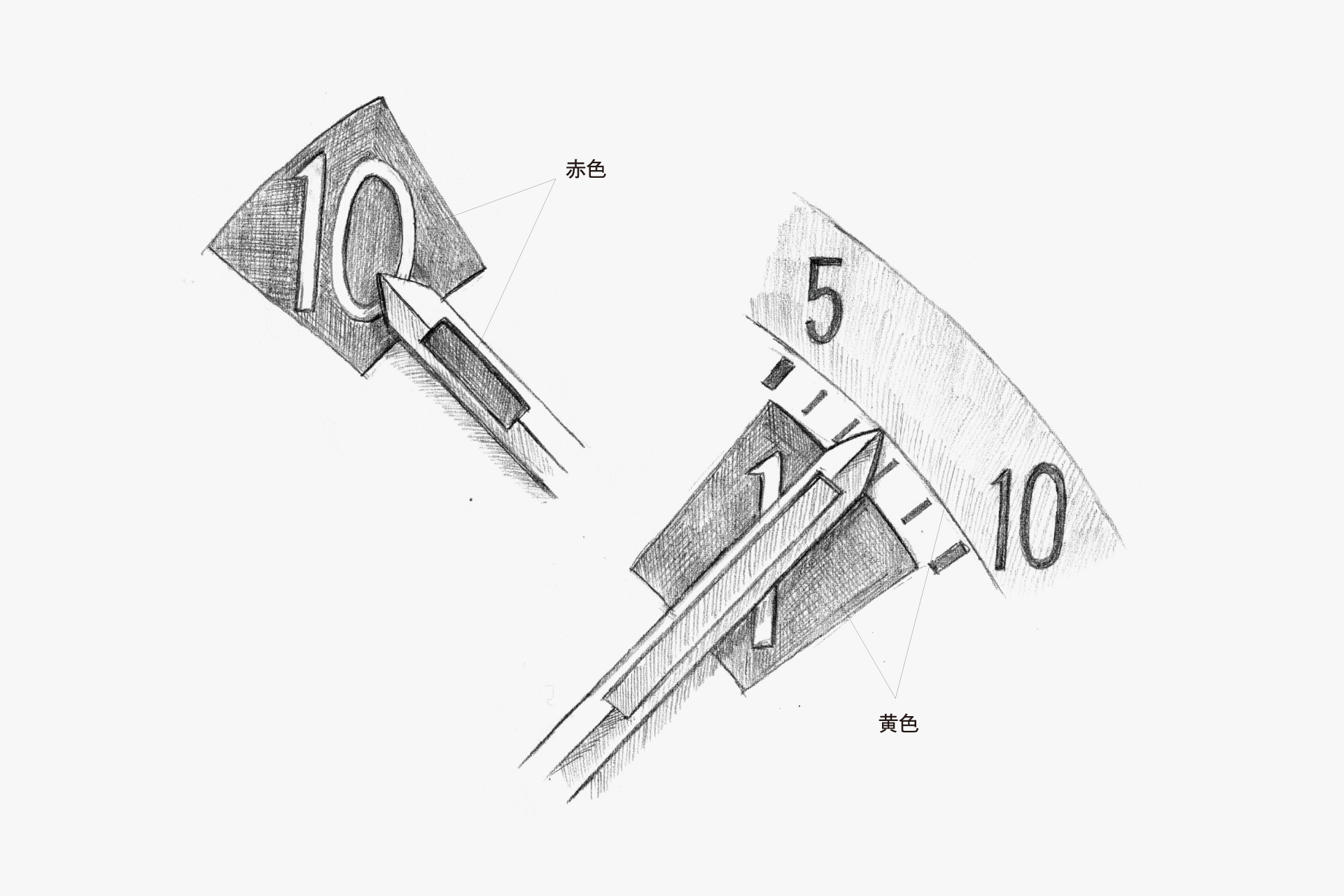
The hour and minute hands and their corresponding markers are color-matched to make reading the time easier.
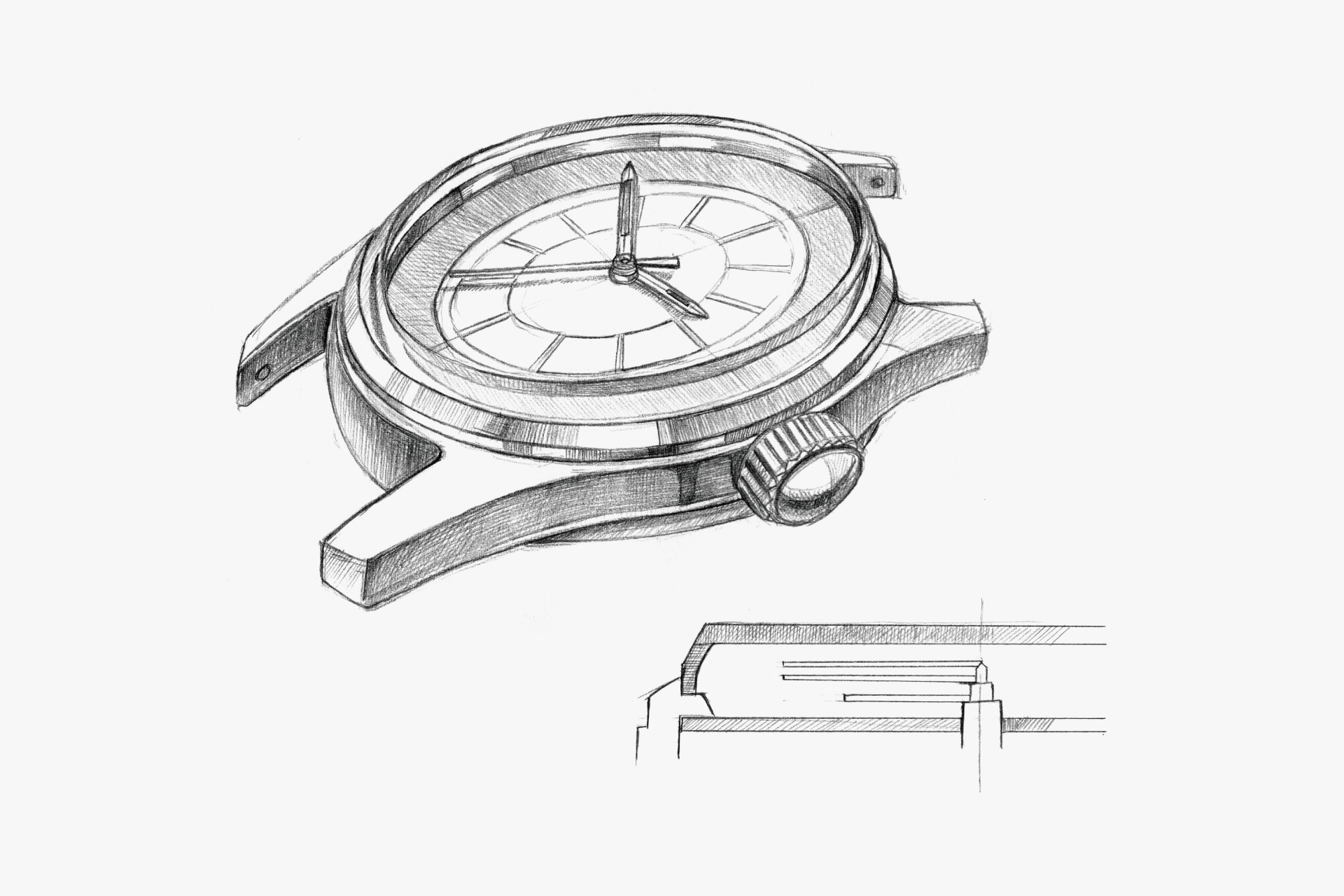
The case has a sharp, edgy, and clean shape that doesn't look like a typical children's watch. The glass is three-dimensional, bringing the dial closer to the user and making it even easier to read.
ENGINEER'S EYE
All-rounder
In fact, the movement installed in this Kinder Time shares the same design as the CITIZEN Homer. Because of the product character as a children’s educational watch, the jewel count was cost-reduced to seven, but it is a bona fide jeweled lever, not a pin-lever system.
There are few examples of a movement used across as many diverse products as the Homer. The railroad watch with an added hacking seconds function is well known, and even CITIZEN’s first chronograph, the Record Master, is a derivative of the Homer. It was also used in some unexpected products, such as the CITIZEN Super Deluxe Date. Meanwhile, it was supplied to overseas watch manufacturers, and the manufacturing technology chosen to support India’s domestically produced watch initiative was that of the Homer. Furthermore, the “Excel,” a rare rectangular movement among CITIZEN’s mechanicals, is also a derivative of the Homer.
Its highly versatile size of φ25.6 mm × t4.0 mm, its rational structure designed with automated assembly in mind, and its stable accurate timekeeping are likely the reasons it enjoyed such broad and lasting support.