The light of the stars was emitted long ago. For example, the light from Betelgeuse in the famous Orion constellation takes about 496 to 788 years to reach us today.
In the past, watches were practical tools valued only by the learned, and simply owning one was a mark of distinction. This watch is one of those models that makes us rediscover the true value of a timepiece. The dial tells the grand history that has accumulated since the Sumerian era, and even those unfamiliar with it are captivated by this watch.
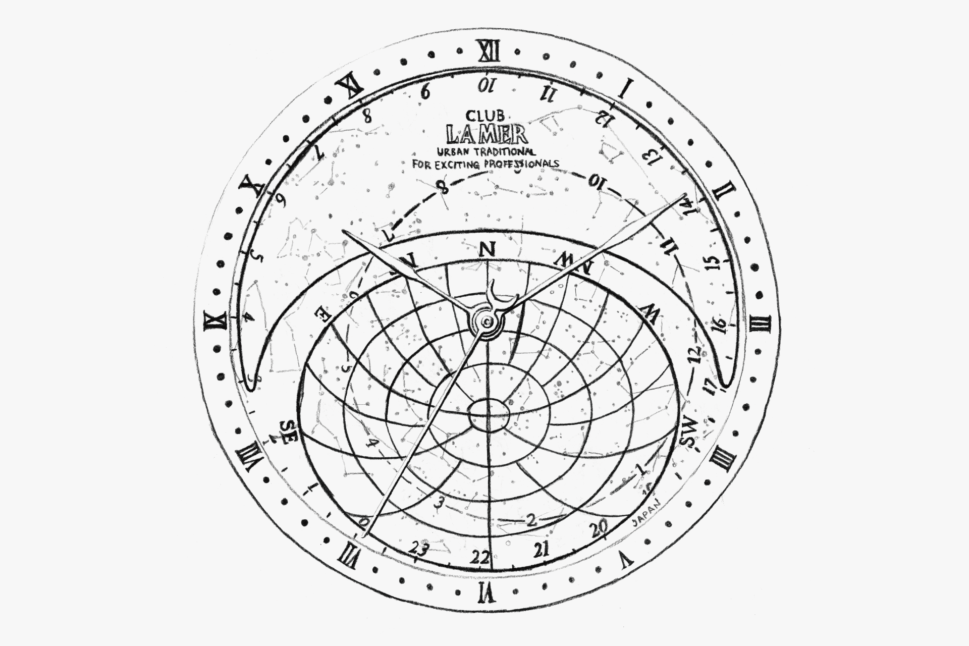
Analog watches intuitively let us sense both the past and the future from their dials, but this watch, with its precise star chart, even shows constellations that are invisible during the day. It gives the wearer both meaning and romance in owning it.
The dress watch-inspired design, which appears slim and thin so as not to detract from the star chart, may seem understated but actually makes a clear statement. The stepped bezel resembles an ancient structure. The delicate cat-like lugs bite into the bezel. The back is cut with a large curve. The slender hands maximize the visibility of the star chart. Each element seems decorative, but by unifying them in gold, the watch achieves a dignified harmony and the tailoring of a historical dress watch. In short, it is a dress watch that wears history.
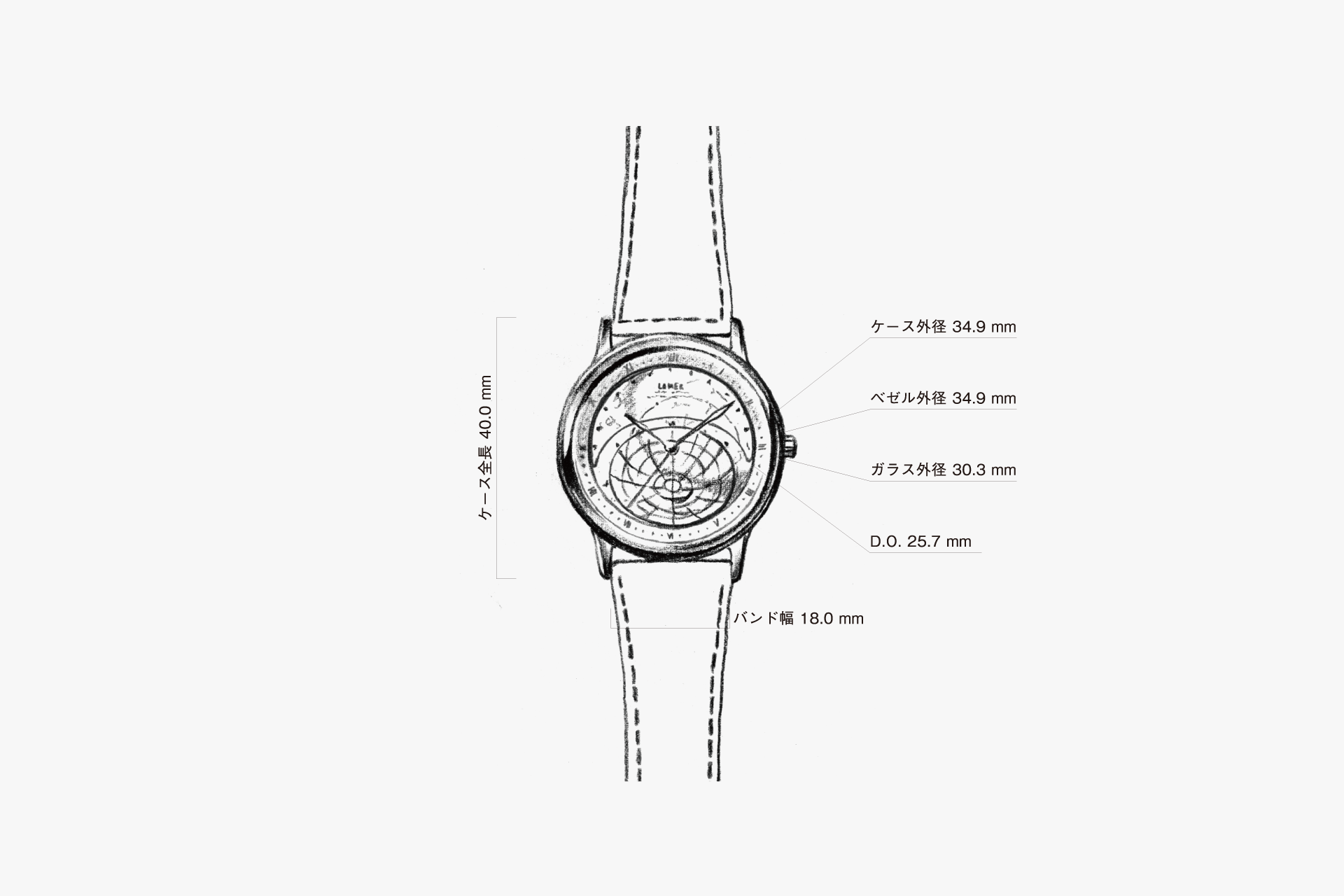
The case is entirely finished with a polished mirror surface, as if trying to make its presence as subtle as possible. The lugs are also made to look as thin as possible by being constructed in two tiers.
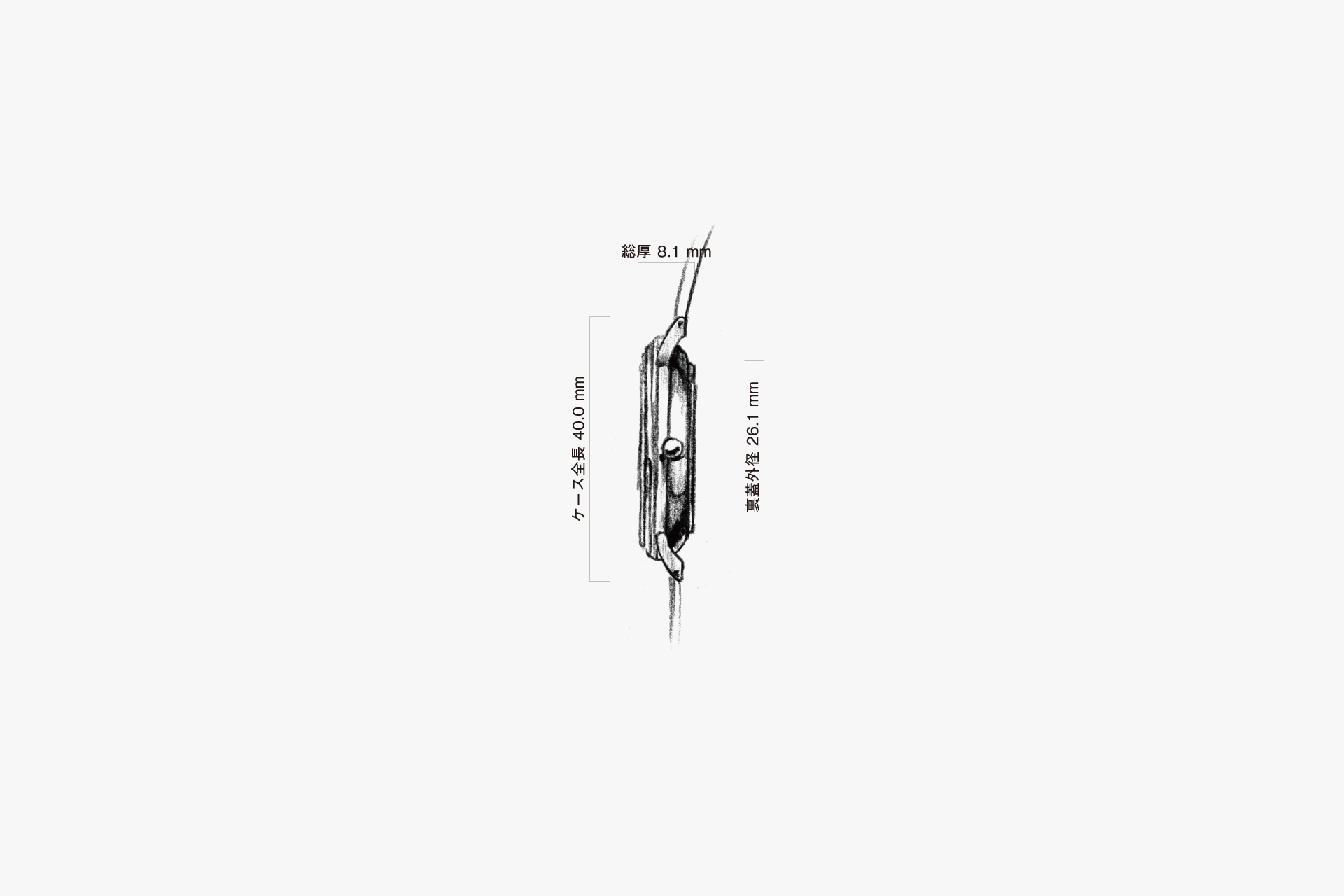
Because of the full mirror finish, when the watch is placed flat, the area below the lugs is not visible, making it appear much thinner than it actually is.
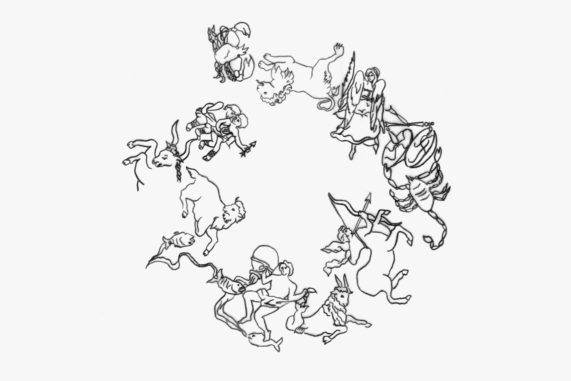
The lines connecting the constellations are actually not fixed. Also, the illustrations of the twelve zodiac signs are slightly offset from the star chart, but this was done for visual appeal.
The unified italic font in gold further accentuates the elegance.
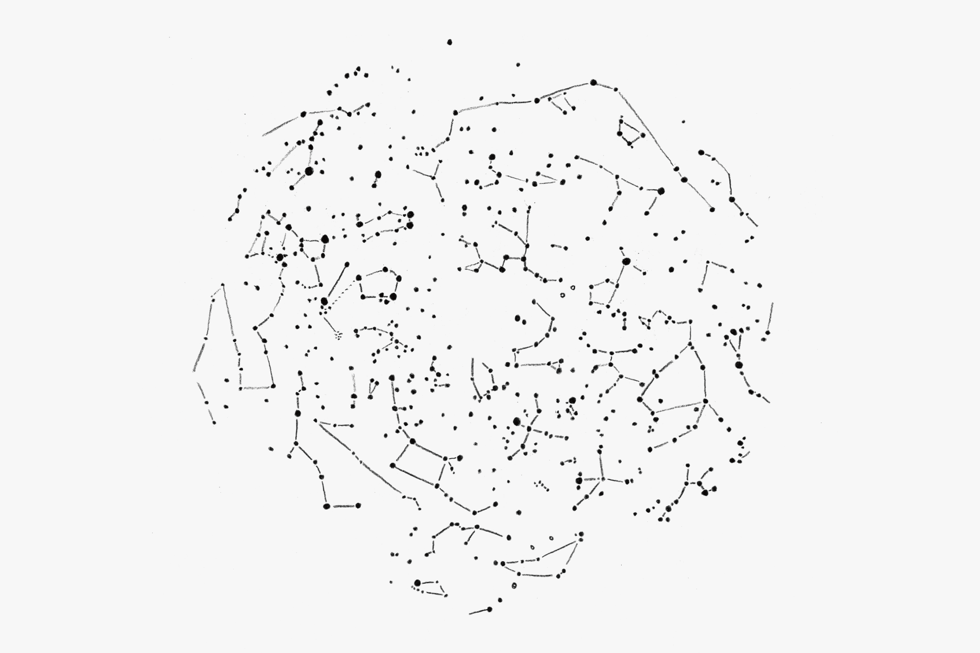
Stars from magnitude 4.5 to 1 are represented by the size of the dots. Red, orange, and yellow giants are color-coded in several shades.
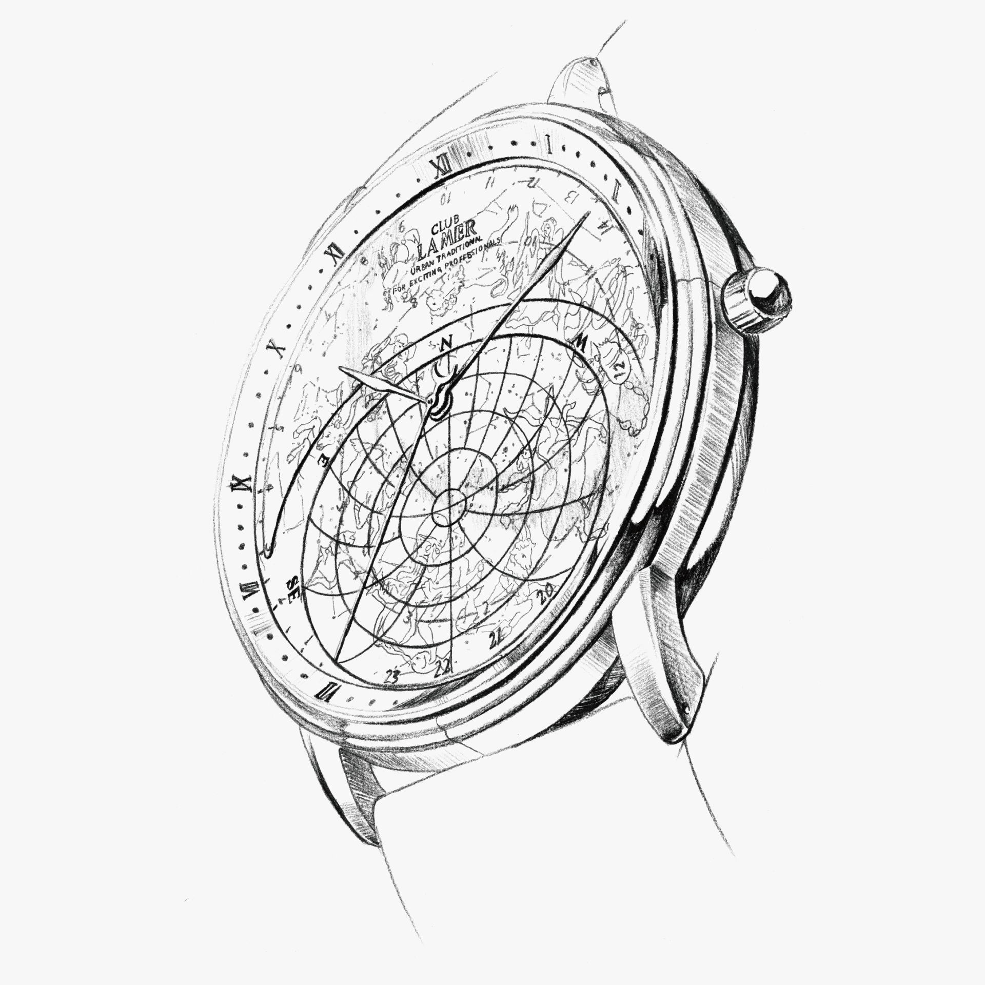
The distinctive three-tiered bezel has the upper two tiers with rounded edges, and the lowest tier with a sharp edge. This emphasizes the lowest edge, while the upper two tiers blur the outline, making the bezel appear thinner. The ridge step of the lugs, created by pressing, looks even smoother and thinner thanks to the polished finish. Also, since the base of the lugs is higher than the bezel, the watch appears even thinner. The back is cut away deeply, so when placed flat, the area below the lugs is not visible, making it look thinner. The result is a watch that is thin, slender, smooth, and elegantly crafted.
ENGINEER'S EYE
A Microcosm
This watch expresses the workings of the heavens by mounting a disc over the entire dial that shows celestial motion and rotating the disc via a gear train linked to the time display. Designed by a movement engineer at CITIZEN who was captivated by astronomy, this model vividly and with high precision portrays celestial movements—so closely tied to the very concept of time—and is said to have drawn great attention when it was exhibited for reference at the 1986 Basel Fair.
In development, computer-based calculations—uncommon at the time—were introduced to reproduce the changing motion of the stars throughout the year with a minimal margin of error. Thanks to a gear train distilled to an optimal reduction ratio, the movement itself carries no electronic computational functions like a CPU, yet the error was driven down to about one minute per year when converted to sidereal time.
Sibling models were also developed: the “Zentenn” type depicting the starry sky as seen in the Northern Hemisphere, the “Shinnanten” type that also includes the Southern Hemisphere, and versions specialized in displaying lunar phases. In successor models, alongside further improvements in the accuracy of celestial reproduction, functions were added to display the Moon’s path and phases. Through such diverse advancements, the lineage has continued to this day.
Considering that since ancient times humanity has perceived time through the movements of celestial bodies, it is only natural that a watch embodying the cosmos would fascinate us. The potential of this watch may well endure not just for a hundred years, but perhaps even for a thousand.