This watch boasts a wide array of functions, resulting in a high-density dial. The well-balanced arrangement of each element allows a wealth of information to be conveyed to the user in a clear and parallel manner.
Additionally, the shapes and color schemes of the sub-dials are carefully considered for visibility, and together with the sense of compactness unique to multifunctional models, they visually delight the user.
The case is composed mainly of taut curves with few flat surfaces, evoking the maternal fullness of earth goddesses found in many ancient civilizations, symbolizing abundance.
The unexpected individuality of this model lies in its evocation of maternal qualities within the highly masculine genre of pilot watches. Rather than simply designing for functionality, the overall presence—from the dial layout to the case shape—aims to evoke a universal image of fundamental richness that resonates with everyone.
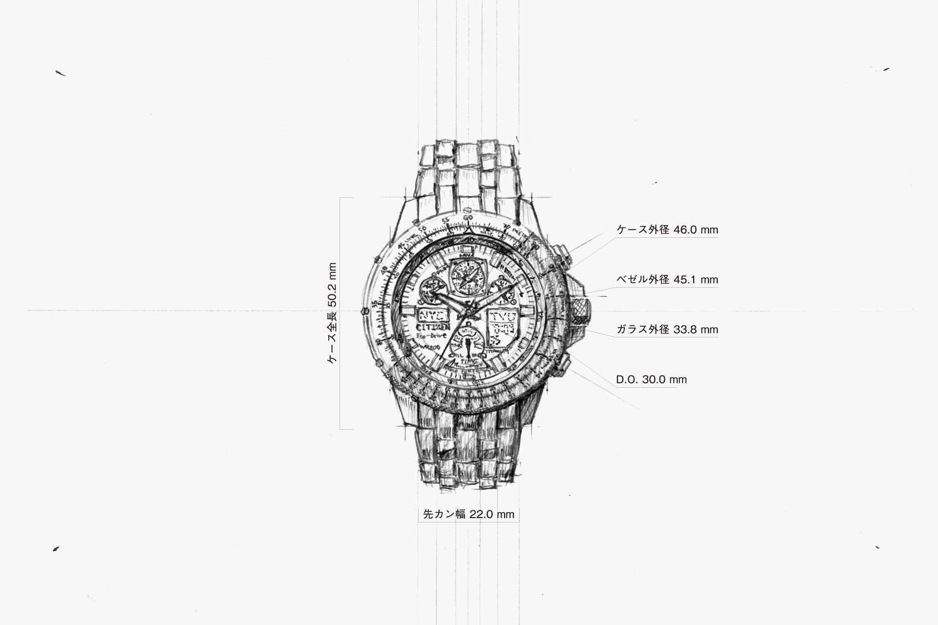
Despite its high density and numerous elements, it offers a reassuring sense of balance, not just a haphazard collection of features.
The overall taut shape gives an impression that is not too rigid.
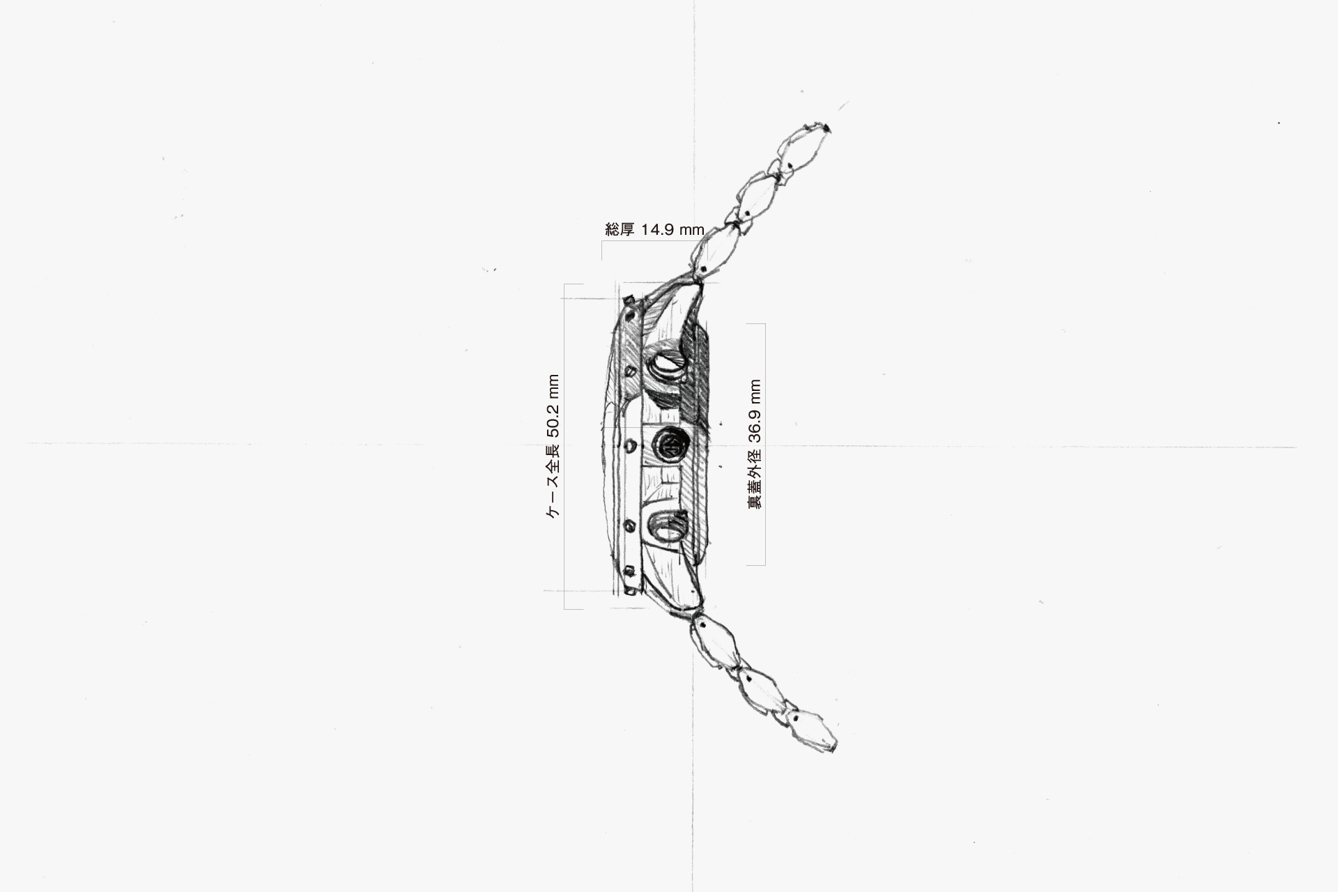
The taut side surface. While avoiding an overly inorganic feel, the large case size still ensures a comfortable fit on the wrist.
A form with almost no straight lines or flat surfaces. While retaining a sense of solidity, it gives an impression that is not unapproachable.
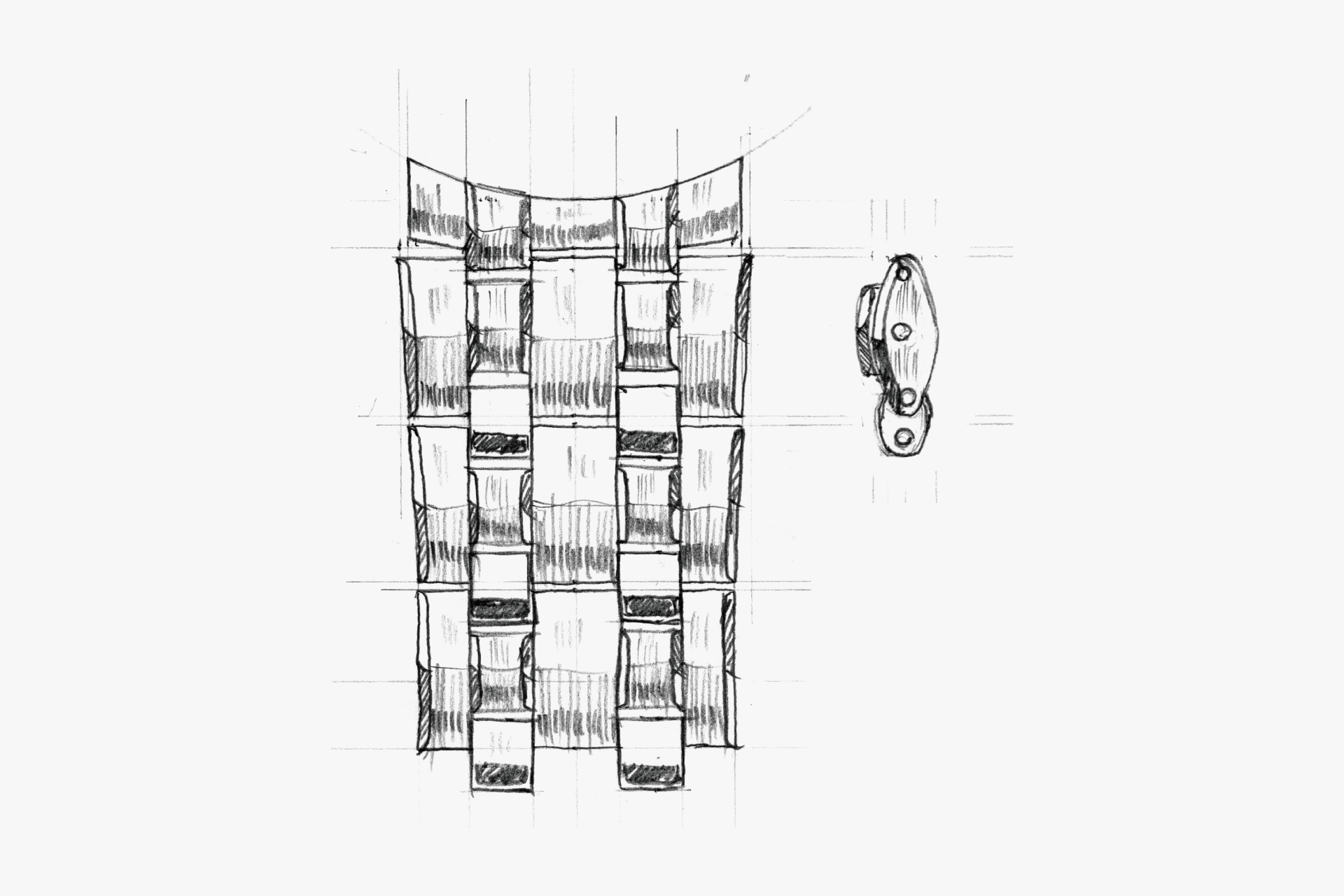
A side view of the band links shaped like grains of rice. Amidst the orthodox styling from the front, this adds a subtle touch of individuality.
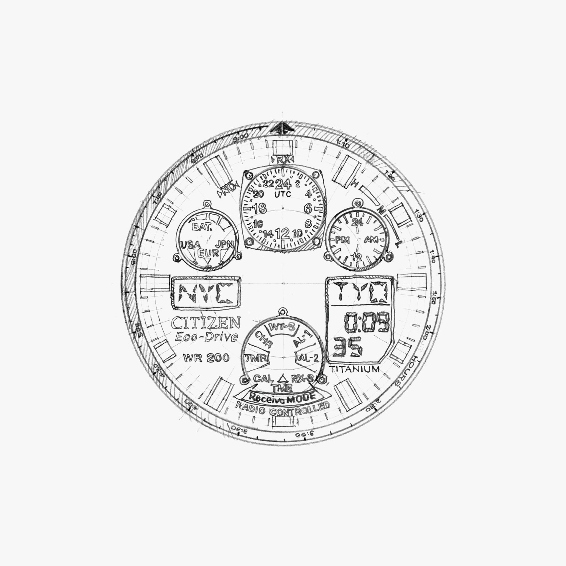
Despite the abundance of elements, the dial maintains a balanced composition. By cleverly using colors for the hands and layout, it enables a wealth of information to be conveyed clearly and in parallel.
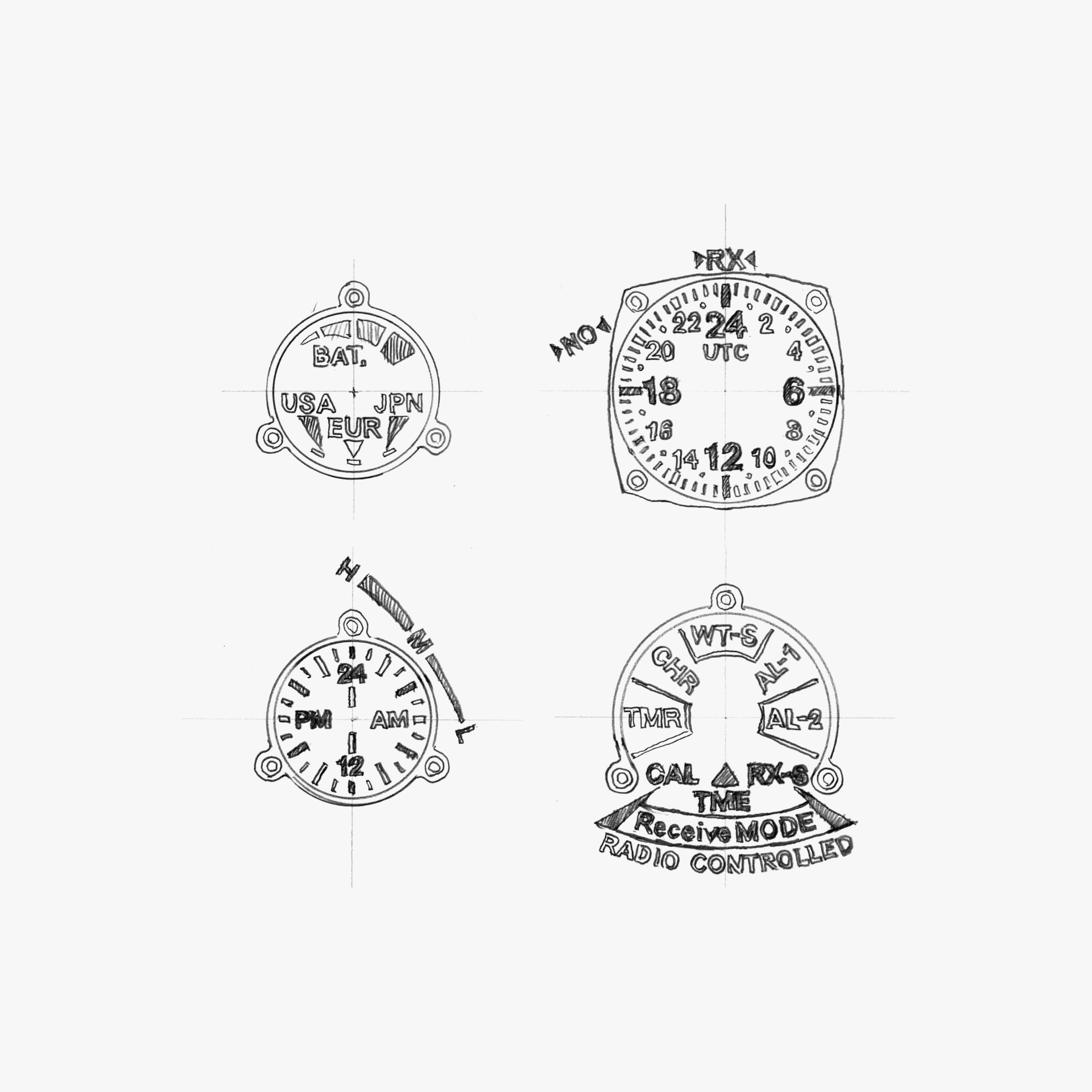
A layout that offers a graphic effect to visually delight the user, not just limited to functional displays. This is also an element that contributes to the unique character of this watch.
ENGINEER'S EYE
Beyond the World
Developed as an evolved model of the Navihawk series, a popular line within CITIZEN PROMASTER. For a true world-time watch built for global travelers, the ability to receive standard time signals outside Japan is indispensable. In the United States—where, across a vast land, there is only one transmitter in Colorado—we set a development goal of achieving a full‑metal exterior while ensuring highly sensitive signal reception, even along the densely populated East and West Coasts. This model took on the role of expanding the market for radio-controlled watches worldwide.
Leveraging technologies cultivated through the development of full‑metal radio-controlled watches to date—such as a hand position adjustment function, shock detection function, and magnetic resistance—as well as a high-function yet low‑power circuit and LCD panel, a receiver IC capable of high-sensitivity, multi‑station signal reception, and an antenna with various sensitivity countermeasures, this model embodies 15 years of radio-controlled watch development know‑how. It can be called a milestone in CITIZEN’s combination watch lineup.
Subsequently, we developed the successor Cal. U680, improved to receive signals from China in addition to the three regions of Japan, the U.S., and Europe. It remains a long‑selling product that represents CITIZEN to this day.