This model gives no sense of the busyness that is often the fate of multifunctional watches; instead, it feels refined, as if its styling has been mastered. Despite being packed with features—a slide rule, three sub-dials, and three LCDs (six displays in total)—the design remains well-organized from every angle. When you try to read each display, none of the markings interfere with each other. Rather than simply adding aviation watch-like touches, the focus is on composing the functional displays with utmost beauty. While this may seem like a paradoxical approach, it might actually be the most straightforward way to express the functional beauty and dignity of a cockpit.
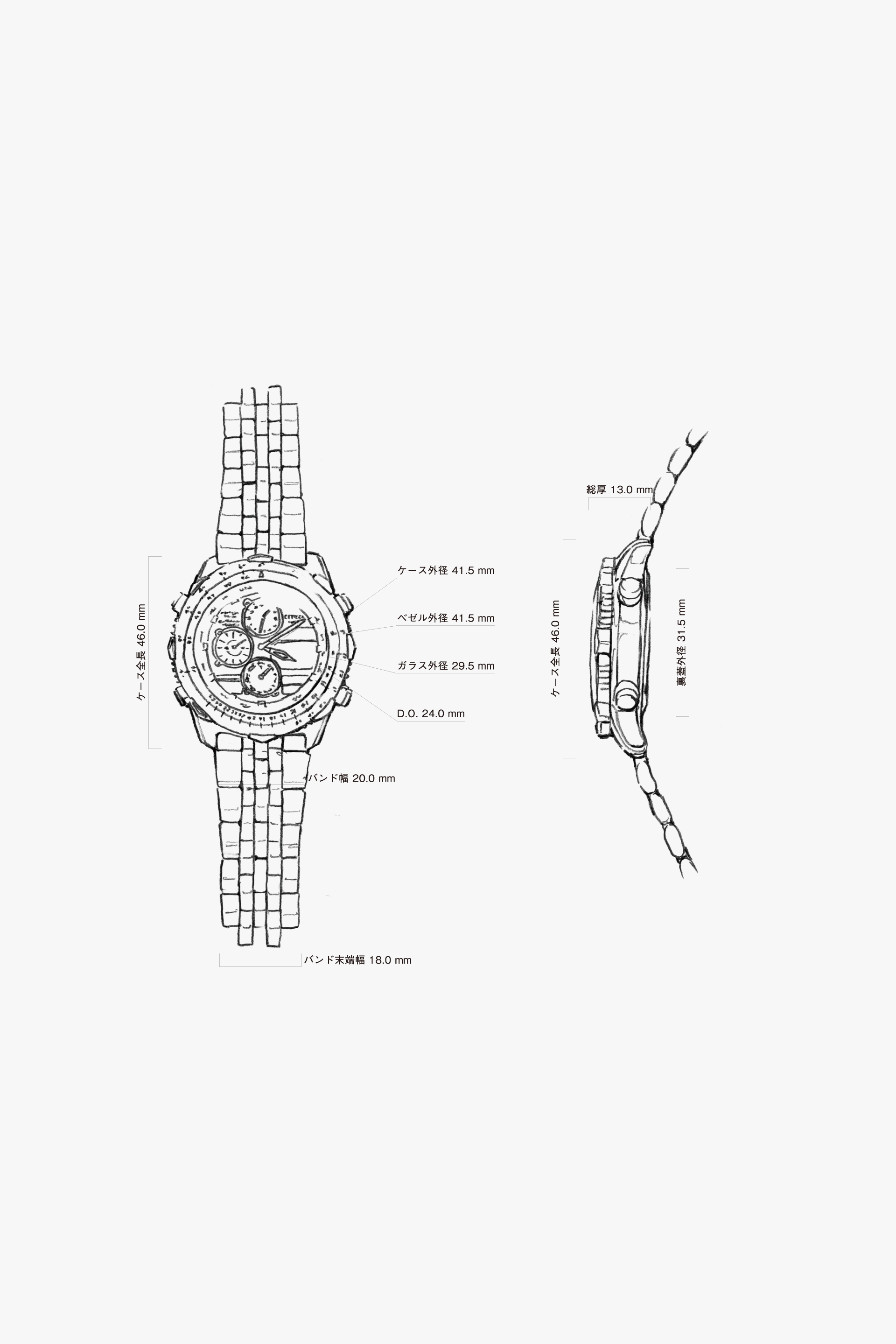
Although it has a slide rule, three sub-dials, and three LCD screens, the overall size is compact, the lines are minimal, and the shapes are softly formed, so it doesn’t feel cluttered. This sense of balance is its individuality. Even though the bezel is thick, the center of gravity feels firmly attached to the wrist. An attractive form is created with minimal moves.
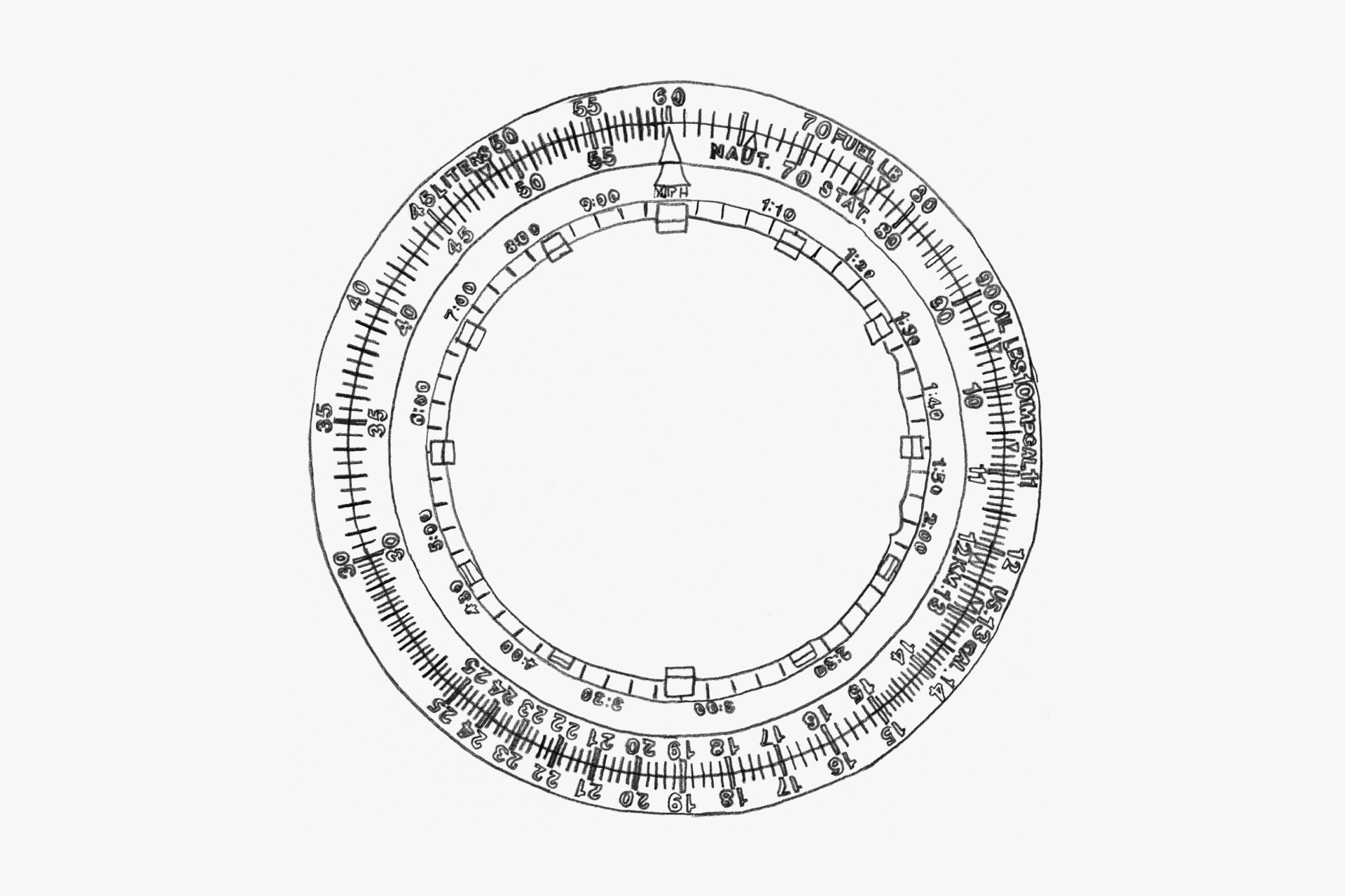
There is nothing that stands out in a bad way; the elements are organized and beautifully unified.
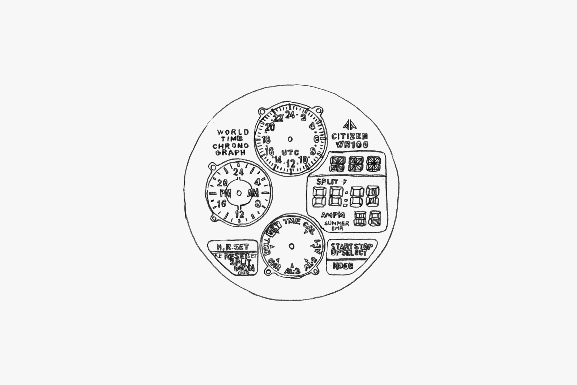
The dial, equipped with five functions, is finished plainly without decoration. This, in turn, is the key to its "cockpit = sky instrument" look.
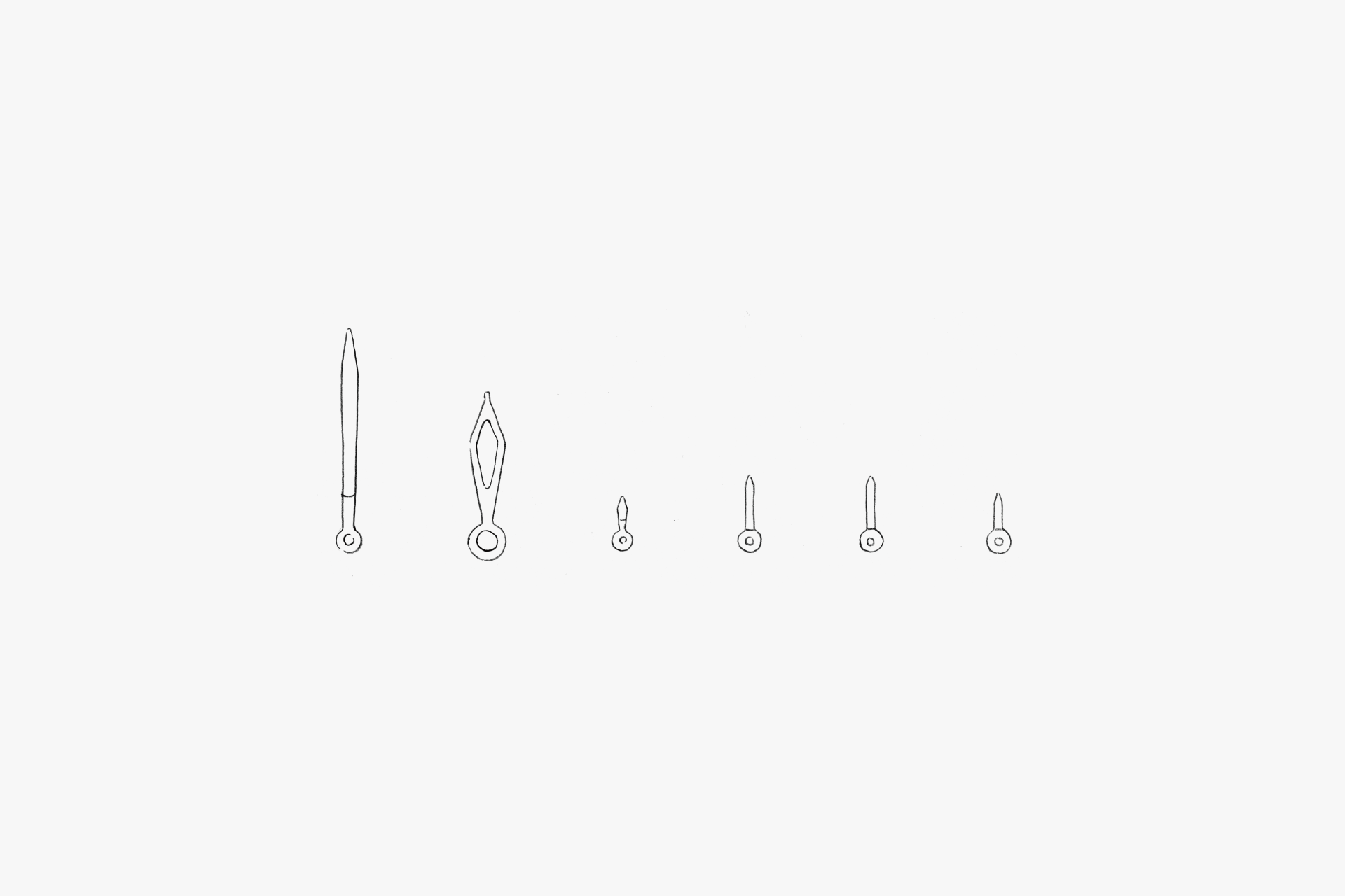
Everything is printed with luminescence on a black base. The time can be read clearly even from a distance.
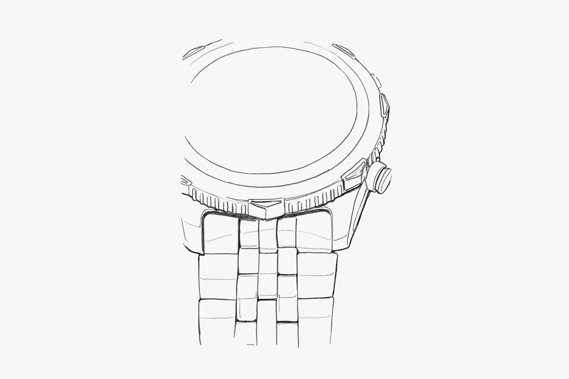
The bezel resembles a compass. It catches the finger well and is easy to operate, while the stick-shaped protrusions provide a pleasant anti-slip effect. Although the lugs are actually short, the way the polished surface is cut makes them appear longer.
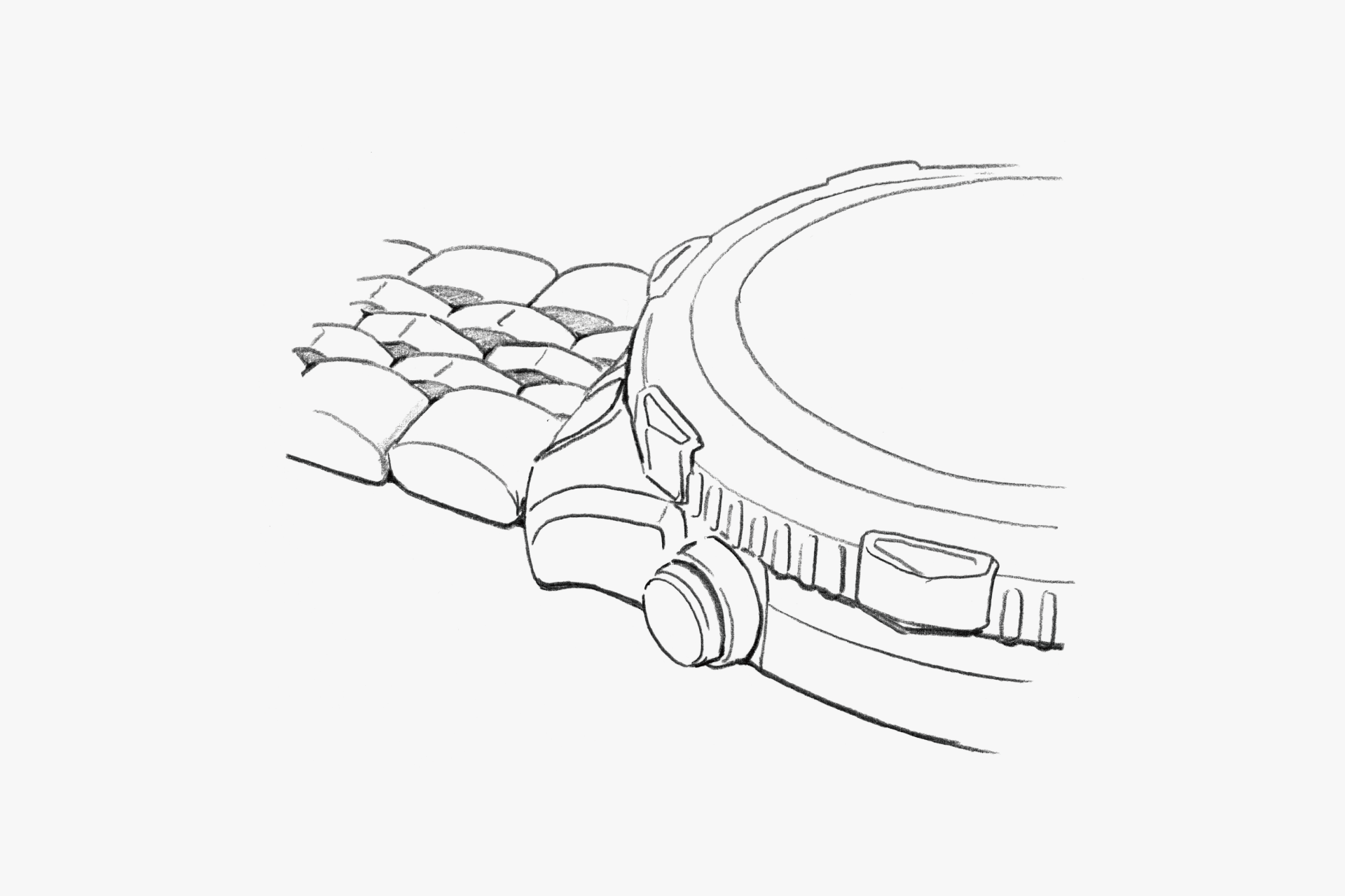
The three central rows of the band are polished in a mountain shape, but the cross-section is rounded, giving just the right amount of shine and creating a thick band.
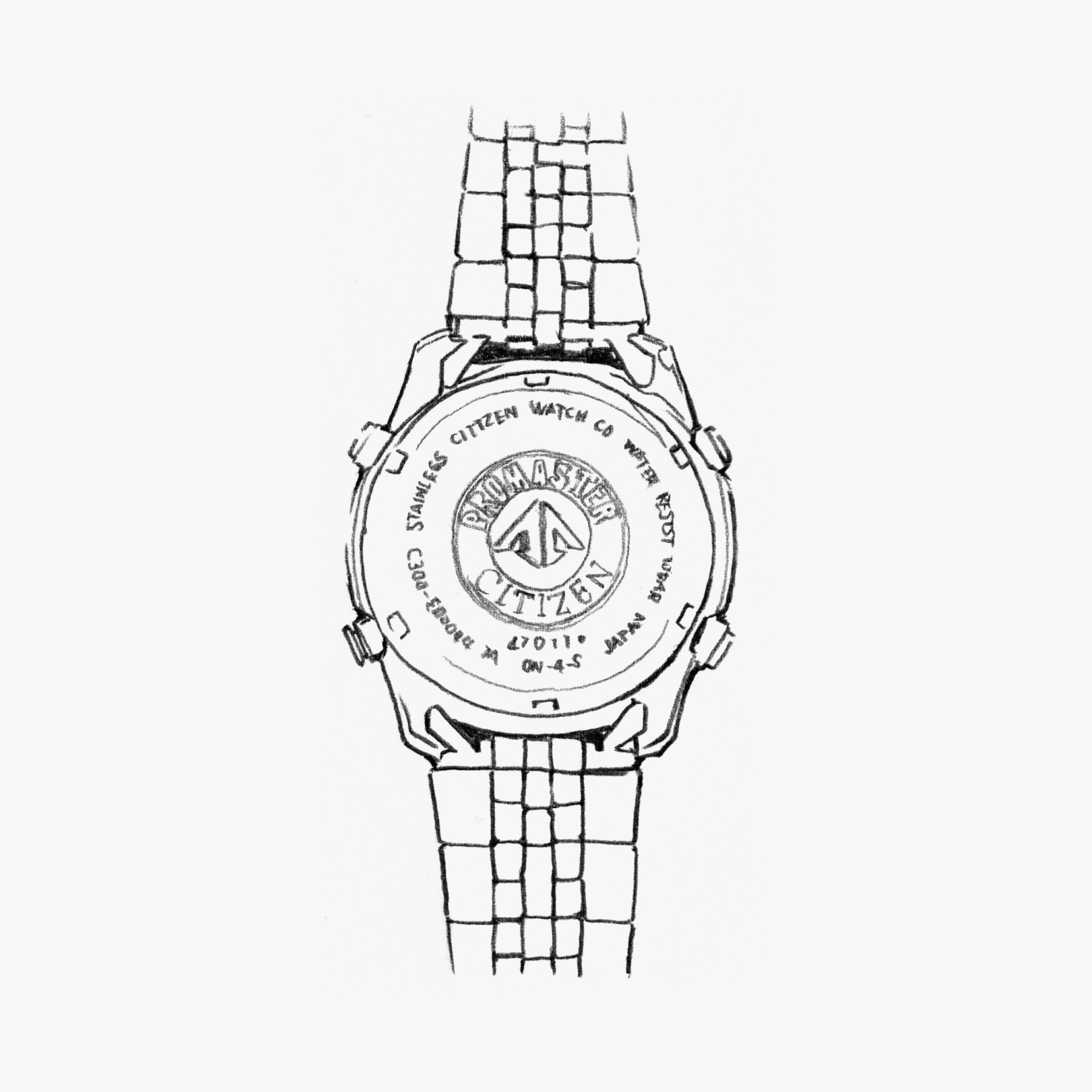
The four buttons are kept to a minimum. The watch doesn’t feel bulky, nor does it feel flimsy; instead, it gives a sense of compactness.
ENGINEER'S EYE
The Origin of the Modern Combination Watch
This is the first-generation model in the Navihawk series, developed as a combination watch that took the concept a step further—after the hugely popular dual-format “Ana-Digi”/“Digi-Ana”—to pioneer a new generation. With an LCD arranged beneath the dial and multi-motor analog indications, it achieved unprecedented expressive capability, including simultaneous display of three time zones such as UTC.
By fully synchronizing the analog and digital sections, it realized numerous functions that enhance the convenience of a combination quartz watch, such as a swap function between analog and digital time, and a hands-retract (hands-away) function that clears the hands to reveal the digital display when they would otherwise obscure it. Another notable feature is the addition of operation indicators in the small LCD windows at the 4 o’clock and 8 o’clock positions.
Despite its many functions, the philosophy of prioritizing ease of operation has been carried forward in various forms to subsequent models, making this a watch that can truly be called the origin of the modern combination watch.