The word that best describes this model is probably "futuristic." At first glance, its distinctive form evokes the cockpit of a spaceship, yet it was designed in 1984, over 40 years ago. Despite being a watch from the past, it exudes a sense of the future. It brings together various functions and elements in a harmonious way, and while the design is unique, it still feels simple—a watch packed with mysterious qualities.
The sense of simplicity may come from the bold, sharp forms and pronounced edges. The unwavering, clean lines and the pleasant transitions between crisp surfaces unify the complexity of each element, creating a sense of cohesion.
Another charm of this model is the sense of "familiarity" and "cuteness" within its sharpness. The large, rounded cutouts and speaker section that appear among the straight lines, the gold and red accents used only for the CITIZEN logo and the REC lettering, and the subtle deviations from the overall monochrome scheme all contribute to its lovable character.
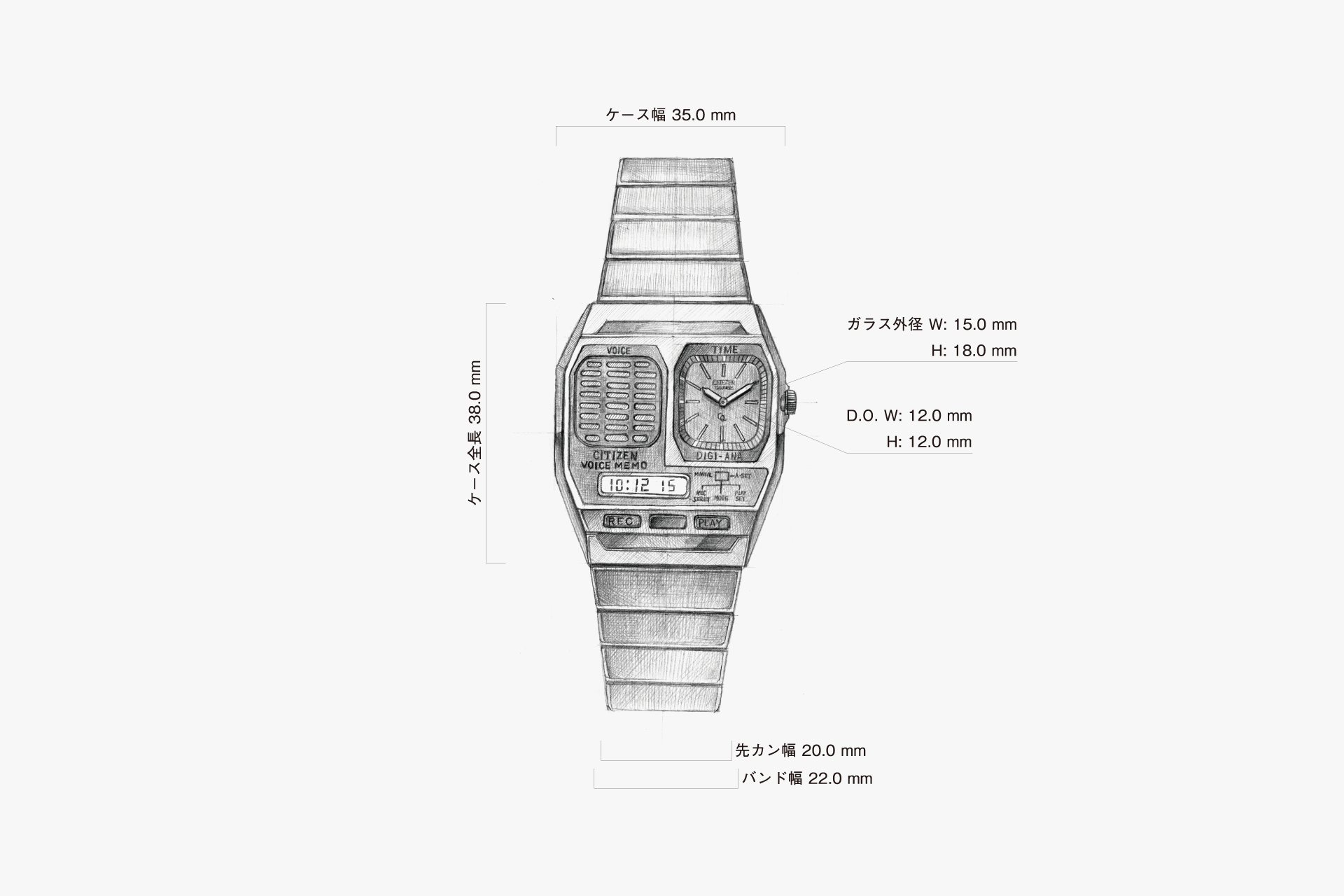
The watch features a groundbreaking function for its time—the ability to record and play back six seconds of audio. By clearly separating the VOICE and TIME functions, the layout is both functional and visually impactful. This watch possesses a futuristic form that remains relevant today, along with uniquely charming details.
Despite bringing together various functions and elements, this watch achieves a balanced sense of unity.
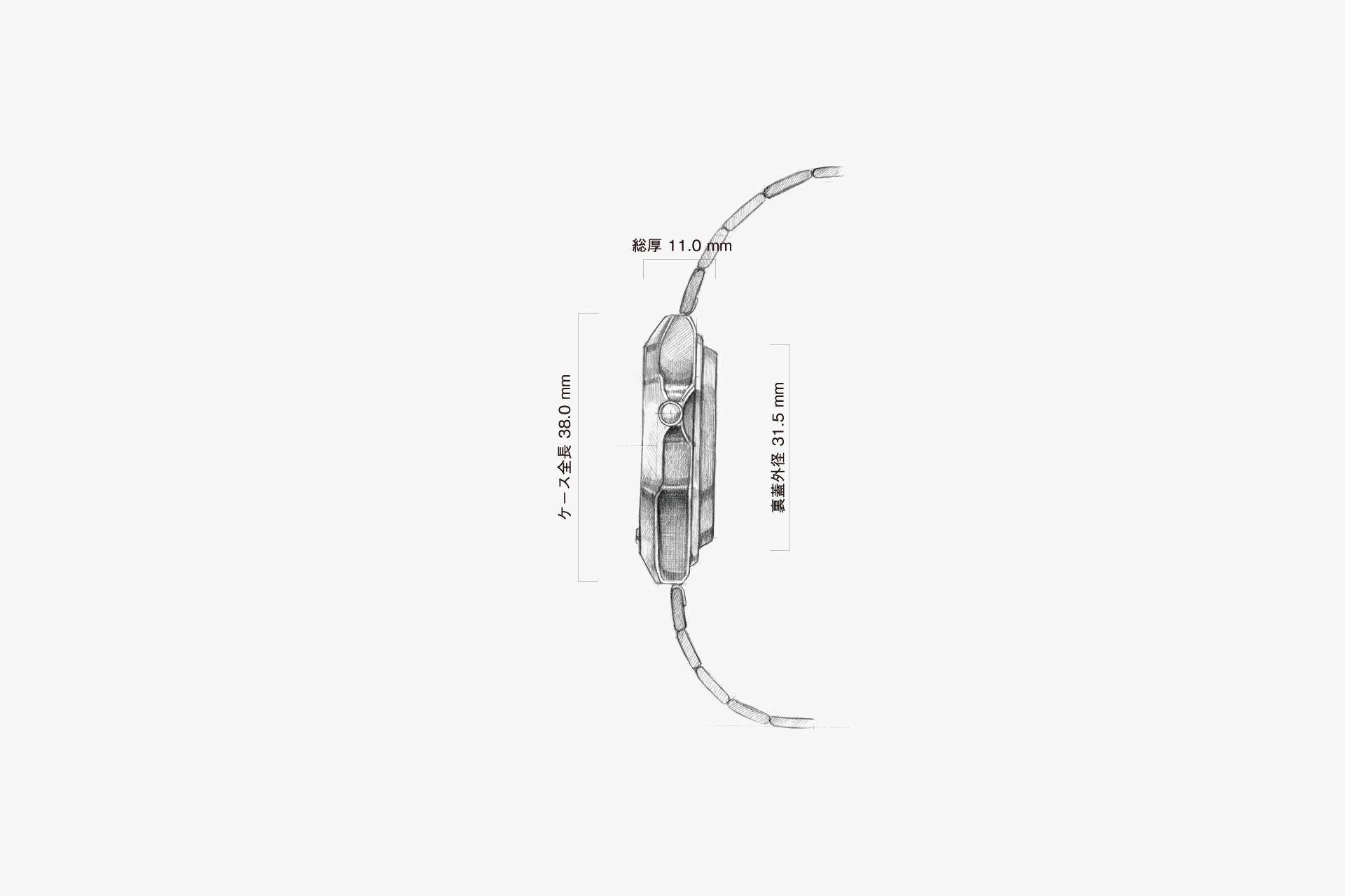
Although the case is thick, the bold slopes and the ingenuity of the case back make it feel less bulky.
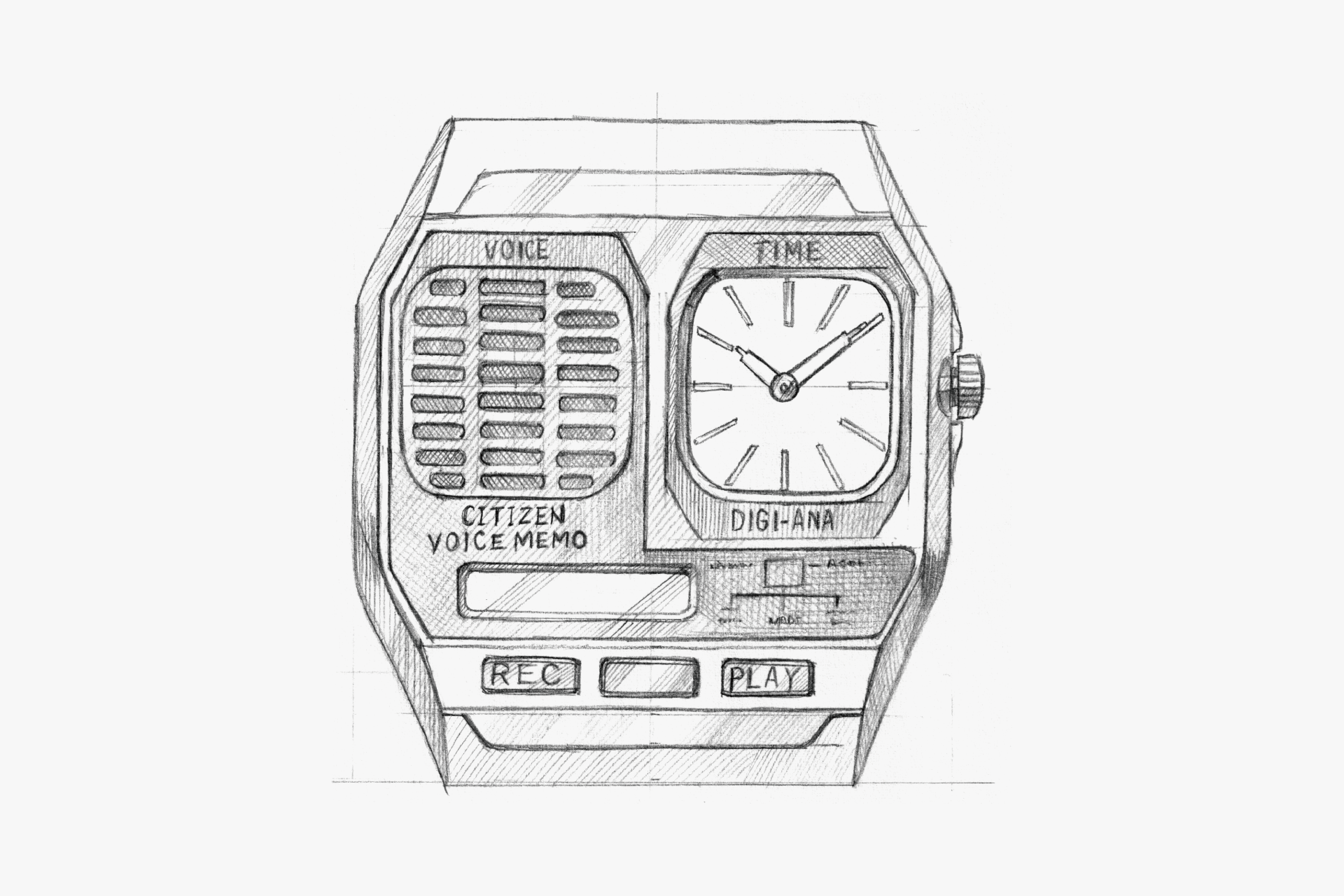
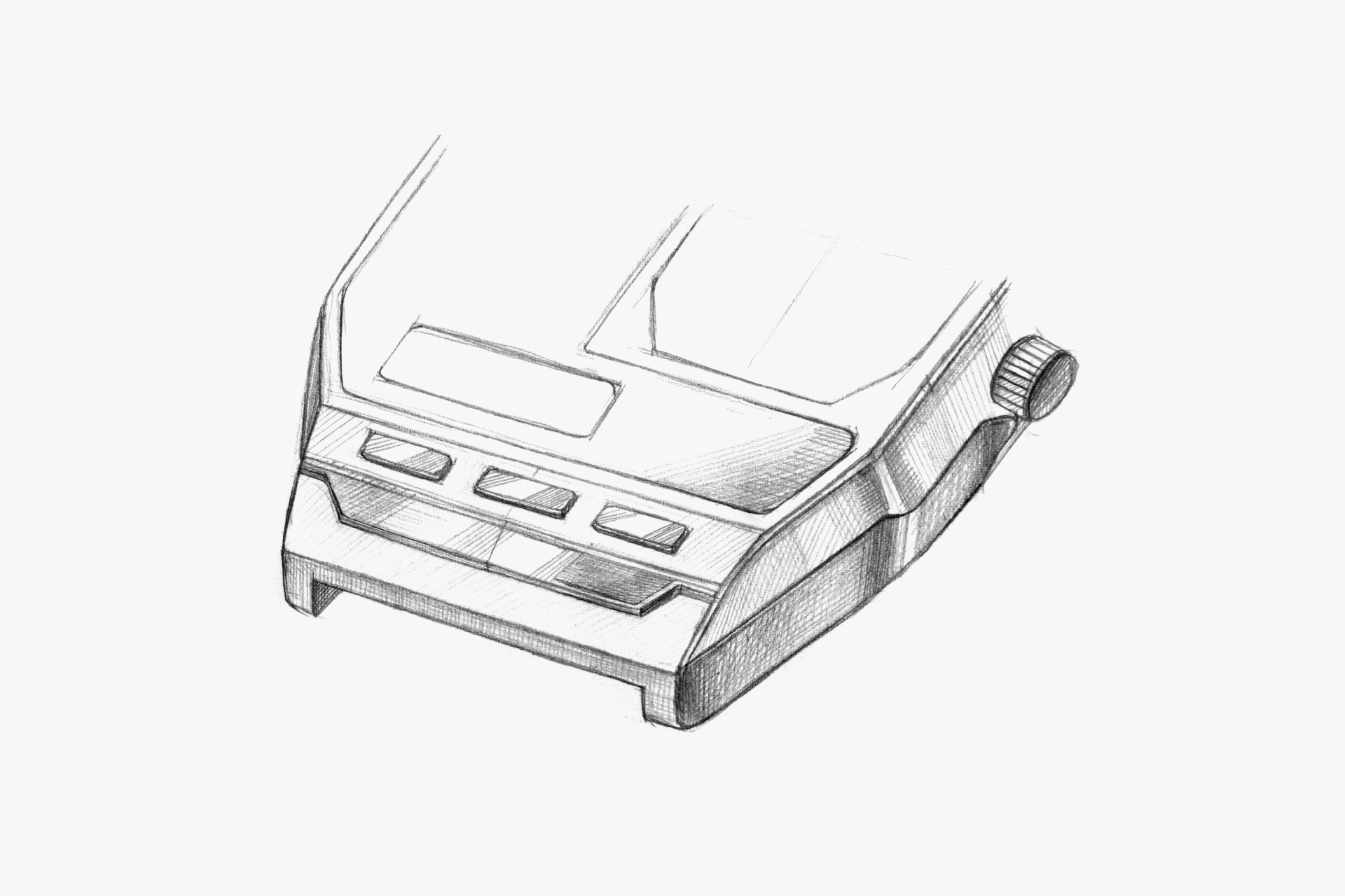
The case, with its futuristic design reminiscent of a spaceship cockpit, is cleverly zoned according to function.
The dynamic form gives off a retro-futuristic vibe. The surfaces transition crisply and pleasantly.
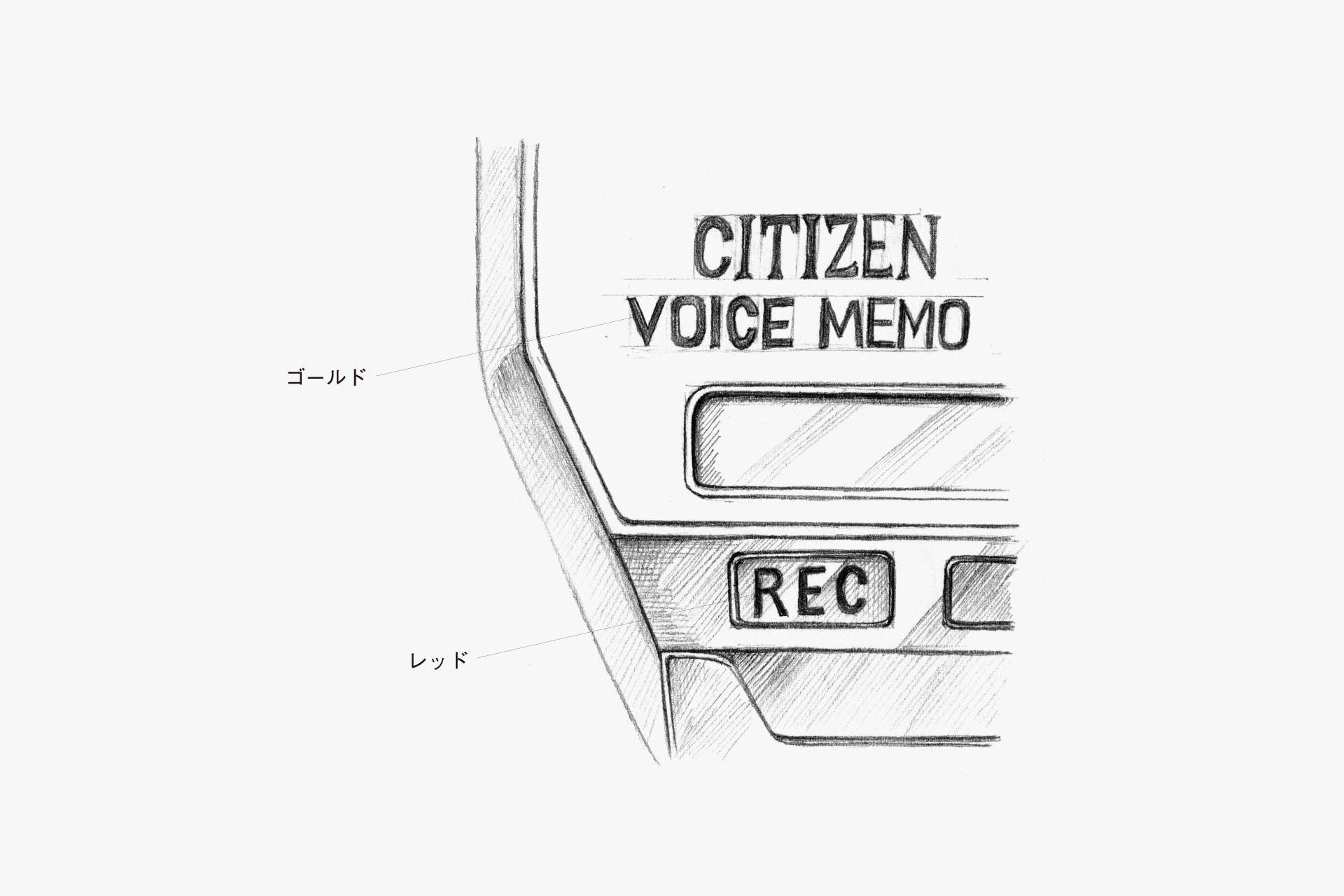
By using color as a subtle accent for important functions, the watch is easy for users to understand and these points also add to its charm.
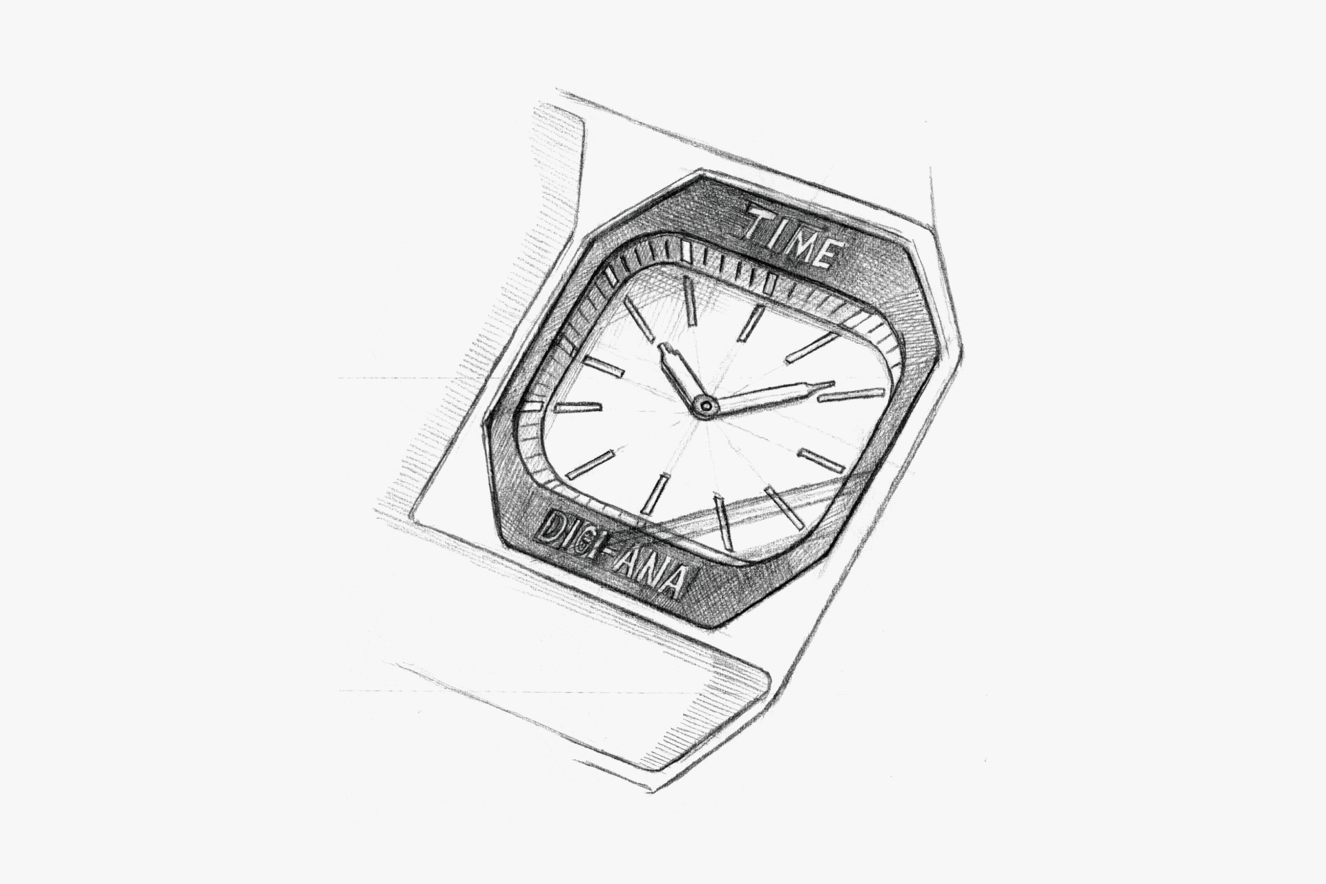
A design that combines straight lines with rounded forms in contrast.

The dial with its thin, delicate indexes harmonizes well with the unique case through a subtractive design approach.
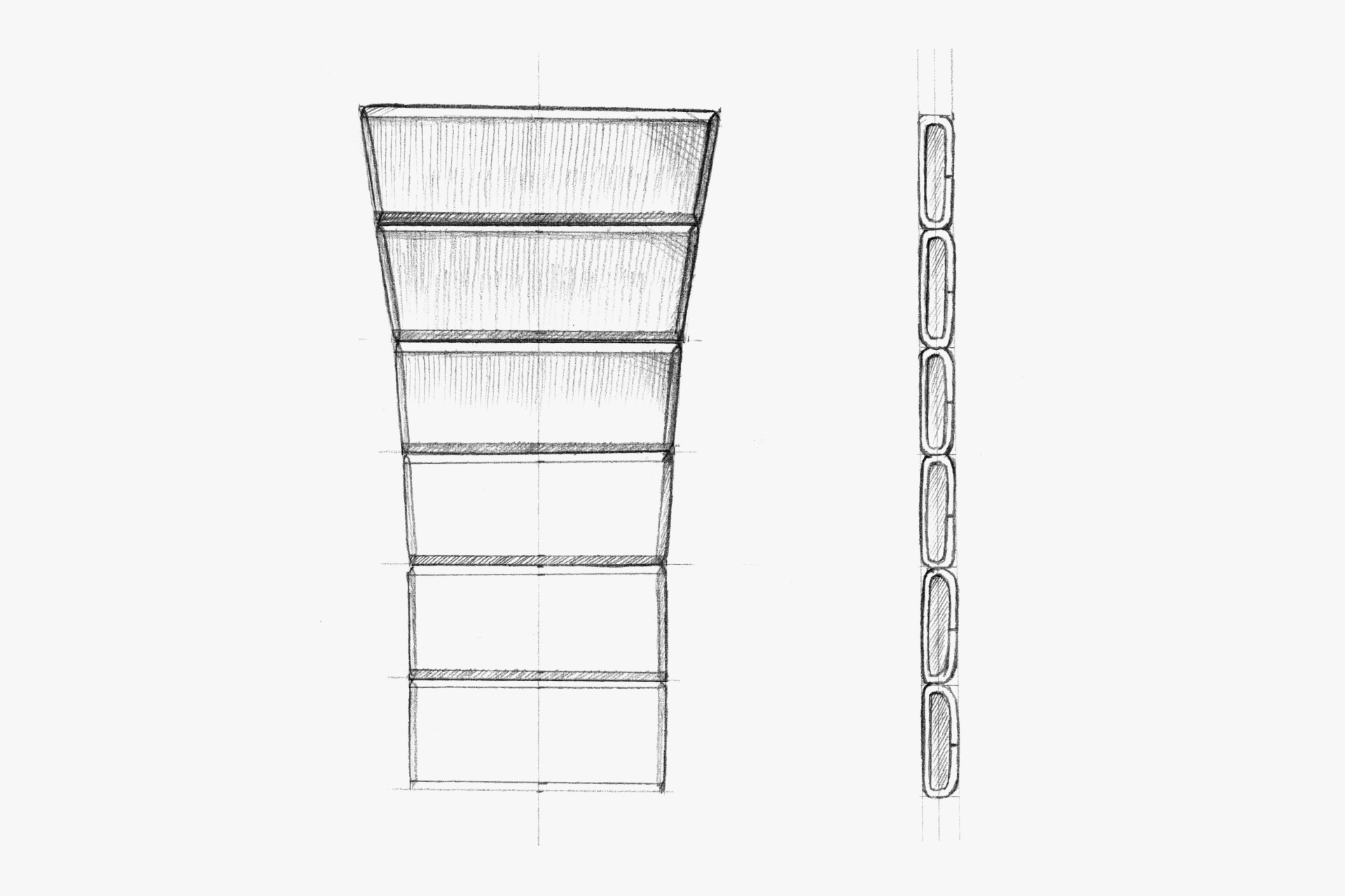
The band, with its sharp-edged, stylish look, is solid and inorganic, yet its clean form gives a futuristic impression. Its understated presence highlights the unique case.

The hands, which taper to a fine, charming point, have a metallic silver finish only at the base, with the rest in white, making them stylish and easy to read.
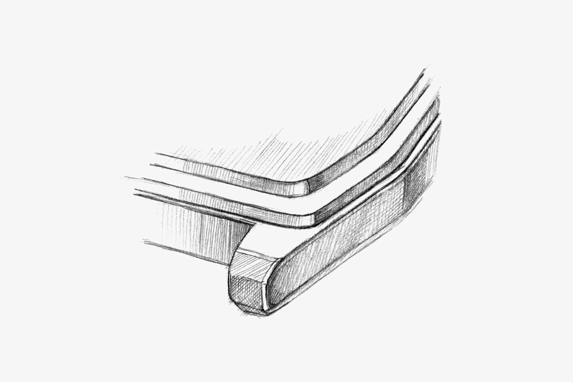
The case back is constructed in two layers, designed to appear as thin as possible.
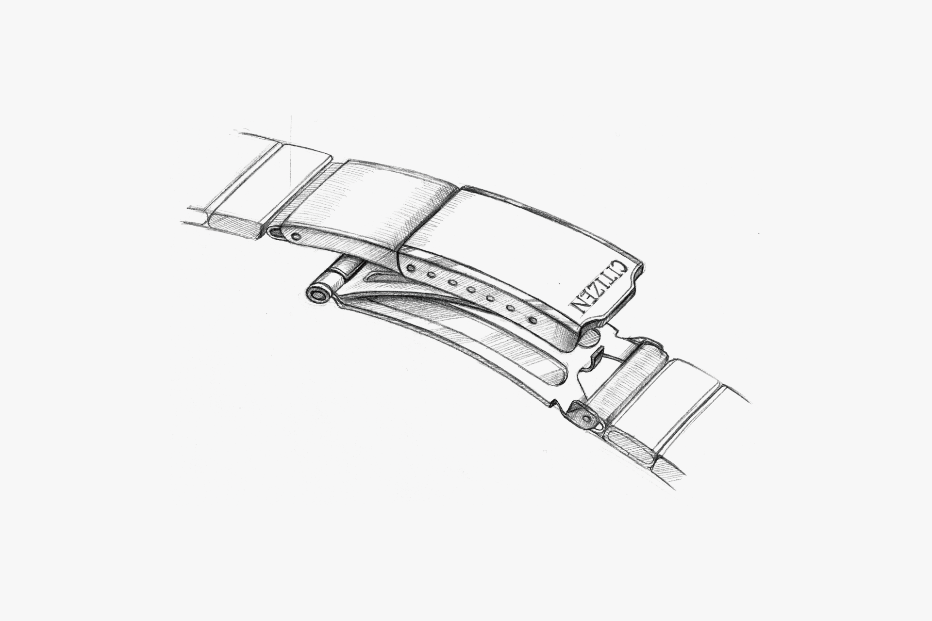
A clasp designed for easy size adjustment.
ENGINEER'S EYE
Pioneer of Portable Voice Devices
This is the world’s first combination watch equipped with recording and playback functions using IC memory. Its hallmark is the ability to record and play back quickly by pressing the dedicated REC and PLAY buttons. True to the name “Voice Memo,” it could smoothly capture up to six seconds of audio even in sudden situations.
For audio recording, it employed a then–state-of-the-art 64-kilobit semiconductor memory, converting voice into digital data for storage, just as we do today.
Three years after this model’s release, a next-generation “Voice Memo Cal. D090,” which allowed the watch to be controlled by voice, was also developed. The series offered a glimpse into the future of portable devices—leading toward today’s voice recorders and features like calling on smart watches.