Straightforwardness

ANA-DIGI PW

https://ms.citizen.jp/assets/013_02-02_アナデジ_01

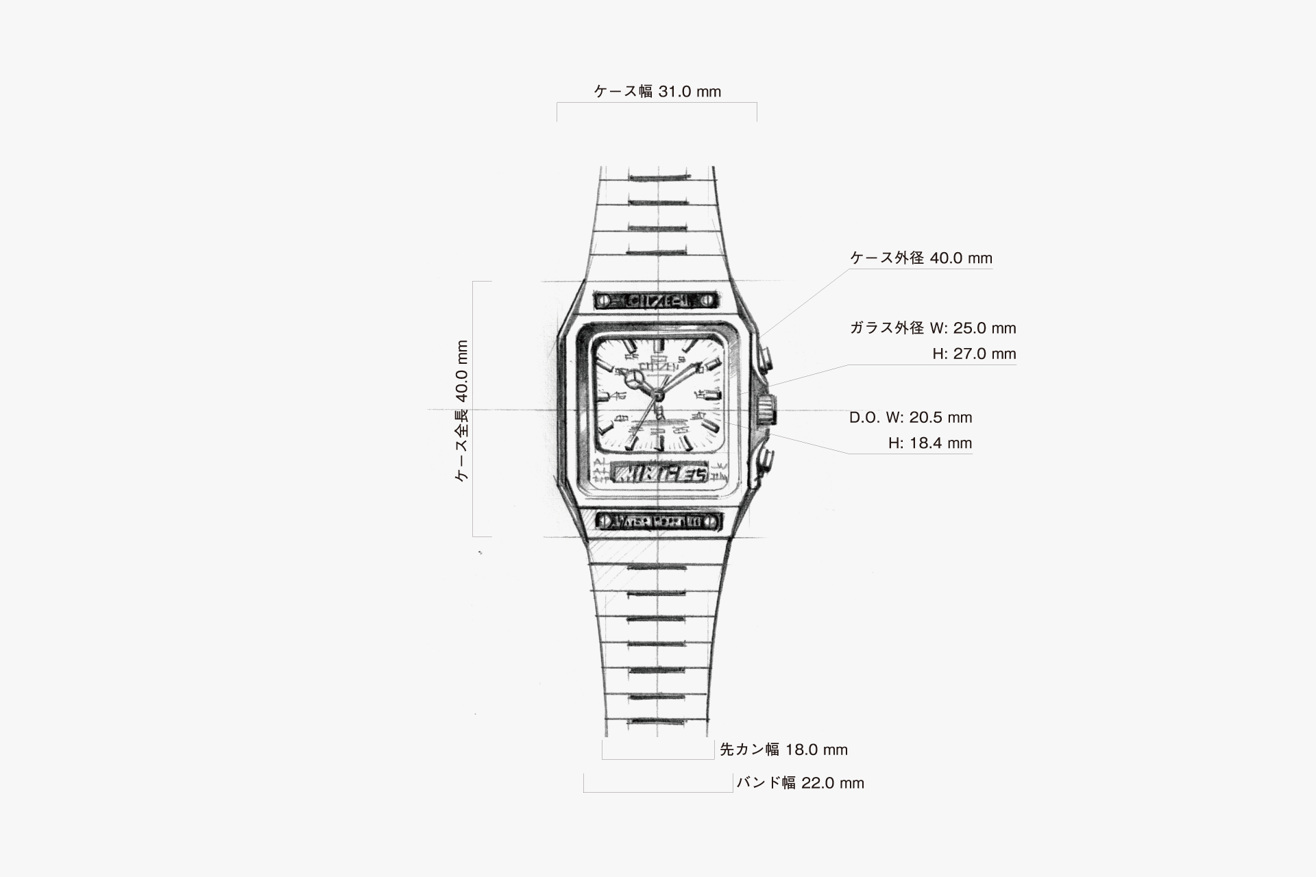
As digital displays became widespread, moving beyond the era when analog watches with rotating hands were mainstream, the skills required of watch designers became increasingly graphical. When it comes to hybrid models that combine analog and digital, the challenge becomes even greater, as both characteristics must be fully expressed. Digital displays, with their segmented numerals, naturally lead to linear and angular forms, but this model is especially square in design. It features an array of straight lines, as if everything were drawn with a ruler and compass, and this consistency brings a sense of unity. In the design process, the one thing that cannot be changed is the digital numerals built into the movement. By aligning the overall design with the linear feel of these numerals, the result is a unified design without any sense of incongruity. The precise, linear motion of the second hand, which ticks step by step, combines with the visual speed suggested by the straight lines, highlighting a straightforward emphasis on functionality.

undefined

An industrial design that makes extensive use of straight lines. A powerful sports style rendered in a monotone palette of stainless steel and black.

undefined

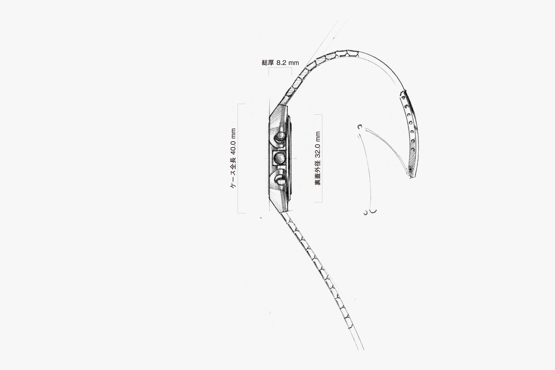
A simple design with a high center of gravity, where the flat, bezel-less top surface of the case flows seamlessly into the band.

undefined

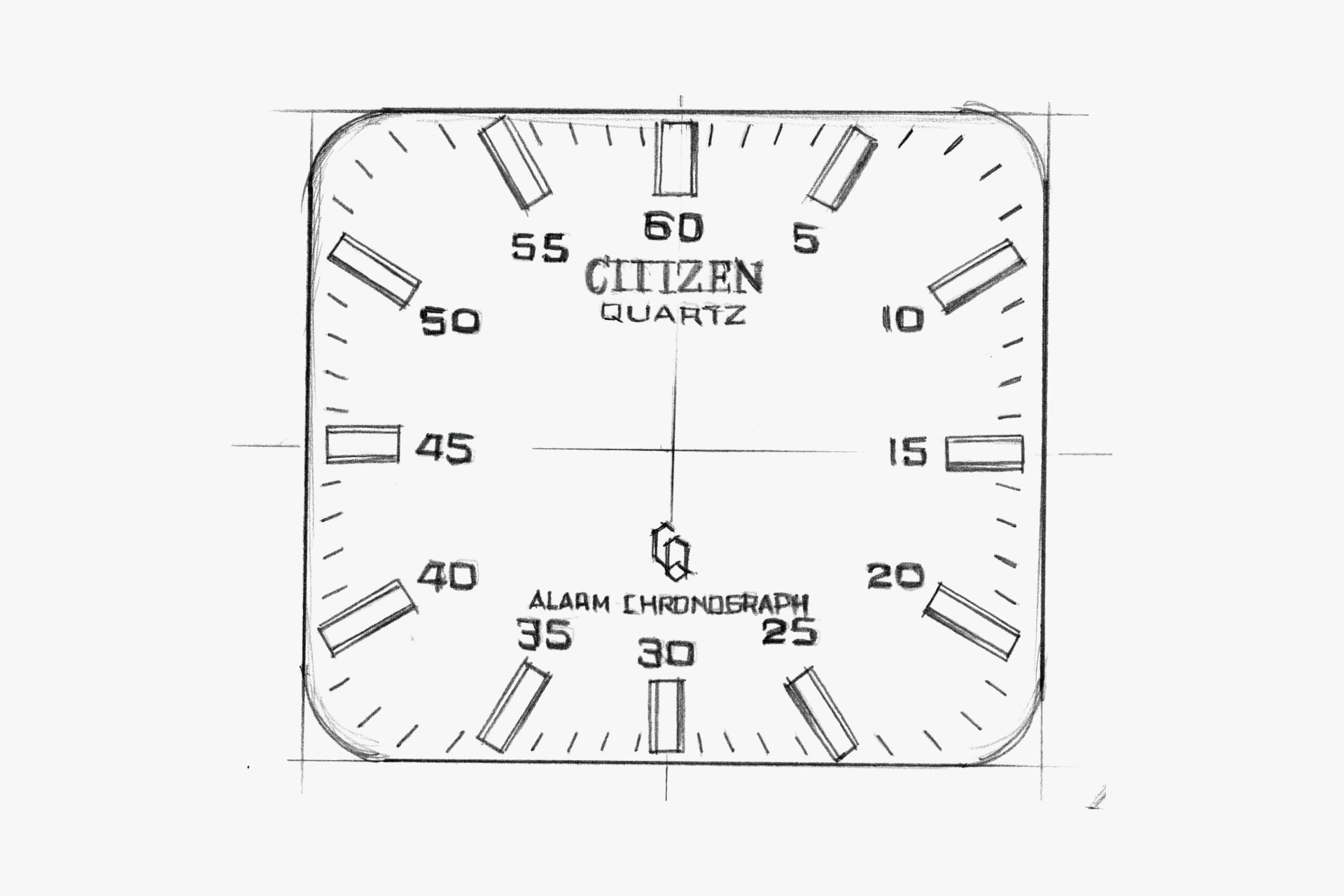
A square dial unified by linear elements. The numerals are also square.

undefined

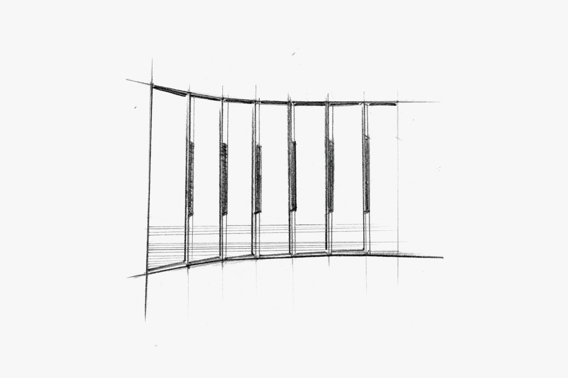
The thin metal band is also flat and linear on top. Its single, uninterrupted horizontal row gives it a clean look.

undefined

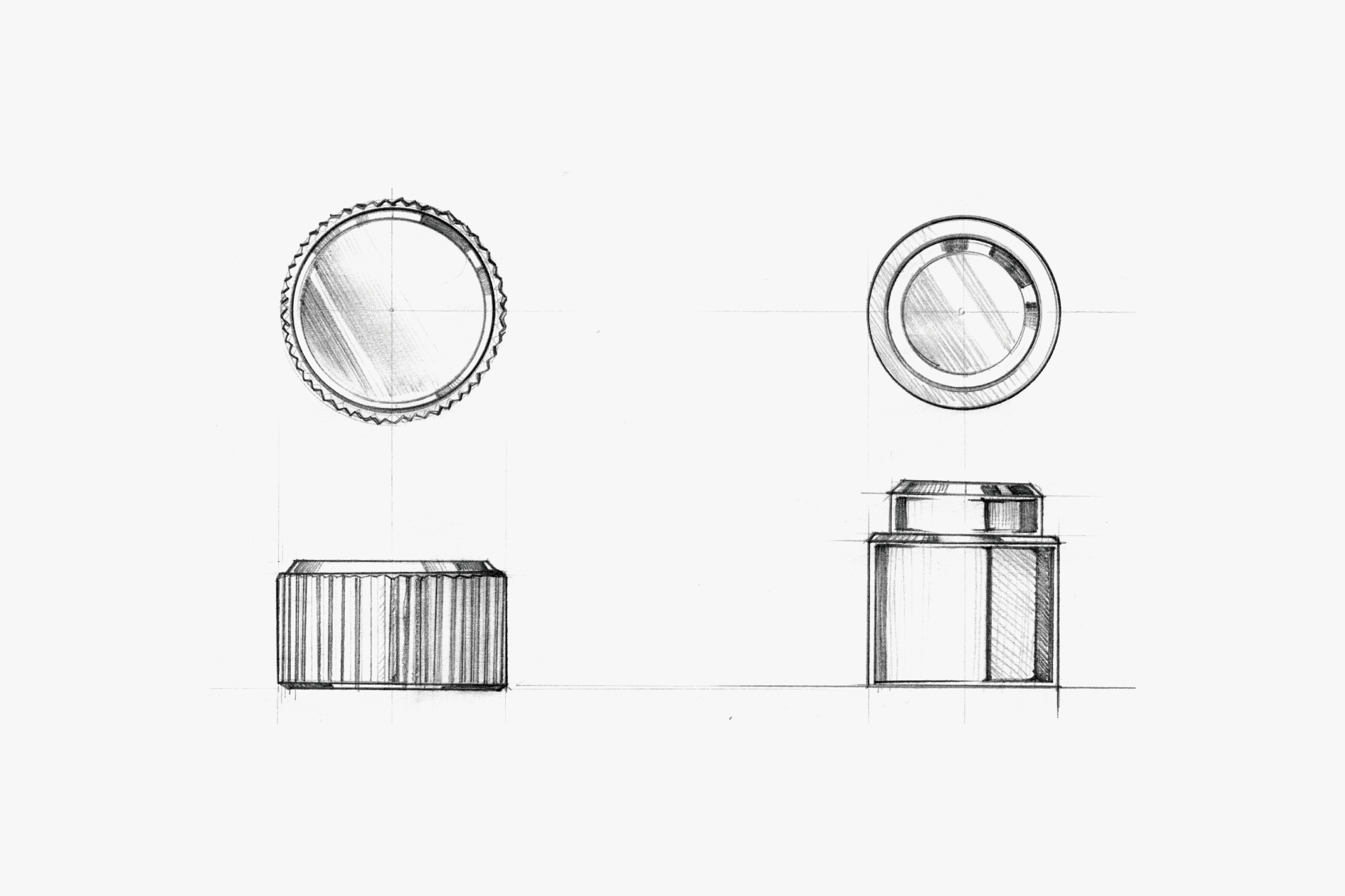
A crown and buttons composed of straight lines and perfect circles.

undefined

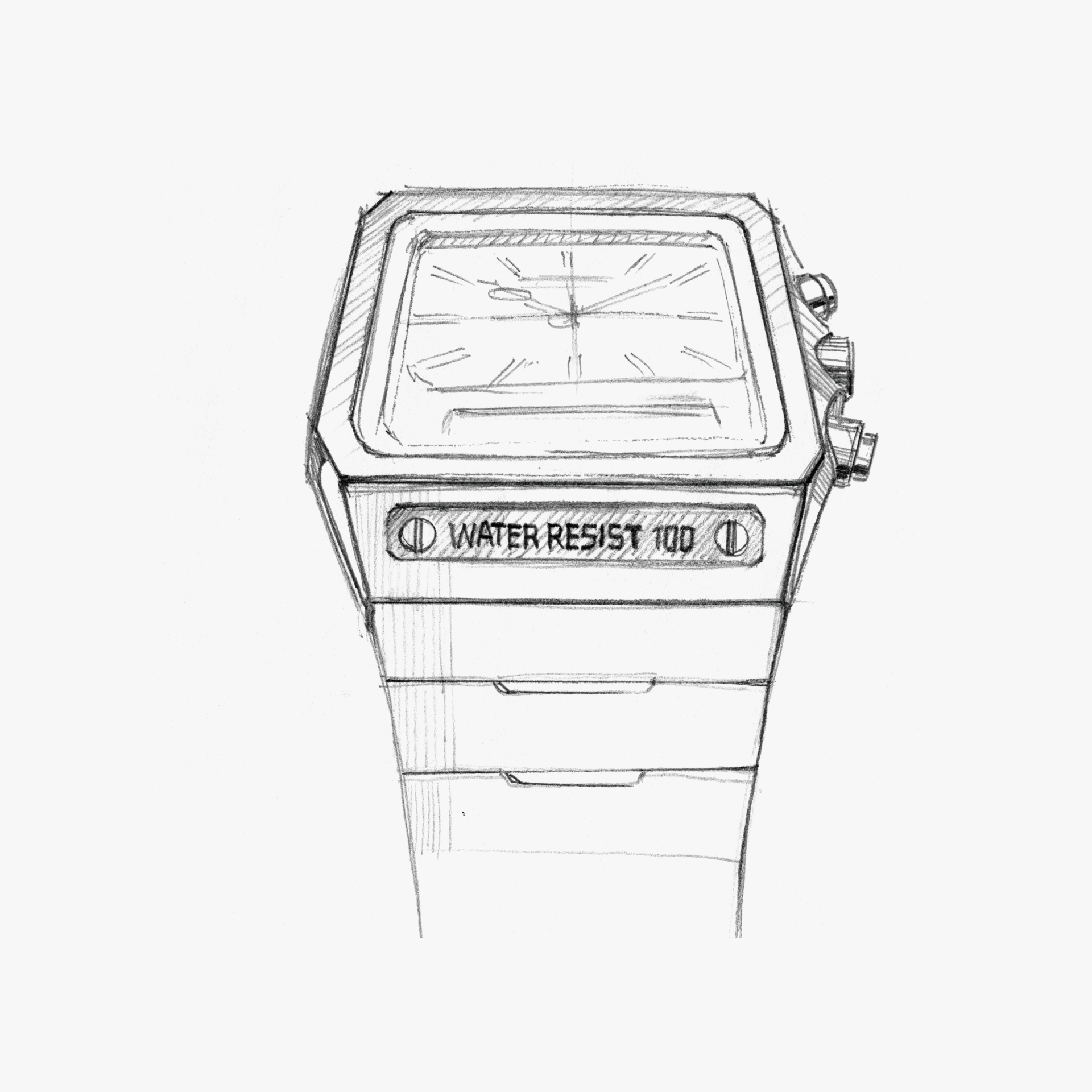
The flat top surface connects directly to the band, creating a simple look. Square decorative nameplate.

undefined

Angular fonts. Care has been taken so that they harmonize with the segmented numerals of the digital display.

WATCH

RELATED

https://ms.citizen.jp/assets/070_10-02_カリキュレーター_01

Retro Future

In the 1970s, a new method of time display—digital display—was developed. At the time, this display function evoked expectations for watches of the near future. This watch was designed based on the idea of utilizing the effectiveness of digital display and, for the first time, adding a calculator function to a wristwatch. The first domestically produced wristwatch to combine watch and calculator functions is expressed with a unique design style: a central display monitor and 23 push buttons arranged radially around the perimeter. Achieving this in the classic round shape of a wristwatch is a testament to the creativity of watch designers. The artificial brilliance of the push buttons, arranged every 15 degrees. The simple lines of the case and band, free from any recesses or protrusions. These are the result of traditional machining, and the combination of a thick case and cool digital display creates a retro-futuristic feel through the imbalance of old and new technologies. Additionally, this early model is unified in gold, skillfully using gold with different textures for each exterior part, creating an elegant atmosphere despite the flashy color scheme. Although the distinctive button layout did not become standard, it exudes the coolness and pride of being a pioneer.

https://ms.citizen.jp/assets/100_12-08_L 漆玉_01

Feeling Light

Urushi beads, diamonds, and smoked glass—each reflects light differently, revealing a model with depth and ever-changing expressions depending on the light source and time of day. The simplicity of the case shape and dial design highlights the beauty of the details, allowing you to sense not mechanical time, but the gentle passage of time illuminated by light. Although there are no indexes on the dial, the hour and minute hands are easy to read, giving the impression of a bracelet that also functions as a watch. Furthermore, urushi lacquer is not presented in the traditional way, but is fused with the watch in a modern design, letting you enjoy a contemporary expression of traditional craftsmanship. Despite its asymmetrical shape, it is comfortable to wear and offers a special feeling, as if wearing modern jewelry.

https://ms.citizen.jp/assets/099_12-07_L ムービングダイヤ_01

Vitality of Nature

Many CITIZEN L models are inspired by shapes and light found in nature, and this model is themed around 'morning dew.' The three diamonds on the case move smoothly along the curve of the case, and the indexes are scattered across the dial, creating a story that evokes scenes from nature even for those who know nothing about the watch. Looking at the parts, despite the many asymmetrical elements—such as the dial pattern, index arrangement, crown position, and case shape—each is balanced in its placement, so there is no sense of discomfort or difficulty in wearing it. The asymmetrical design brings a rhythm and movement reminiscent of the vitality of nature, making you feel a relaxed, natural flow of time rather than a uniform one. Although the watch uses many diamonds and has a jewelry-like feel, the arrangement of the indexes and the spacing between the case and band give it an airy look, making it suitable for everyday wear as well.

https://ms.citizen.jp/assets/098_12-06_エクシード ユーロス_01

From Small Cues to Decoration

"Band, hands, circle"—these are the minimal components by which people recognize a watch. ◆ A watch is a "wrist" watch because it has a band. ◆ A watch is a watch because it has hands. ◆ Time was created from the recurring cycles (circles) of celestial bodies. This model seems to be a textbook example of a "watch" that focuses on these three elements. By lavishly decorating these three elements, it clearly establishes the hierarchy among the other components. Isn’t this the ideal model for all watches, combining the "watch-like" qualities users seek with the beauty of an ornament that satisfies them?